Designer Doesn’t Design Own Logo
Categories:
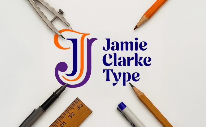

New branding… with a little help from my friends
I didn’t plan to change my logo
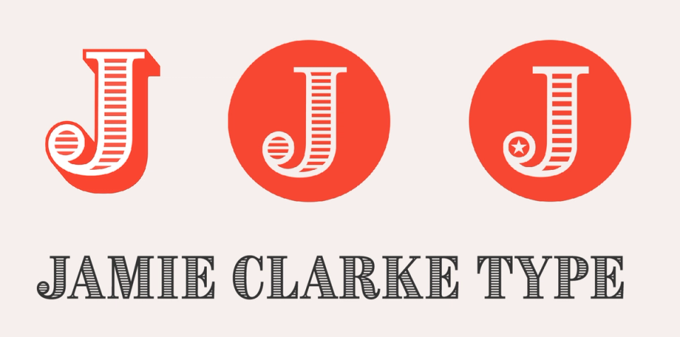
I was fairly ambivalent about my previous logo. I’d simply used the ‘J’ from my first typeface, Brim, and placed it (carefully) in a red circle. It was a decent placeholder for years, and though I always thought I should create something better, it felt like a luxury I didn’t have time for.
Last year, I decided it was time for a new website – this website – to present myself and my work more clearly to clients and sell my typefaces direct. To do it justice, I knew I’d need help: a team who could look at my business objectively and bring a fresh perspective.
That’s when I met Andy at Set Studio. He understood the challenge immediately. Together, we unpicked my business and built this site around its newly clarified priorities.
As the website designs came together, it quickly became clear: my old logo wasn’t fit for the task. It didn’t identify my business. It didn’t reflect the breadth of my work. And its bright red jarred with everything.
Why I didn’t design it myself
As a designer, you think you should be able to do everything yourself.
I help clients with logos for a living!
The real challenge was distance – and I didn’t have any.
When it’s your own business, you’re too close. It’s hard to see it the way a new client would. You don’t spot the contradictions or the blind spots. And between client projects, when exactly was I going to find the headspace?
In the end, the smartest thing I could do was the simplest: ask for help.
Working with Andy and his team on the website had already proved how valuable that outside perspective could be.
I decided to dedicate some budget and let someone else hold up the mirror.
A bottom-up approach
Conventional wisdom suggests the brand should come first – then the website and everything else follows.
But that simply wouldn’t have worked in my case.
The website is like the long-form version of my business. It’s where I showcase my capabilities, set my tone of voice, and connect with potential clients. The logo, by contrast, is the condensed version – the summary. So I needed that clarity – that solid base – before I could distil it into a single mark.
I approached Jamie Ellul at Supple Studio with the challenge. I’d worked with Jamie before, admired his team’s work, and the fact they were local was a bonus.
A collaborative process
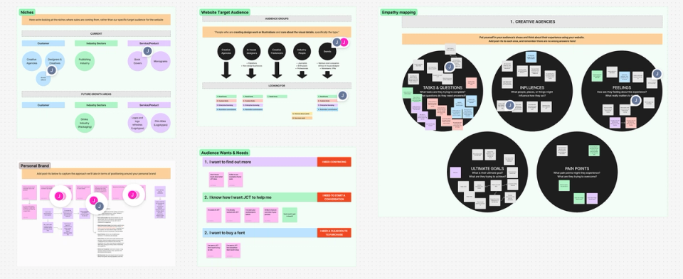
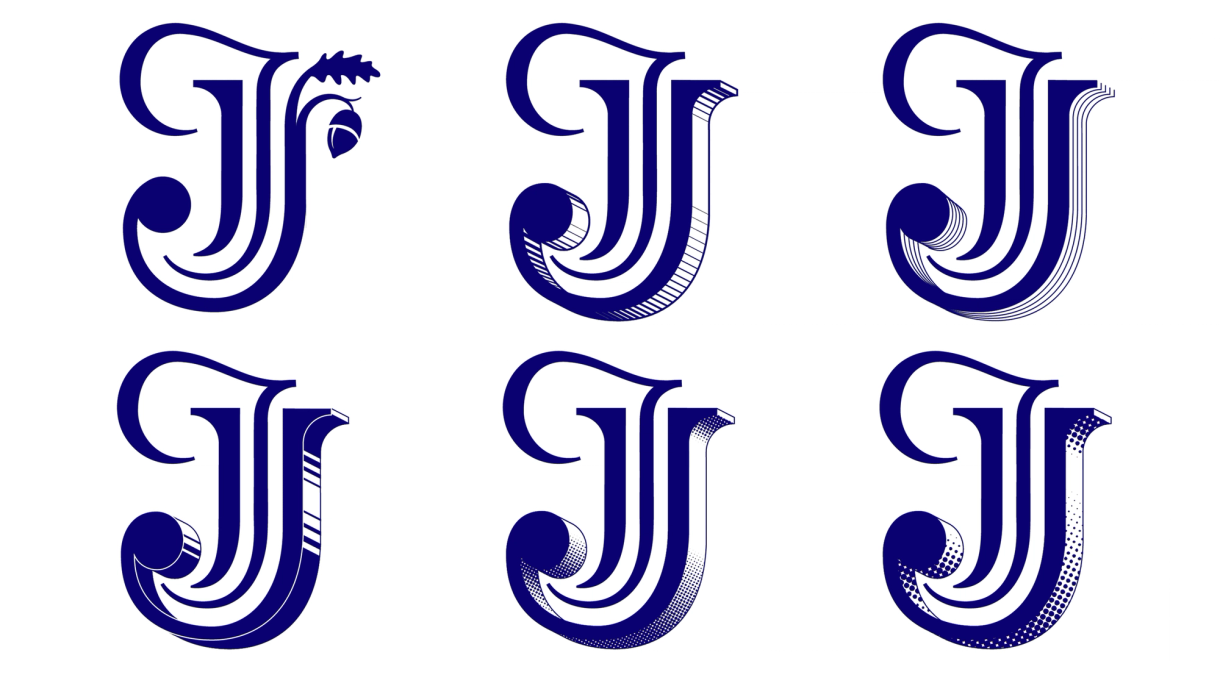
Jamie and the team dived straight into the project – asking tricky questions, probing and challenging my thinking. From there, they produced a set of thoughtful concepts that explored several directions.
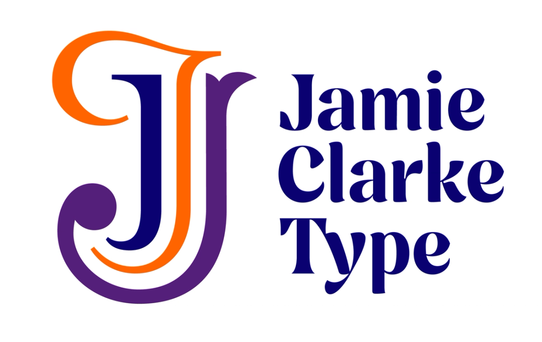
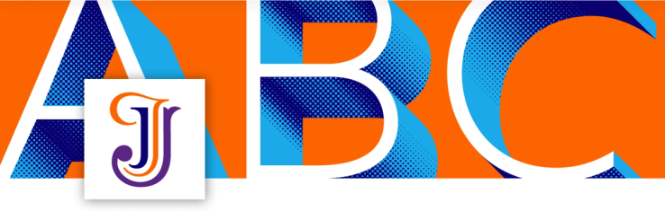
It took less than 24 hours for me to settle on a direction: a multidisciplinary monogram that captured the three main strands of my practice and combined them into one neat mark.
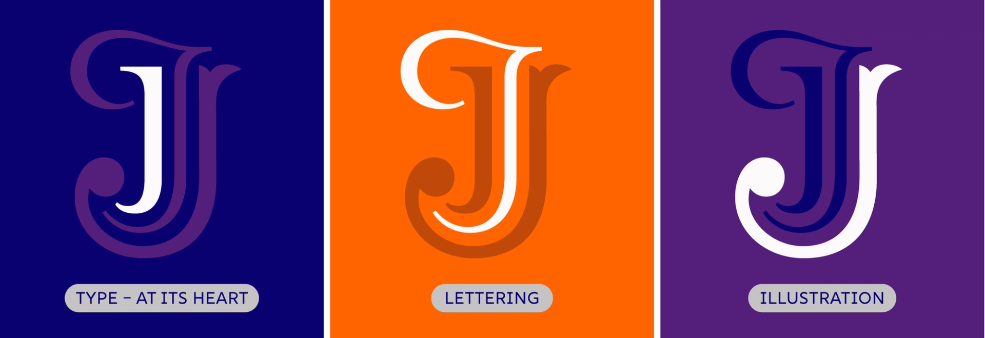
Jamie’s team then presented a few interpretations of the chosen concept – exploring colour, typographic lock-ups with my company name, and testing its ‘plonkability’: how it sat in real-world settings and scale.
Once we’d narrowed it down, they passed the working vectors over to me. As I would for any client, I refined the drawing – adjusting the overall shape and proportions, and fine-tuning all the tiny details that make a mark sing.
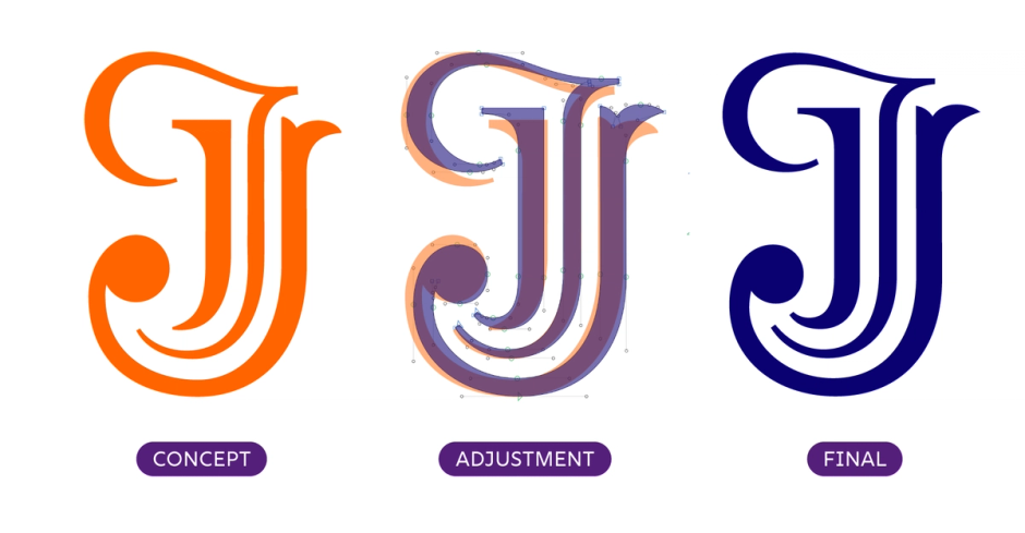
We set the logotype in Nave Heavy, tracked tightly at –27. That meant a few manual kerning adjustments – and even a custom ligature between the now-touching T and y.
More than a logo – a system
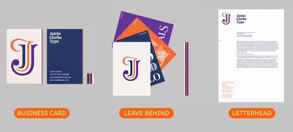
With the mark finalised, Jamie’s team began building out the wider identity.
They built a system that complemented the mark and gave it space to shine – across everything from business cards and pitch decks to social posts and mini-portfolios.
The logo needed to support and represent my work, rather than distract from it. But it also needed enough character to feel distinctive and confident – something that quietly says: this person cares about design.
Importantly, it all needed to work in real life – across email signatures, social media, and partner platforms like Adobe and Monotype.
Final thoughts – a mark of trust
The new identity feels right. It reflects who I am and how I work – with care, craft, and clarity.
Getting there meant letting go of some control. But that distance gave me exactly what I was looking for: a clearer, sharper sense of my business.
Sometimes, the clearest view of yourself comes from how others see you.
A quiet thank you
If you’ve read this far, thank you – I hope you’ve enjoyed the story behind my new logo.
As a little reward for the typographically curious, you can use the code WELLREAD10 for 10% off any font on the site.
This code isn’t widely advertised – just a quiet thank you for taking the time.