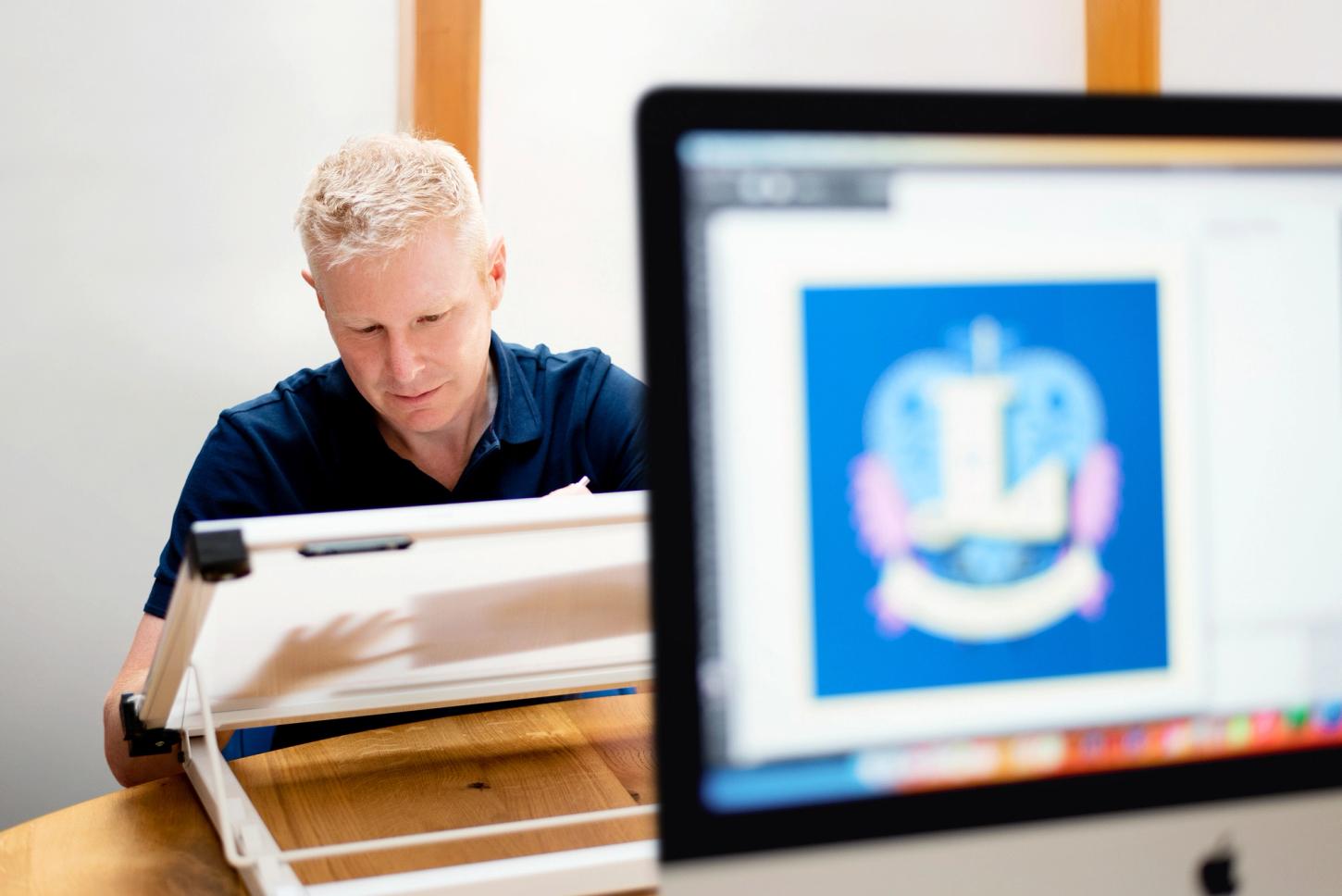
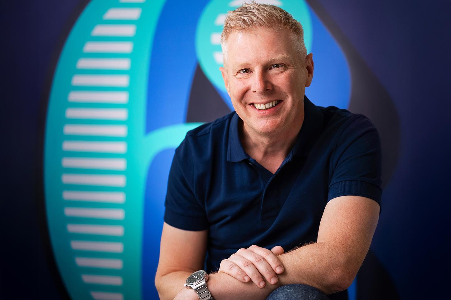
I’m an independent lettering artist and type designer with over 25 years of experience. I'm based just outside of Bristol in the UK.
My creative focus is divided between two passions: illustrative lettering and type design, both of which are detailed below. Although distinct, these aspects of my work complement and influence each other. My typefaces are inspired by my illustrative creations.
I enjoy meticulously crafting illustrations to tell visual stories, with lettering often taking the spotlight. My designs have captivated an expanding audience among branding agencies, book publishers, and packaging designers.
In addition to my illustration projects, I design original typefaces, like the one you're reading now (Rig Sans). These fonts offer a unique visual tone to the text and can be licensed through reputable partners. I also create custom fonts for clients seeking to capture their brand essence in written form.
These terms may seem interchangeable but are distinct activities.
Lettering refers to letters and words drawn for a specific purpose, like a book title, logo or illustration.
Type refers to a set of characters designed and arranged into a font. The process of making a font is called Type Design.
If you're interested in the process of making a font, take a look at my article over on Google Fonts.
Despite a passion for letters that was ignited at school, my design career began in web design. I initially worked for a couple of startups before joining Microsoft, where I became Head of Design in EMEA.
In my late twenties, I started my own design agency with two friends in London. The business grew to employ over 20 designers and developers and attracted a client list of globally respected brands. In my spare time, I started to re-explore the world of type and lettering via my blog, Type Worship. This ultimately led to a career turn.
After an exhilarating decade at my agency, I decided to follow my passion and studied type design at the University of Reading, and took a course in letterpress at the St. Bride Foundation.
To make a fresh start, I relocated to Sydney for a few years where I began developing my lettering skills and designing my first fonts. I've since returned to the UK, where I’ve been working on lettering commissions and expanding my library of typefaces.
2024 – Awarded Font of the Month, Steven Heller, Rig Solid
2024 – Universal Principles of Typography, Set in SideNote
2023 – Print Magazine, Type for Illustrations
2023 – Creative Boom, Top 50 fonts in 2024, Span
2023 – Type has a body…Just like you!, Foreword
2019 – Graphis, Typography: Platinum Winner, Rig Shaded
2018 – Typism Books 1, 3, 4, Finesse Press
2017 – ABCD, Best Book Cover Award, Shortlisted
2017 – Scripted, Sandu Publishing, The Woman in Black
2017 – Type Tells Tales, Steven Heller, Gail Anderson
2017 – Expressive Type, Alex Fowkes, Fictus Farm
2016 – Sketching Type, Lee Suttey, Fictus Farm
2016 – 365 Typo, Étapes Editions, Brim Narrow
Jamie’s expertise and enthusiasm were invaluable in the development of a new educational handwriting font for our client. Jamie was flexible and accommodating to the needs of our client, their product and schedule, ensuring the process was smooth and enjoyable throughout. Our client is absolutely thrilled with their final font and we would undoubtedly work with him again!
Rebekkah Hughes
Design Manager, Oriel Square
Jamie is your illustrator. Here’s why: He’s a rock star talent. The man can create anything. He tracks on creative direction and doesn’t miss a beat. He listens. He understands. He pushes on ideas to bring out their full potential. And then best of all...he delivers...on time and on point. Beautiful work. I trust him with my trickiest projects. He’s a superb communicator.
Paul Vaughn
Creative Director, Orvis
Here’s a list of my clients, so you know you‘ll be in good company…
Adobe | Google | Monotype | AMV BBDO | Creative Partnership | Royal Mail | The Royal Mint | The Folio Society | Collins | Oxford University Press | Penguin Random House | HarperCollins Publishers | Smythson | Orvis | Co-Partnership | Freytag Anderson | Lux | Pushkin Press | Bensimon Byrne | Scotiabank | Future | Houghton Mifflin Harcourt | Osborne Pike | Little Big Brands | Alphablocks
I am a member of the International Society of Typographic Designers (ISTD),
the Association Typographique Internationale (ATypi) and the Letter Exchange.
I'm proud to share that my studio is powered using 100% renewable electricity and heated by geothermal technology. I prioritise sourcing materials responsibly and reducing waste, to minimise my environmental impact.
Contact me to buy my fonts directly or use them free with an Adobe subscription, or licence them from a reputable foundry partner.
For occasional project and blog updates, please subscribe.
© 2015-2024 Jamie Clarke Type LTD and contributors | The Hive, Bristol, BS39 4JJ, United Kingdom