Fonts for TV
Categories:

Typography plays a defining role in a TV show's identity. It can evoke a particular era, establish a mood or give us a hint of what's to come – sometimes before we've watched a single scene.
I've had the pleasure of designing both title treatments and custom typefaces for the small screen, which has made me particularly interested in how type helps give a show its personality. Sometimes it's the choice of typeface itself; sometimes it's how the letters are modified, arranged, animated or integrated into the wider title sequence.
Deciding which font to use – and whether it should complement the world of the show, contrast with it, or accentuate a particular aspect of its character – is a key decision in creating a memorable identity.
Here are some of my favourite examples from television – including a couple I know particularly well – and why I think each works so well.
Stranger Things
ITC Benguiat, Ed Benguiat
Match kind: Accentuating
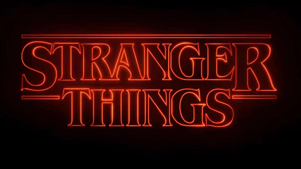
Few TV shows have put typography quite so centre stage. Designed by Ed Benguiat in 1977, ITC Benguiat was already part of the visual landscape of the early 1980s in which Stranger Things is set.
The title sequence makes the most of its distinctive letterforms. Huge fragments of type slowly slide across the screen, creating an almost labyrinthine puzzle of curves, strokes and serifs before finally coming together to reveal the title. The typeface establishes the period, while its eerie treatment perfectly accentuates the mystery and unease of the show.
The Bear
Knockout No.90 Ultimate Welterweight, Jonathan Hoefler / Helvetica Neue Bold, Linotype
Match kind: Accentuating
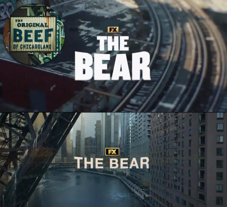
The Bear is one of my favourite shows, and I've always loved the punch of its title treatment. The first two seasons use the characterful, condensed Knockout No.90, while later seasons switch to the more neutral Helvetica Neue Bold.
Interestingly, the distinctive treatment remains: both typefaces are flared at the edges, giving the title an almost stamped quality and adding drama and urgency. This appears to echo the similarly flared ‘BEEF’ lettering on the sign for the family's restaurant, The Original Beef of Chicagoland.
Rivals
Custom title treatment and typeface, Jamie Clarke Type
Match kind: Accentuating
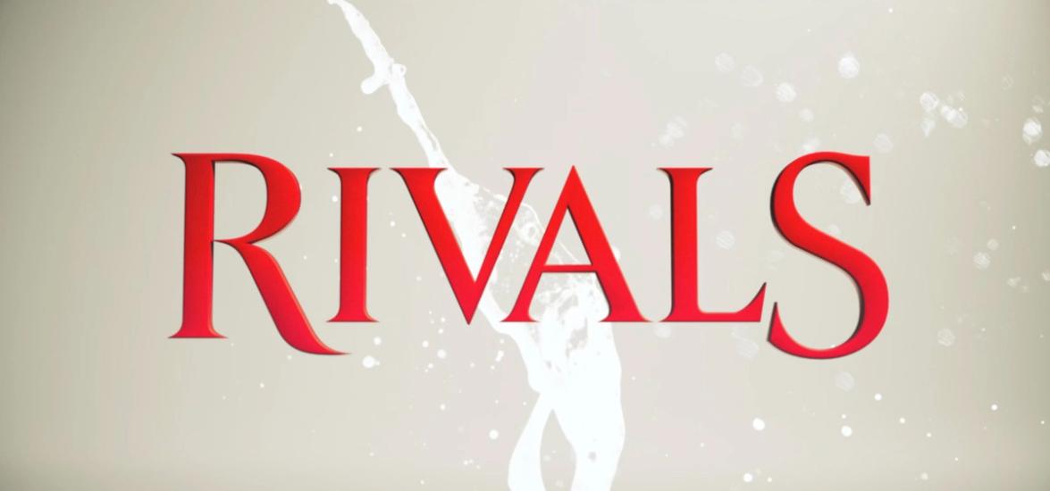
Okay, I know this one rather well. I was commissioned by The Creative Partnership to create a title treatment for Disney+'s adaptation of Jilly Cooper's Rivals, capturing the seductive glamour and competitive energy of the show.
I combined sharp serifs and a strong upright structure with more sensual curves, balancing authority with a little flamboyance. At the centre, the V and A are spaced fractionally too close together – two letters quite literally competing for space. That detail was later animated in the opening titles, adding a little extra tension to the rivalry.
Atlanta
Cabernet JF, Jukebox
Match kind: Contrasting
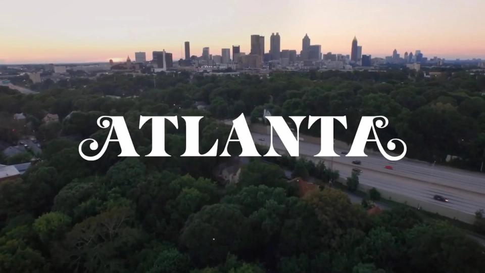
Cabernet is an elegant and distinctive choice for Atlanta, contrasting beautifully with the everyday environments of the show. The logo, designed by Kim Cazzolla at P+A, mirrors the swash on the initial ‘A’ to create a strikingly symmetrical wordmark that echoes the offbeat character of the show.
What I particularly love, though, is how the title is slipped into the opening of each episode. It appears naturally within the scene – on a tattoo, a basketball court, a tablecloth and even a gun barrel. It's a playful way of integrating such a contrasting typeface into the world of the show, turning the search for the title into part of the fun.
Succession
Engravers Gothic, Bitstream Inc. / Sackers Gothic, Monotype
Match kind: Complementing
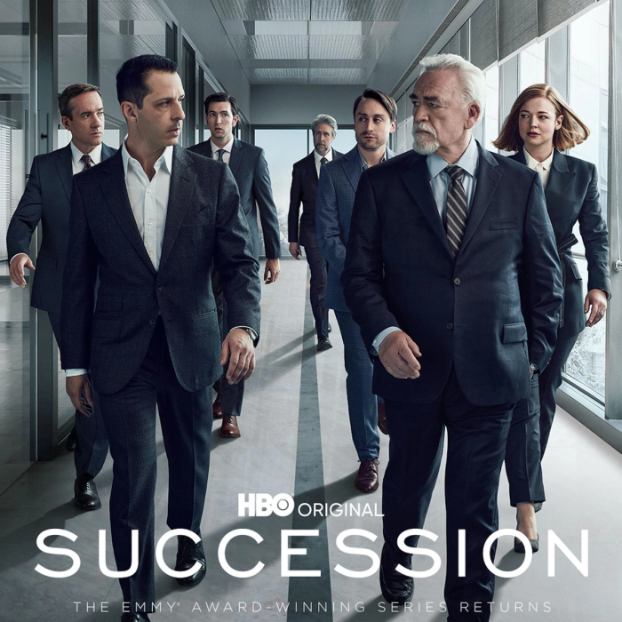
The restrained typography of Succession feels perfectly at home in the rarefied world of the Roy family.
The logo uses Engravers Gothic, while the opening titles use the very similar Sackers Gothic, giving the small type a little more room to breathe.
Engravers Gothic's most distinctive character is the S, which snakes around to squeeze the upper opening. And of course, SUCCESSION has three S's to show it off! Both typefaces draw on the tradition of engraved stationery, giving the typography a quiet sense of establishment, wealth and authority.
Game of Thrones
Trajan Pro, Carol Twombly, Adobe
Match kind: Complementing
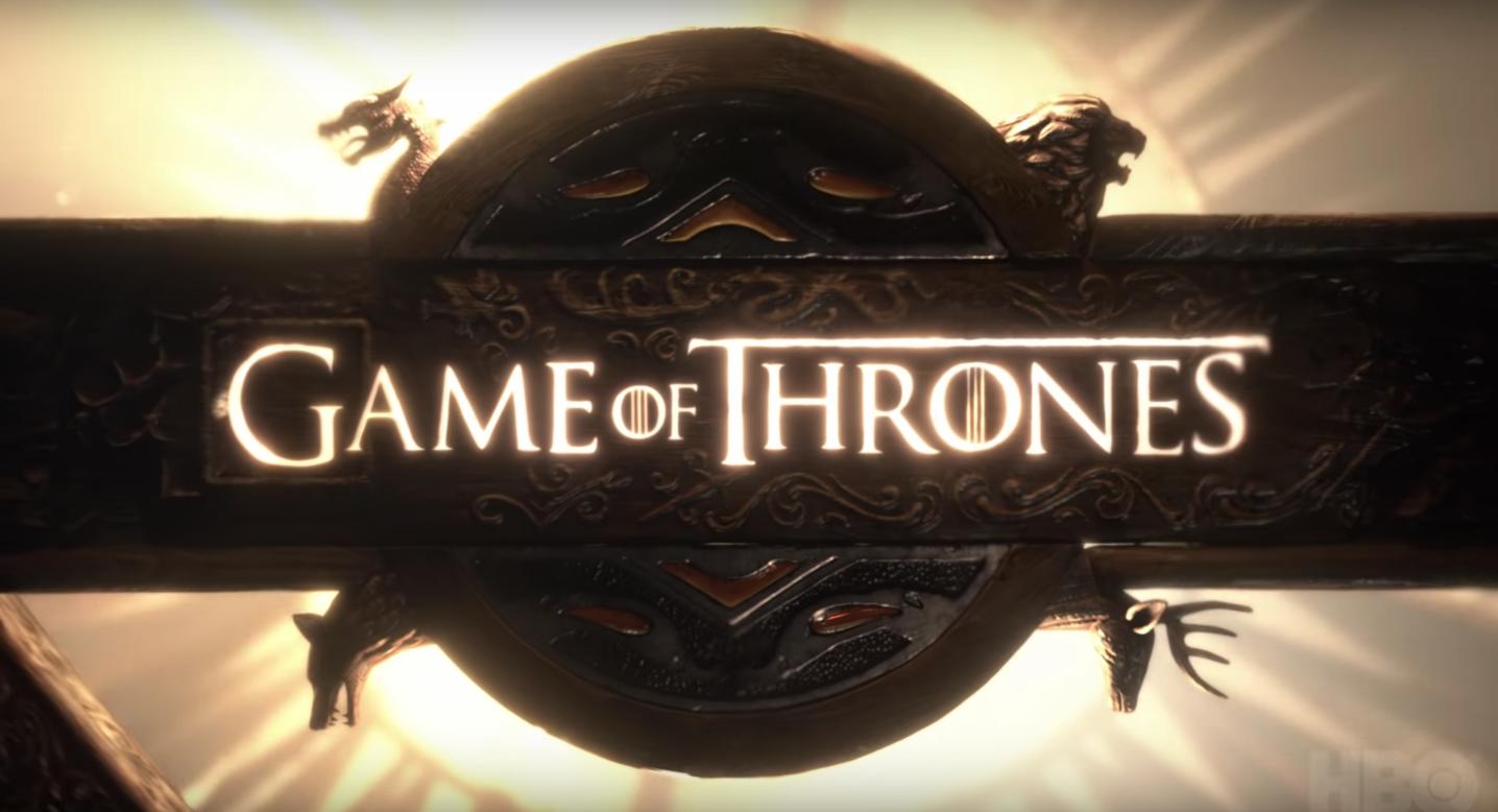
The underlying type in the Game of Thrones title is Trajan. Based on the monumental Roman capitals carved into Trajan's Column, it has become almost a shorthand for epic storytelling, appearing in countless film and TV titles.
Its inferred meaning feels almost hard-wired. Creative studio Elastic made it their own with the barred O's and distinctive lock-up, although to my eye the enlarged final S unbalances the composition rather than improving it.
Trajan isn't the only way to evoke classical stature. My own Span typeface explores similar territory with a more contemporary character – and its small and mid caps make smaller letters particularly easy to control.
The White Lotus
Trajan Pro, Carol Twombly, Adobe
Match kind: Accentuating
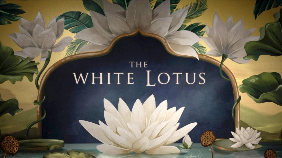
And here's Trajan again. The White Lotus embraces the typeface's associations without apology.
As the beautiful decorative imagery of the title sequence gradually reveals something more decadent and sinister, there's something almost overripe – even slightly sickly – about Trajan's familiar grandeur. Intentional or not, it feels particularly fitting.
The Last of Us
Press Gothic, Canada Type
Match kind: Accentuating
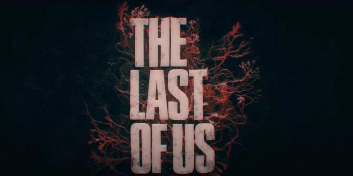
This tall, compressed style of type has become a graphic trope in its own right – instantly conveying urgency, toughness and impact. It's a territory I explored with my own typeface Reel, looking for ways to retain that graphic punch while giving it a broader range of voices.
The Last of Us embraces the tougher end of that spectrum with Press Gothic. The type is rarely left pristine; across the identity it's distressed in different ways, making the typography feel as though it's been exposed to the same decaying world as everything else.
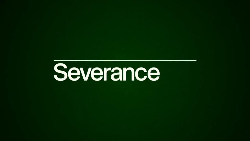
Severance
Custom typeface, Teddy Blanks
Match kind: Complementing
Severance could easily have reached for another typographic trope: Helvetica as shorthand for the anonymous corporate world. Instead, Teddy Blanks created a custom typeface that feels like it should be Helvetica, but isn't quite right.
Inspired by the kind of rigorous corporate identity manuals produced for organisations such as NASA and Toshiba, its familiarity makes it immediately believable as part of Lumon's world, while subtle deviations introduce a sense of unease. It follows the rules of corporate conformity while quietly breaking the mould – rather like the show itself.
I hope you find this list useful. These examples reveal how much meaning a typeface can carry before we've even read the words. Whether complementing, contrasting or accentuating, it's how those familiar associations are used – or subverted – that gives a title its personality.
If you're looking for type with plenty of character for your own titles and display work, please take a look at my fonts.

Newsletter
Join my newsletter to get the latest on new fonts, updates and behind-the-scenes insights.