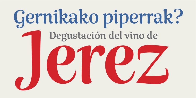
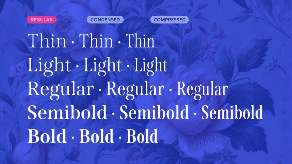
Nave: Font Story
Categories:


How not to take 10 years to design a typeface
I’ve often heard type designers speak about the many years spent crafting a typeface. With awe, I’d think, 'Wow, that must have been challenging – it must be exceptionally well-crafted and groundbreaking.'
Now, I’m here to tell you that my last typeface, Nave, took an astonishing 10 years to complete. This wasn’t because I spent the time polishing it or extending its character set, but rather due to the many missteps and wrong turns I took along the way.
Nave was the first typeface I started, and the style I aimed for was elusive and well beyond my skill level at the time. Perhaps I should have started with a simpler design, but then I wouldn't have benefited from the most valuable lessons – the ones taught by making mistakes.
Let me take you through the process and highlight some of the challenges that shaped both me and the typeface.

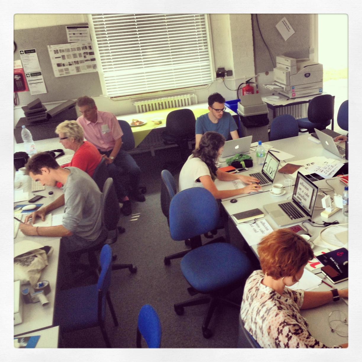
In 2013, after nearly two decades in web design, I decided to change careers. I had become increasingly discontent with the web's fleeting, ephemeral nature. I had enjoyed maintaining a blog about type and lettering for a couple of years and knew my new path would involve letters. After taking courses in letterpress, sign painting, and calligraphy, I ultimately decided to dive into type design. I enrolled in the intensive summer course (TDi) at the University of Reading.
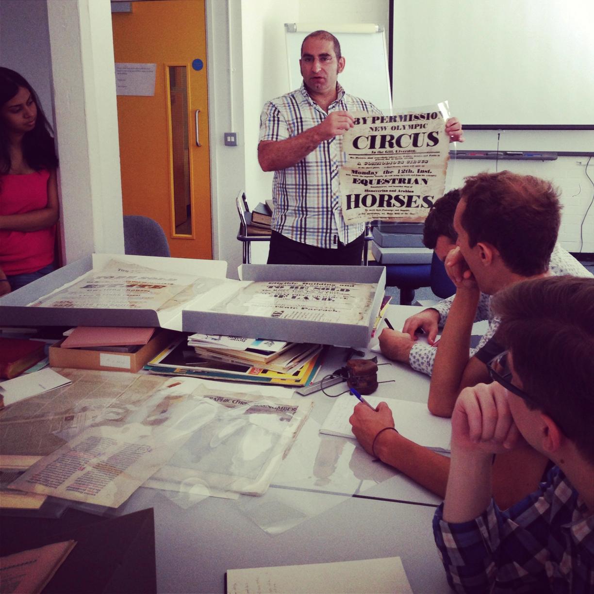
The course was a completely transformative experience. I had fantastic lecturers, including Gerry Leonidas, Gerard Unger and Fiona Ross, but also I met fellow students and professionals that I'm still in touch with today. (You can read more about it here.)
In one class, we explored mark making with various brushes. I was captivated by the fluid marks and wondered if they could be shaped into a more formal structure – a hybrid that would align with my personal taste in letterforms. Back then, I lacked the skills and a clear vision of what this might look like across an entire typeface, but I pressed on, driven by the wonderful freedom of naivety.
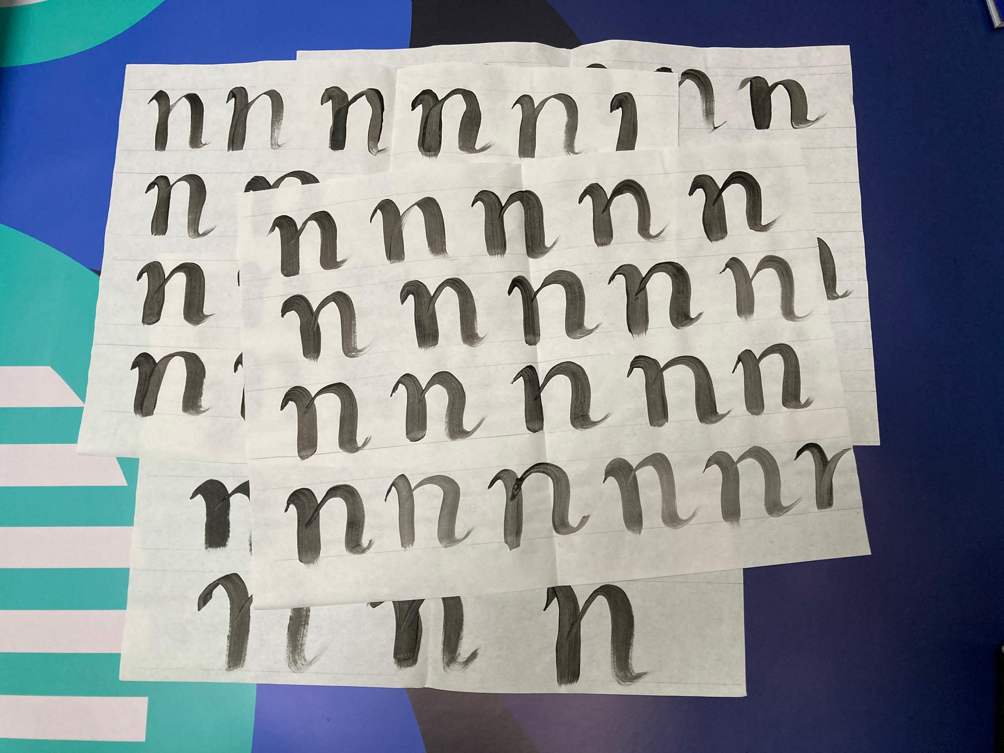
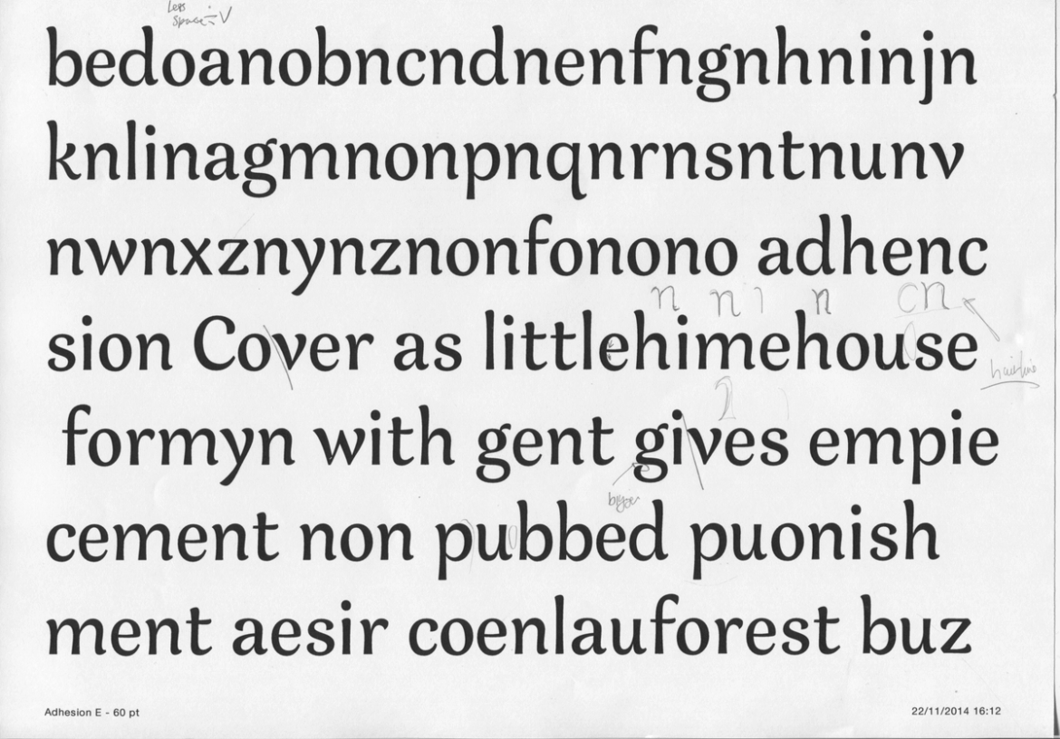
These sketches evolved into a handful of characters. Despite excellent direction from Gerry and others, I couldn’t capture the concept in my head. Instead of evoking elegance, the result felt more like a troupe of circus clowns. In hindsight, I definitely should have spent more time sketching, but I felt the need to make progress to fully benefit from the short course.
Around that time, fellow designers directed me to some typefaces that might provide clues about the style and direction of my design. While these were excellent designs, their goals and trajectories differed significantly from what I envisioned. I wanted to maintain a stronger link to upright Roman letters rather than cursive or handwritten styles. In hindsight, this might have thrown me off course and dented my confidence in the direction I was heading.
After completing the course, I continued working on my design, trying to mould it into my now slightly blurred vision. I reached out to Toshi Omagari, a type designer I met at Reading and someone whose work I’ve long admired. Toshi astutely pointed out that the end strokes of my letters had become an unnatural mix of flat and rounded ends, suggesting a tool that was a cross between a chisel and a brush.
Even though I knew Toshi was right, I resisted the idea of a design made solely with a brush. However, I couldn’t figure out how to add just a hint of 'brushiness' to my design without fully committing to that style.
After weeks of frustratedly bending Bézier curves, I decided to put the design aside and move from the UK to Australia. It sounds like I moved in a fit of anger, but the reasons were more for fun and family than design despair. While settling into Sydney life, I focused on an entirely different design, Brim Narrow, which has since led a full life out in the wide world.

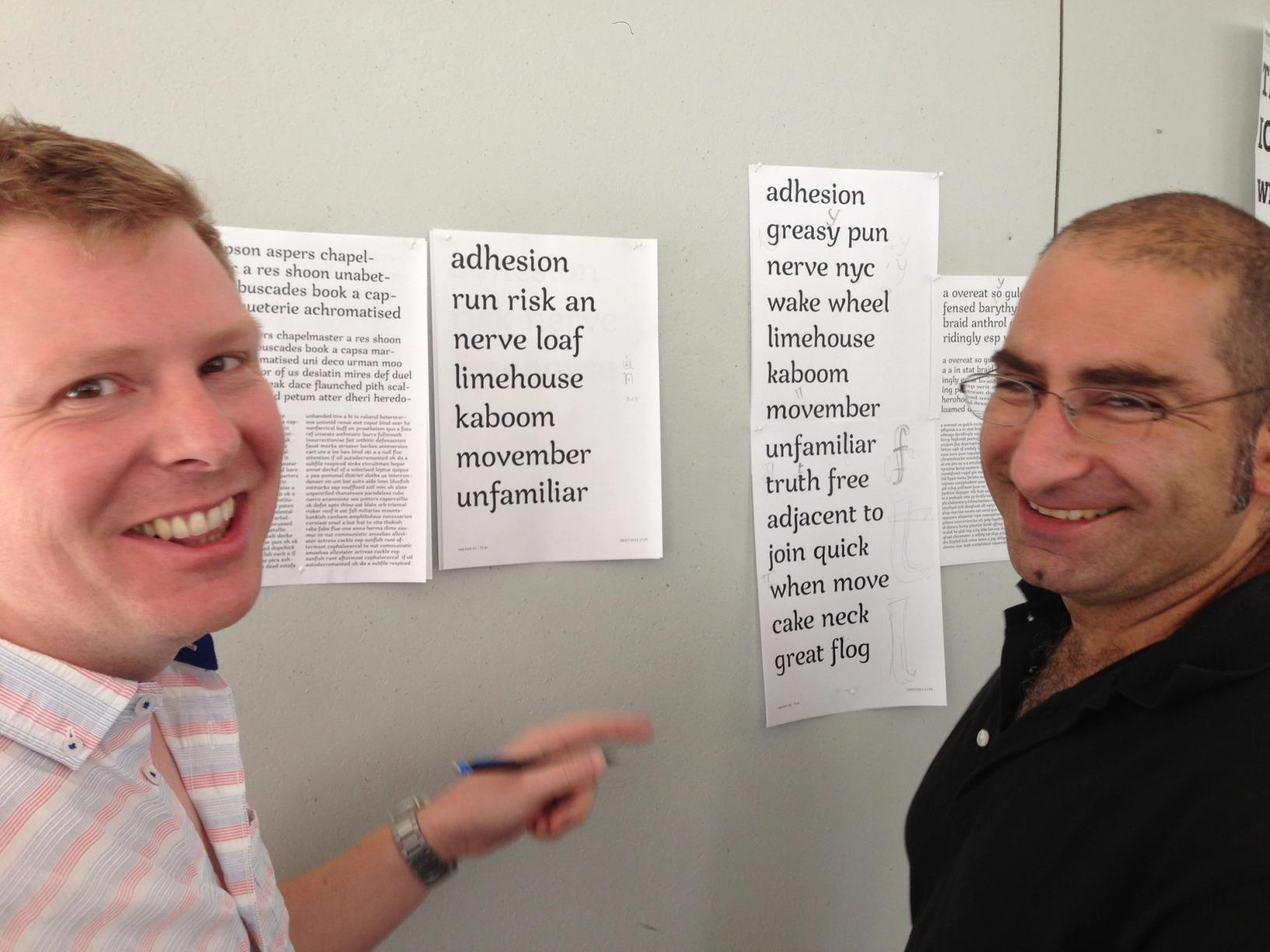
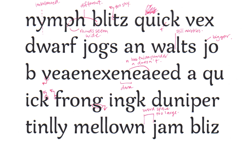
While attending a type conference, my friend the Australian type designer Dave Foster kindly offered to review my design. He patiently marked up the main inconsistencies in the characters, of which there were many! I happily tinkered away correcting the issues, but still wasn't addressing the 'wobbly', uncertain feel. To find solutions, I looked at excellent fonts like Caturrita and Appetite, but they still had too much movement. I was aiming for something with more rigidity.
So, I put the design to one side again and made another typeface. This one was also completely different from Nave. Rig Shaded has been very successful and found a home in hundreds of designs from TV shows to podcasts and packaging.

After a few sun-filled years in Sydney, we decided to move back to the UK, where I gave the typeface another shot. I revisited the main characters, applying the suggestions to rationalise the stroke terminals and bring more harmony to the design. I still hated it. So, I designed a completely different typeface instead. Span, which has nothing in common with Nave, has proved to be my most popular typeface and has been used for Bond, Beauty and the Beast, and multiple books.
It's now 2022. By this time, I've launched seven type families but still haven't resolved my first. With the new year, I set a new goal to finally finish the typeface – no more distractions!
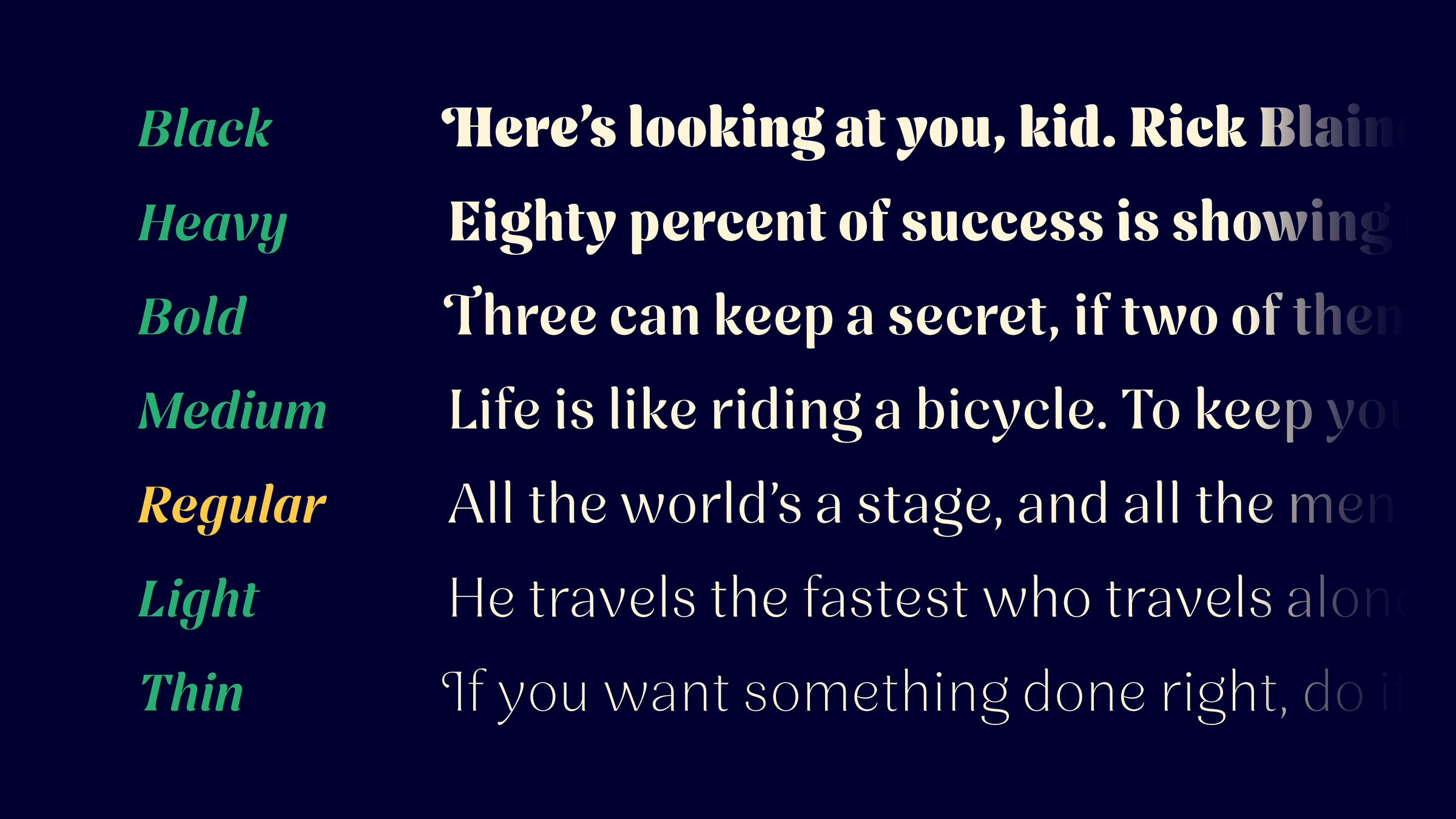
I decided to completely start from scratch, working from my memory of the letterforms, which seemed to yield much better results. I created two masters, a light and a heavy, and things were going well.
That is, until I came to the uppercase. While my control characters looked fine, carrying the stroke weight into the vertical areas like the arms of the E and the bar of the T wasn't working – it ended up looking like a Disney Aladdin font.
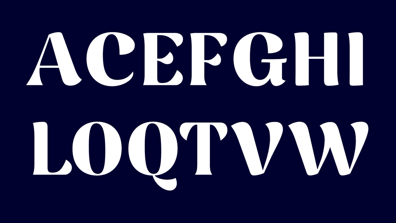
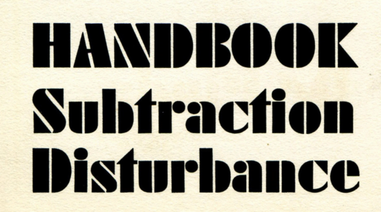
One day, while flipping through some specimen books, I stumbled upon a sample of Futura Black. Even though this typeface had little in common with Nave’s final design, it sparked an idea for Nave’s capitals. Paul Renner seemed to have crafted Futura Black by carving into blocks to create stencil-like letterforms.
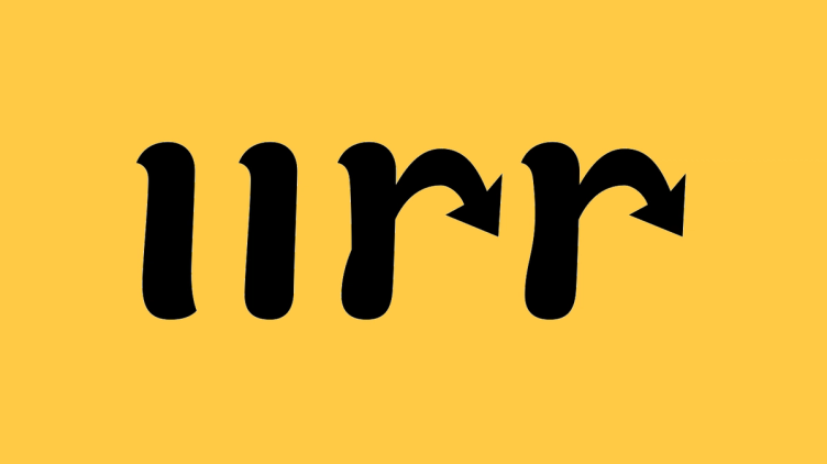
This focus on negative shapes allowed me to play with the letterforms, making the outer shape more formal and the inner shape more playful. This approach finally allowed me to complete Nave, bringing it in line with my original vision.

While this path was winding, halting, and occasionally infuriating, it was a necessary process. Could I have made the font without taking all these turns? Absolutely not. I wasn't ready. Is there a more efficient process? Definitely.
If you want to make life hard on yourself, simply follow my foolproof method:
- Start with a subtle and tricky concept.
- Skip writing a brief entirely.
- Ask for help but don’t articulate your goals.
- Second-guess yourself at every turn.
- Keep pushing forward with a design you despise.
- Constantly distract yourself by working on other fonts.
In the end, despite all the chaos, every wrong turn helped sharpen my skills and shape the final design. Some typefaces take years – not just to refine, but to grow into. And who knows? Maybe the next one will only take five!
Acknowledgements:
Thanks to Gerry Leonidas and the late Gerrard Unger, who helped me kickstart the design and guide it through its early stages. Thanks to Dave Foster and Toshi Omigari, for patiently steering my naive early drawings. Thanks to Bradley Martin and Elliot Jay Stocks, for checking drafts and their unwavering support and enthusiasm. Thanks to Borys Kosmynka, for helping me refine the design into its crisp, clear and consistent final form.
A quiet thank you
If you’ve read this far, thank you – I hope you’ve enjoyed the story behind Nave.
As a little reward for the typographically curious, you can use the code WELLREAD10 for 10% off any font on the site.
This code isn’t widely advertised – just a quiet thank you for taking the time.
Next Post

Newsletter
Join my newsletter to get the latest on new fonts, updates and behind-the-scenes insights.