Reel: Font Story
Categories:
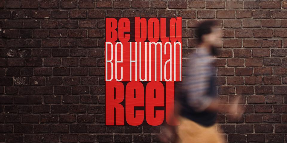

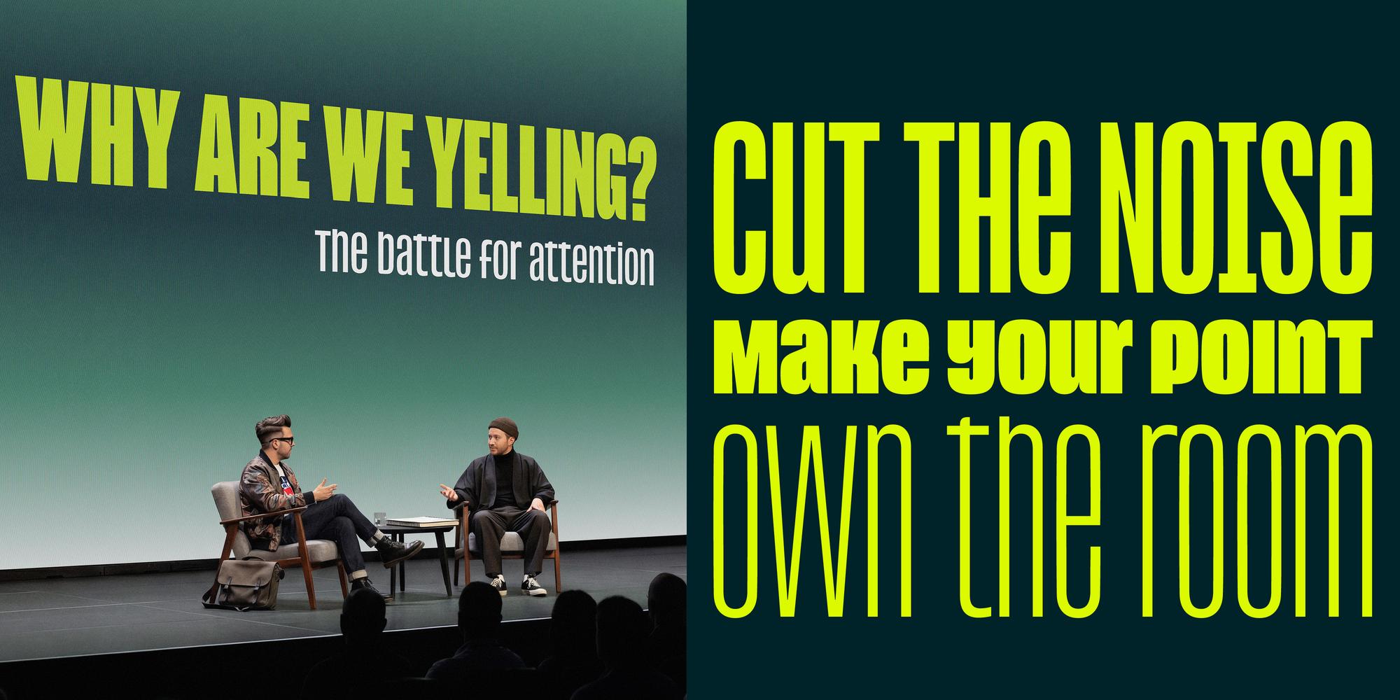
Reel: Bold Headlines Without the Shouting
Bold condensed headlines are everywhere: film titles, posters, book covers, sports graphics, tabloid front pages. Designers return to them time and again because, when set in ALL CAPS, they do two things exceptionally well: command attention and form neat rectangular blocks of type.
There is a trade-off, though. These dense blocks of ALL CAPS typography come with a default emotional tone: urgency, authority, command. But what if you want to catch the viewer’s attention without shouting at them?
Type designer Jamie Clarke wondered if headline typography could become more expressive and conversational without losing the strong rectangular impact that makes condensed ALL CAPS so effective in the first place.
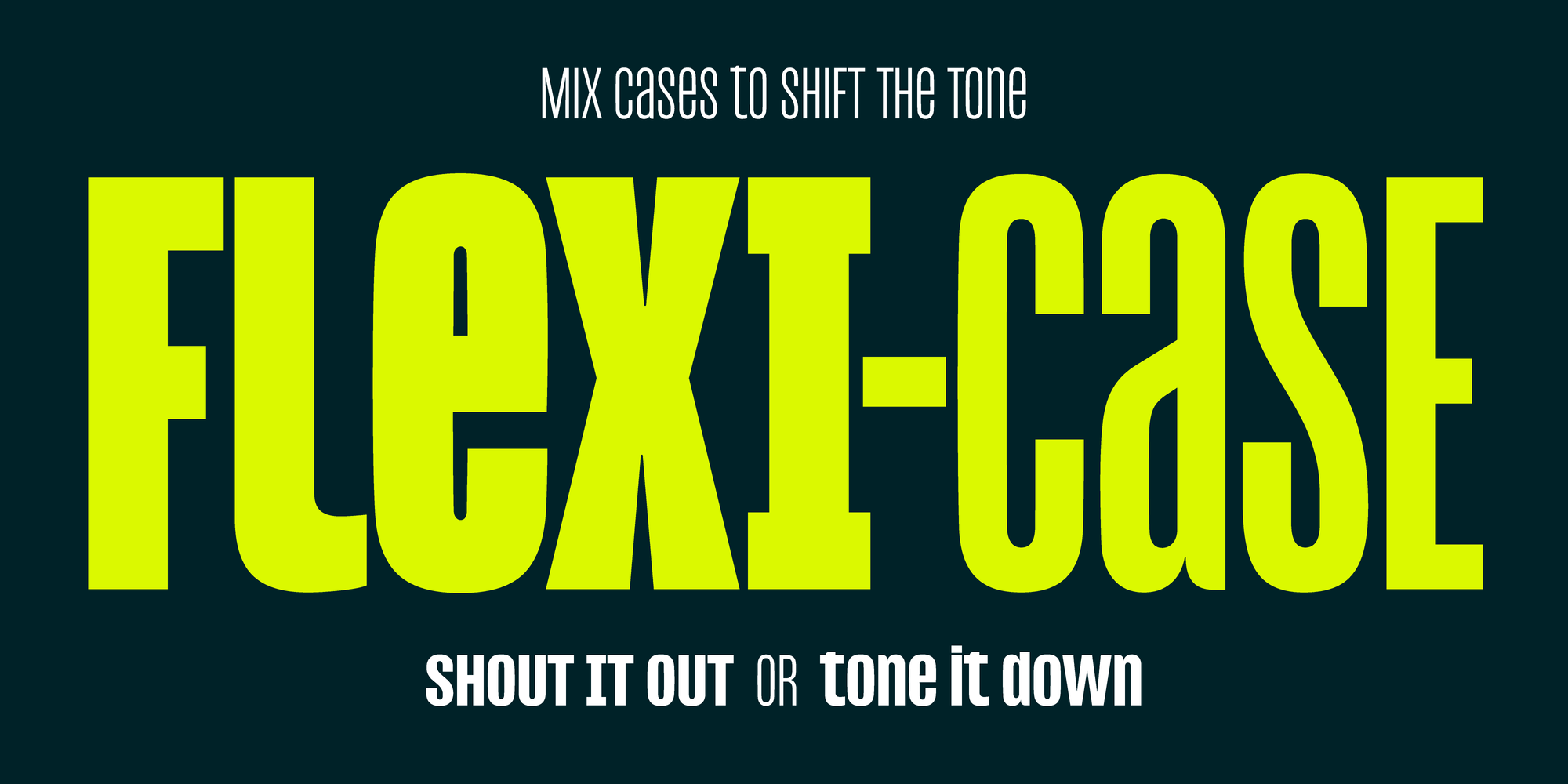
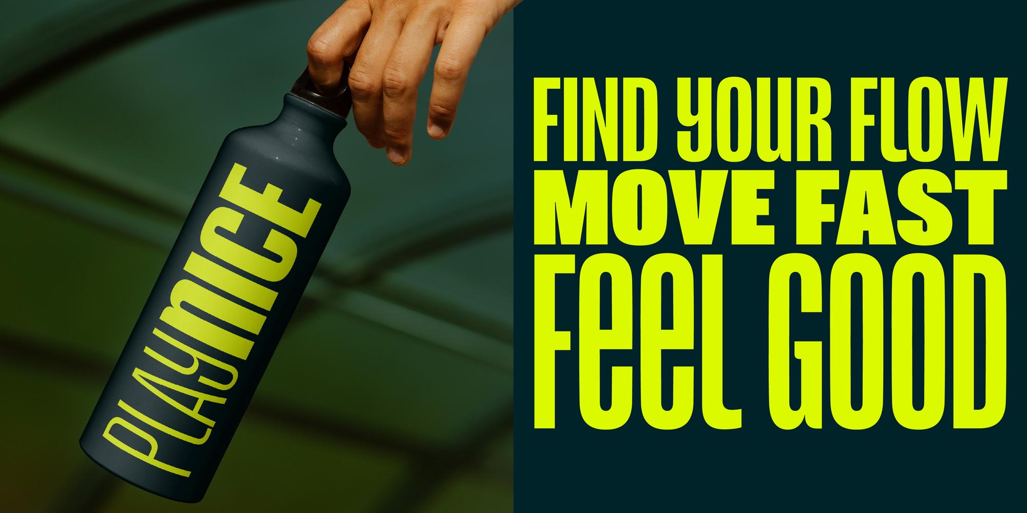
The result is Reel: a condensed headline typeface built around what Clarke calls “Flexi-case”, a system that gives lowercase letters the same height and visual presence as capitals, allowing designers to shift tone without breaking the rectangle.
The Rectangle
We experience modern media in rectangles: TVs, cinema screens, phones, tablets, posters, and book covers. Everything is framed within rectangles — just as historical manuscripts were before them. It is no surprise that headline typography naturally evolved to mirror those same shapes.
Condensed ALL CAPS typography became the natural solution because it fits these spaces so well. It is compact, efficient, and instantly impactful. The result is the familiar dense block of type seen everywhere from film titles to internet memes.
Clarke understands exactly why designers rely on it. “It makes the designer’s job really easy. It looks neat, structured, and familiar. You instantly get this strong shape that people are already used to seeing.”
Adding in Lowercase
But the challenge comes when you want to use lowercase letters because they invariably disrupt this neat, rectangular structure. Ascenders and descenders create uneven gaps that visually break the clean edges, especially in condensed typography where every millimetre matters.
And yet lowercase carries something uppercase often lacks: personality, warmth, and tonal nuance. This contradiction became the foundation of Reel.
Part of the project’s origins can be traced back to the 2018 titles Matt Willey designed for the BBC television series “Killing Eve.” Clarke was struck by the way a single lowercase “g” subtly disrupted the rigid rectangular structure of the wordmark while adding personality and tension. “That stayed with me.” he says. “It showed how even a tiny disruption could completely change the tone.”
For Clarke, the difference between uppercase and lowercase is emotional as much as visual. “Uppercase is a bit like a poker face. It projects authority and urgency, but keeps you at a distance. Lowercase carries more personality and humanity because it developed from handwriting. It’s a much more natural and human way of communicating.”
Historically, condensed gothic typefaces have almost always prioritised uppercase letters. Lowercase existed in some faces, but rarely with equal visual importance.
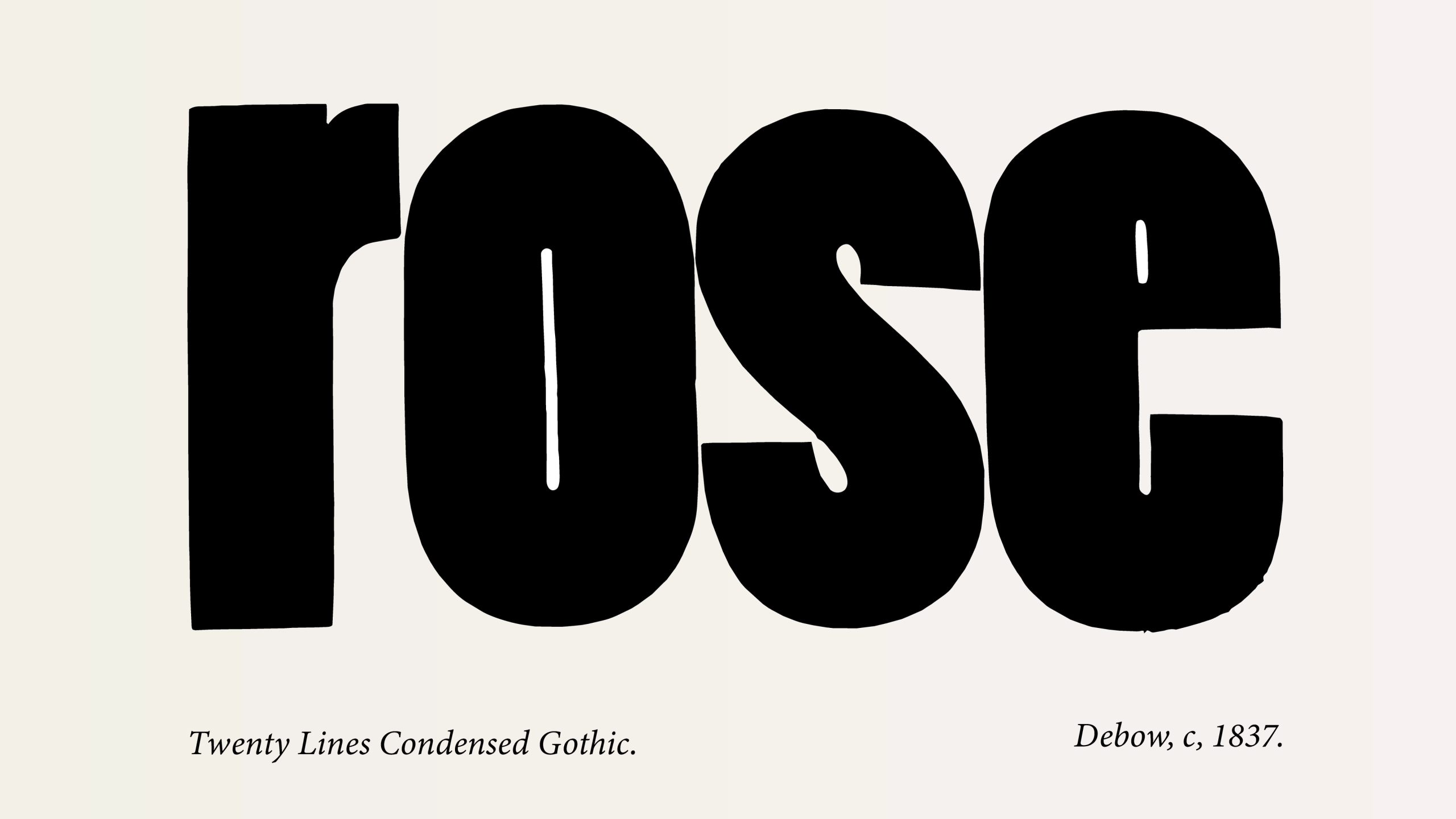
While researching the origins of condensed nineteenth-century wood type, Clarke became fascinated by a design by J. M. Debow from 1837. Hidden among the large shouting capitals was a surprisingly soft lowercase word: “rose.”
Those four letters helped shape Reel’s direction.
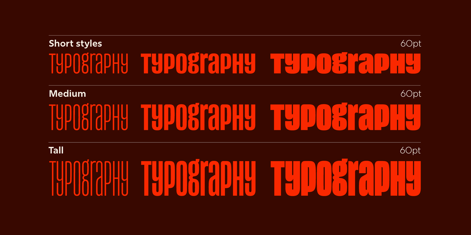
Clarke began sketching ideas for Reel at his independent type foundry, Jamie Clarke Type. He specifically moved away from the colder, geometric precision associated with typefaces like DIN and instead looked toward the warmth and materiality of early wood type.
In Reel, straight strokes subtly bulge outward and curves feel slightly fuller and softer, especially in the lowercase characters. The result is a condensed typeface that feels bold and graphic, but less mechanical and severe.
Flexi-case, Not Uni-case
Reel sits apart from the more experimental tradition of uni-case typography: systems that merge uppercase and lowercase into a single alphabet such as The New Alphabet by Wim Crouwel released in 1967. Rather than collapsing the alphabet into a single set of forms, Reel preserves the familiar distinctions between upper and lowercase letters while allowing them to work together harmoniously inside the same visual space.
“I’m not trying to reduce the designer’s options,” Clarke explains. “I want lowercase to have equal presence alongside uppercase while giving designers more flexibility.”
Clarke refers to this approach as “Flexi-case”: a system that allows designers to move fluidly between authority and personality, emphasis and conversation. The goal is not novelty; it is range of style.
Acknowledgements:
Thanks to Borys Kosmynka, who helped refine the design into its consistent final form and Sofia
A quiet thank you
If you've read this far, here's a small thank you: use WELLREAD10 at checkout for 10% off any font on the site. Not widely advertised — just for people who read to the end.
Next Post

Newsletter
Join my newsletter to get the latest on new fonts, updates and behind-the-scenes insights.