Block Universe Custom Font
Categories:
An educational font that seamlessly blends playfulness with readability across all media.
Overview
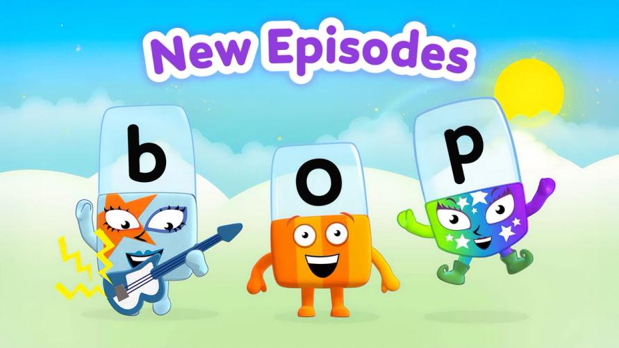
I was commissioned by the BAFTA award-winning Alphablocks team to create the custom font family BlocksUniverse, designed for use on their well-known characters, animated TV shows and other media.
The typeface needed to balance a playful aesthetic with exceptional readability, supporting Alphablocks’ educational mission.

Method
After analysing the previous Alphablocks typeface, I identified key changes to improve legibility, clarity and balance. I designed a range of weights from thin to heavy, along with a regular italic.
The character set covered all Latin European languages, with distinct shapes drawn for ‘b’ and ‘d’, plus alternative numerals provided for regional preferences.

Outcome
The resulting type family is visually engaging, highly readable and versatile. Used across TV and media, BlocksUniverse enhances Alphablocks’ brand while meeting the rigorous demands of content designed to support early literacy.
The client praised the project for its precision, clarity and seamless execution.
Jamie created a beautiful font for us, that fits our needs perfectly. He is a pleasure to work with.


