Fonts for Cookbooks
Categories:

Matching fonts to food is often nuanced and subjective, but it’s also creative and fun. Sarah Hyndman, the founder of Type Tasting, has published academic studies about our responses to typography and food, so there’s certainly some science to it too.
Rather than feature a photo of a single dish on the cover of a cookbook, Art Directors often choose to commission an illustration that will more broadly encompass the author’s chosen cuisine. Pairing this skilfully with type can create a beautiful book that every cook will want in their kitchen.
Deciding which font to use – and whether it should complement, contrast with, or accentuate the imagery – is a key decision in designing a brilliant cover. Here are 13 (a baker’s dozen) cookbooks that beautifully match type with illustration – and why I think each works so well.
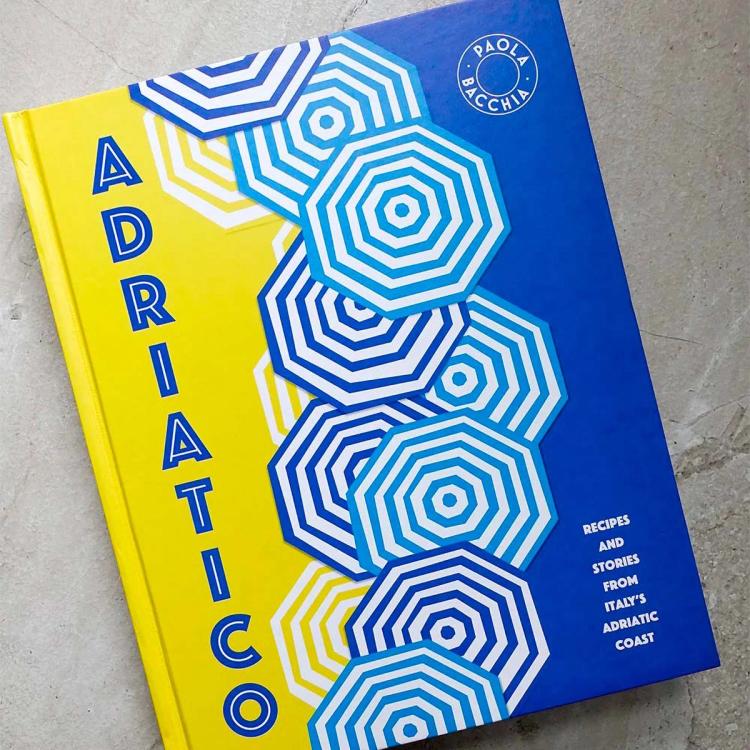
Adriatico, Paola Bacchia
Phosphate Pro Inline, Red Rooster Collection
Match kind: Complementary
Not only does Phosphate’s inline style flawlessly complement the striped beach umbrellas, its sturdy characters allow it to effortlessly balance in this vertical setting. I’ve learnt from creating my own inline style font, Rig Solid, that using vivid, flat colours helps make each letter pop.
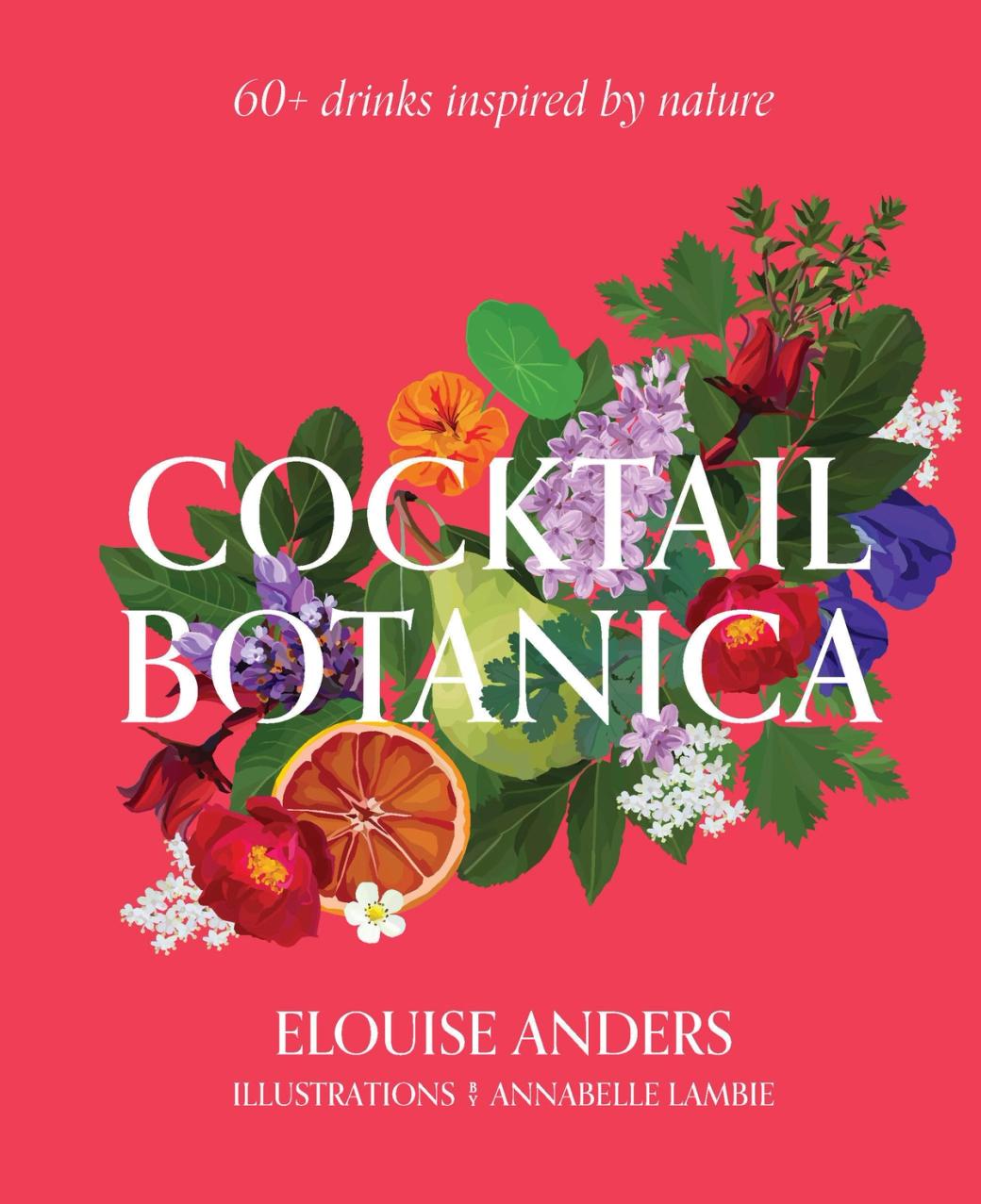
Cocktail Botanica, Elouise Anders
Orpheus, Canada Type
Match kind: Contrasting
This gorgeous cover was designed by Michelle Mackintosh, who identified the typeface for me, and has been exquisitely illustrated by Annabelle Lambie.
Setting type over such a complex illustration can be a tricky balance; it can blot out the image or hinder the readability of the text. The contrast and balance here though are excellent. The chosen typeface has strong, upright letterforms with distinct serifs that help it to stand out. It’s also been set in the perfect weight and colour for maximum contrast.
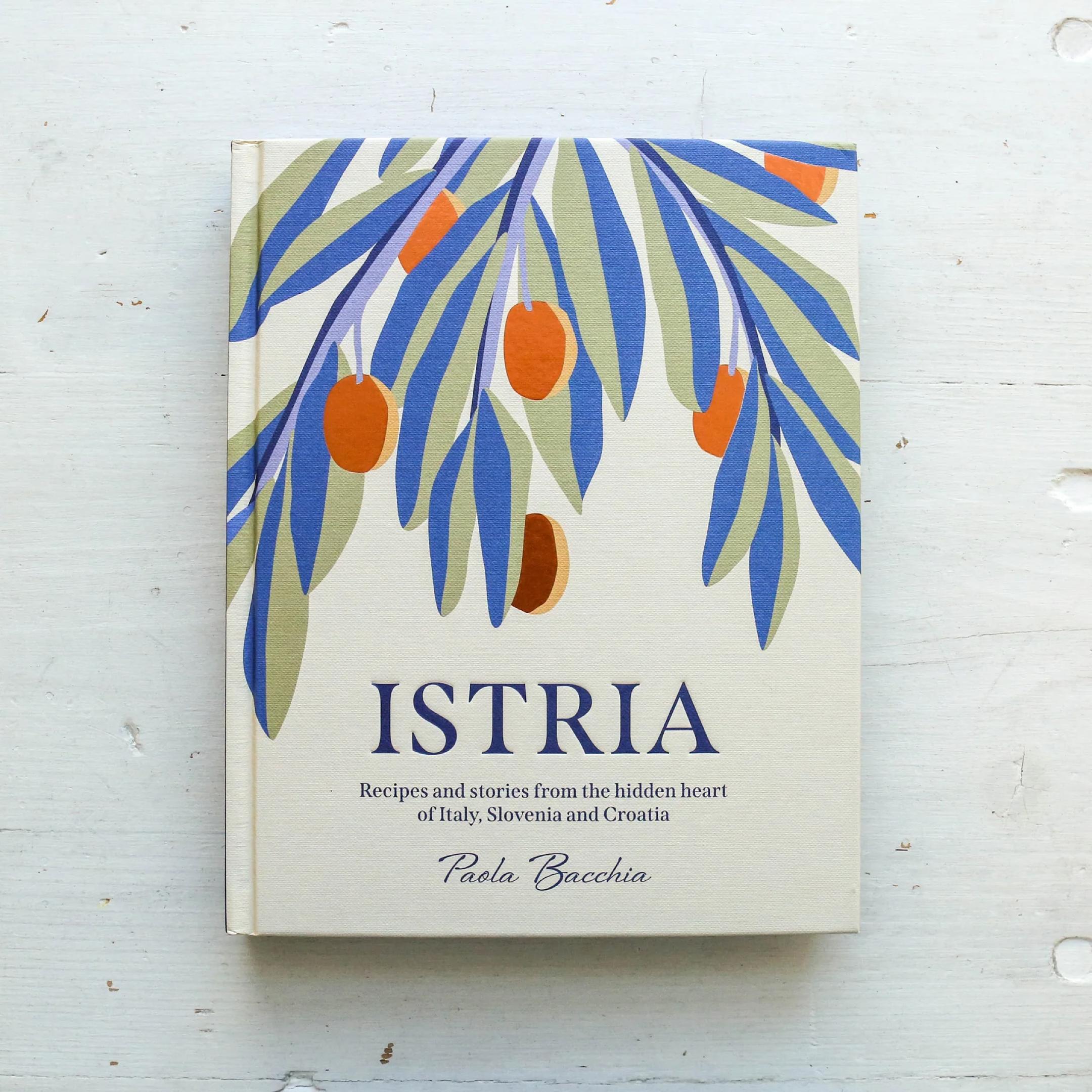
Istria, Paola Bacchia
Span, Jamie Clarke Type
Match kind: Accentuating
It’s not often you find a cookbook where the designer has chosen a single type family for titles and body text, but Istria is a remarkable exception. My font Span is used throughout, from the main title to the descriptions and ingredient lists. Its classically proportioned letterforms and sweeping serifs emphasise the timelessness of the olive branch illustration. See more photos at Fonts In Use.
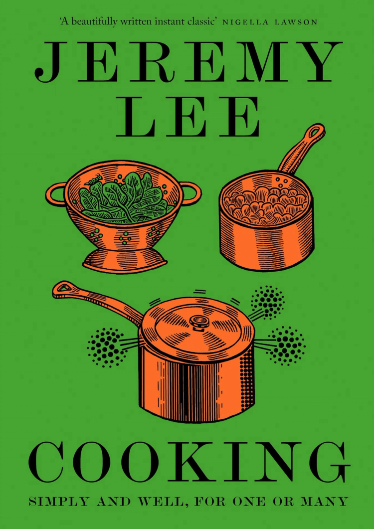
Cooking, Jeremy Lee
Scotch Modern, Shinntype
Match kind: Complementary
This three-colour design has a wonderfully quirky quality. The pen-drawn illustration uses thick outlines for the pots and pans, with meticulous inner shading. This style is charmingly mirrored by the thick and thin strokes of the typeface. At smaller sizes Scotch Modern’s characters even seem to mimic the wobbly character of the penned lines.
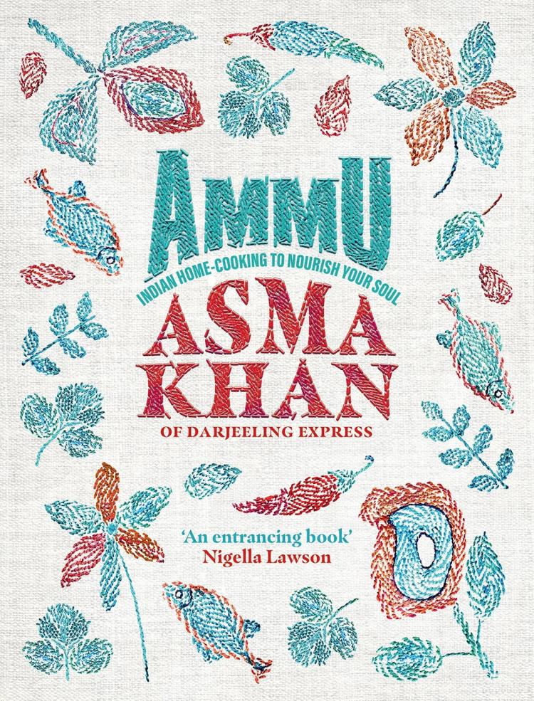
Ammu, Asma Khan
Masqualero, Monotype
Match kind: Complementary
This gorgeous stitched cover features two fonts but the real hero is Masqualero, used for the author’s name and details below. The heavy style, dominated by its huge serifs, really allows the stitchwork to shine and echoes the shapes of the plants and fish sewn around it.
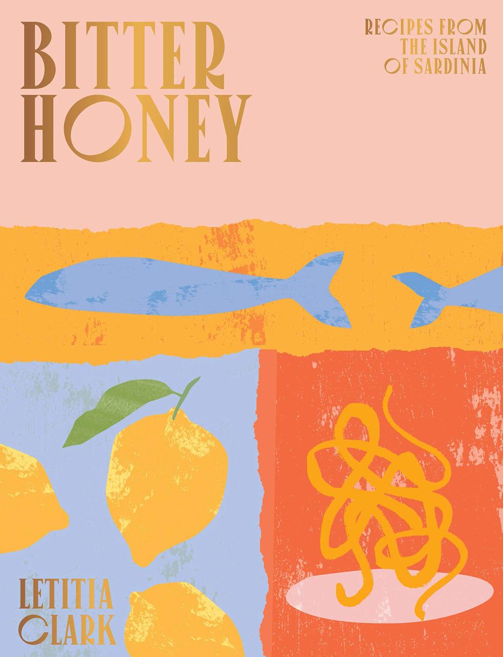
Bitter Honey, Letitia Clark
Canopee, VJ Type
Match kind: Contrasting
Reflecting the book’s name, this cover is an adventurous juxtaposition of type and illustration. The typeface itself displays huge contrast. Its wide C, G and O seem to contradict the rest of the narrow letters, producing an irregular rhythm. It also combines these broad, round shapes with small, sharp serifs.
On top of all this, the unconventional font is then set in gold foil and audaciously partnered with a textured, handmade illustration. It might not be everyone’s cup of tea, but I think it’s commendable.
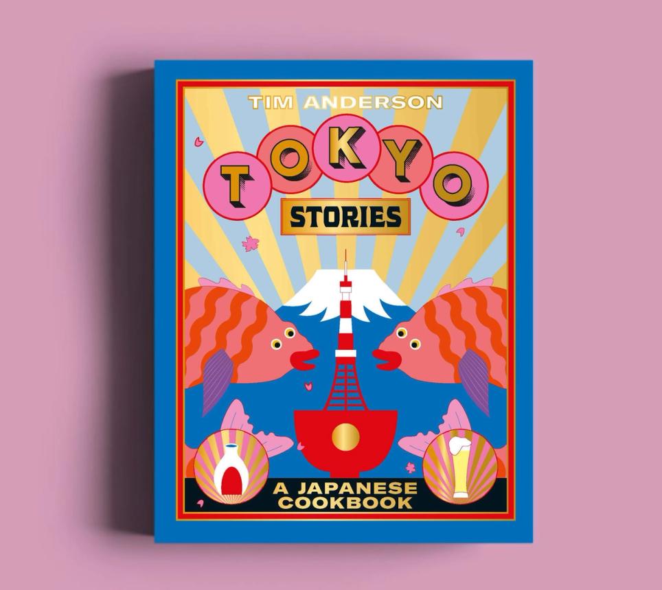
Tokyo Stories, Tim Anderson
Rig Shaded, Jamie Clarke Type / Moloch by The Pyte Foundry
Match kind: Accentuating
I struggled to categorise this match type. While both fonts stand out from the illustration, they also bring the whole cover design to life. My font Rig Shaded evokes urban streets with bulb-lit signage (or plates of sushi?) while Moloch conjures up images of Japanese pergolas and the Far East.
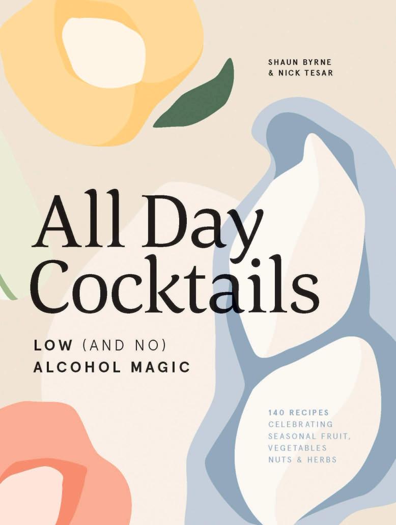
All Day Cocktails, Shaun Byrne & Nick Tesar
Corda, Hoftype
Match kind: Accentuating
These cocktails are low (and no) alcohol, and the cover sensitively captures this. The soft shapes, muted colour palette, and relaxed typeface with its brush-style terminals have me sinking into a comfortable armchair with ice clinking in my glass.
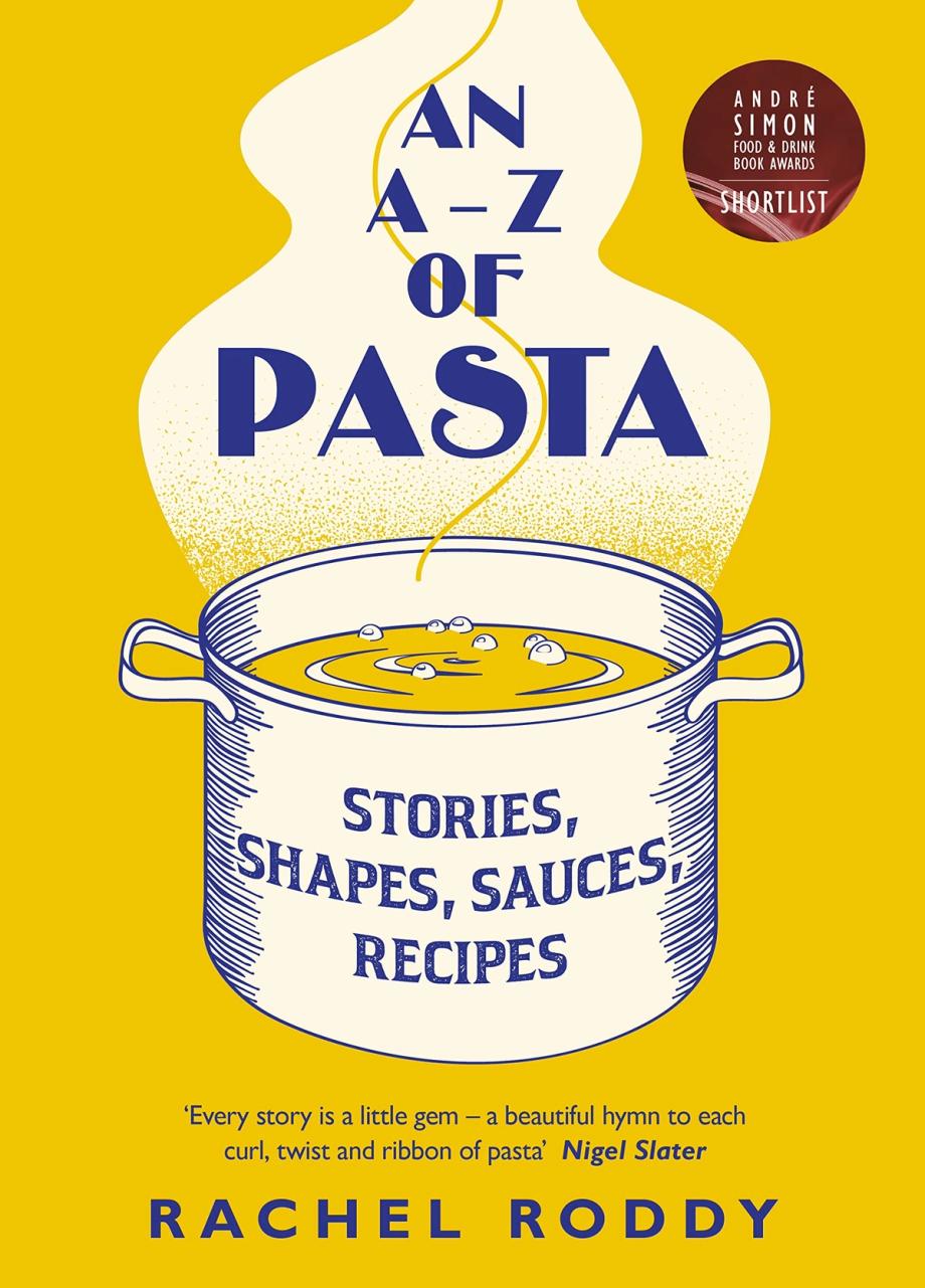
An A–Z of Pasta, Rachel Roddy
Binner Poster / Ghost Pro, Monotype
Match kind: Accentuating / Complementary
Drifting up in steam, Binner Poster conjures up images of 1920s travel posters of Italy and handsomely reinforces the overall composition. Ghost Pro meanwhile complements the hand-drawn elements on the big cooking pot with its rough, printed texture and early 20th-century feel.
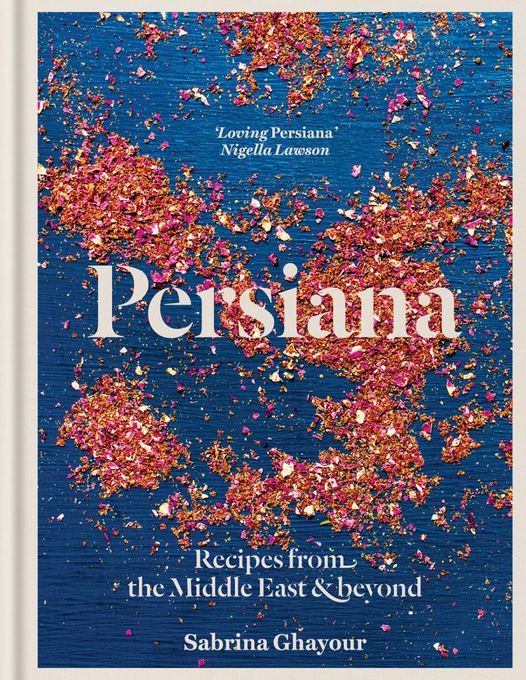
Persiana, Sabrina Ghayour
Dala Floda, Commercial Type
Match kind: Contrasting
OK, this is a photograph not an illustration, but the image of the advieh spice mix is fairly abstract and I wanted to show this example as I love the typeface. Persiana makes excellent use of Dala Floda both on the cover and inside the book. The elongated swashes with ball terminals reflect the Middle Eastern theme, while the stencil structure gives it a distinct, modern finish.
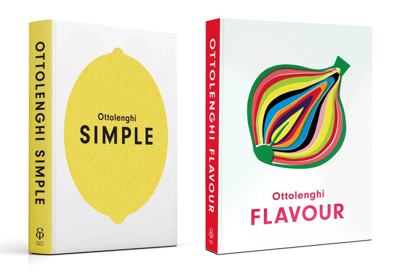
Simple / Flavour, Yotam Ottolenghi
Neuzeit Grotesk, URW Type Foundry
Match kind: Accentuating
I couldn't finish without including some of Ottolenghi’s books. I have eaten so many fabulous home-cooked meals based on his recipes. These two books (and some of his others) are linked through a carefully considered design system: a bold icon of an image, paired with a single-word title in uppercase.
The font is clean and utilitarian (Neuzeit Grotesk was used in Germany as its official signage and was known as DIN) but it does have some embedded 20th-century warmth: a narrow V, a hooked S shape and uniform arm length of the E and F. The combination of type, colour and image make a well-founded brand.
I hope you find this list useful. If you’re matching type with illustration, please take a look at my fonts, which have all been designed in conjunction with my illustration projects.
A small note: many of the cookbooks here are UK and European editions which may differ from their US counterparts.
Next Post

Newsletter
Join my newsletter to get the latest on new fonts, updates and behind-the-scenes insights.