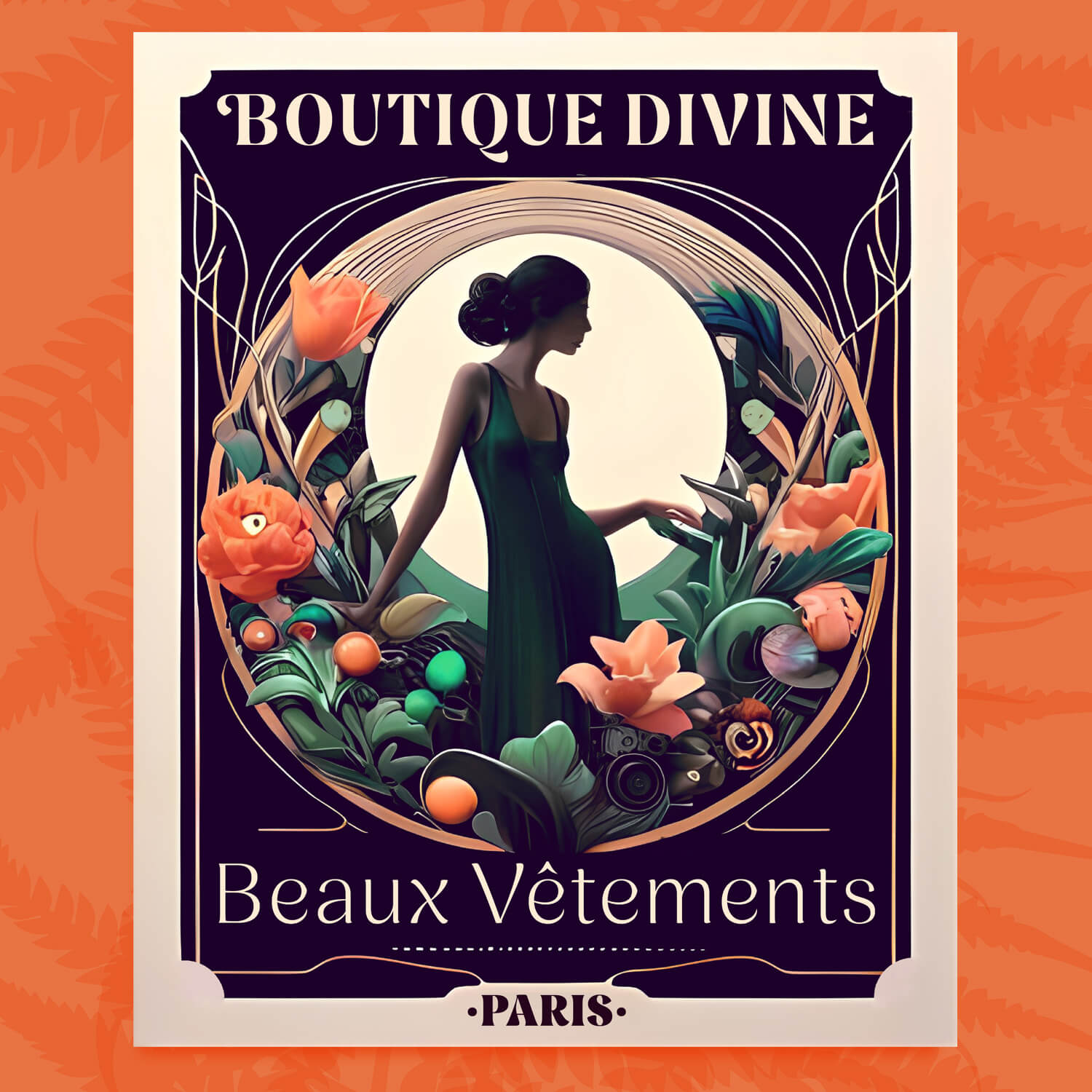
Nave is the perfect choice for designers looking to intertwine tradition with creativity. Its characters are framed by a formal, rigid outer shape, revealing an unexpected twist: a flowing, sensuous inner form. This unique combination ensures that Nave stands out in any design, adding a touch of elegance and flair to every project.
Nave is designed for forward-thinking designers and businesses who value classic design but also want to infuse their work with personality and warmth.
These contrasting qualities breathe life into words, inviting readers on a journey from the familiar to the extraordinary.
Around my studio, numerous centuries-old churches grace the surrounding villages. Most have traditional stone exteriors, square towers, and utilitarian shapes. However, their interiors often showcase creativity with decorative columns, fluid arches, and intricate ceilings. Nave follows this concept: it has a conventional exterior shape, but its interior features are dynamic and fluid.
Nave is comprised of seven weights, each with accompanying italics. Each style contains over 580 glyphs, including:
Language support: 227 Languages including Western, Central and South Eastern European.
Albanian, Austrian, Basque, Breton, Bosnian, Catalan, Croatian, Czech, Danish, Dutch, English, Estonian, Faroese, Finnish, Filipino, French, Galician, German, Hungarian, Icelandic, Indonesian, Irish, Italian, Kurdish, Latin, Latvian, Lithuanian, Malay, Maltese, Moldavian, Norwegian, Occitan, Polish, Portuguese, Romanian, Samoan, Serbian (Latin), Slovak, Slovenian, Spanish, Swahili, Swedish, Tagalog, Turkish, Walloon, Welsh, Wolof, Zulu, and more…
This typeface took an incredible eleven years to complete. It was the first typeface I started at Reading University. Initially, it was too subtle and sophisticated for a beginner project, so I set it aside to focus on other designs. Over the years, as my skills developed, I revisited and refined it. Now, it's the typeface it was always meant to be. The long, thoughtful process has undoubtedly changed both the typeface and me for the better.
Gerry Leonidas and Gerard Unger, who helped me kickstart Nave's design and guided it through its early stages. Dave Foster and Toshi Omigari, for patiently steering my naive early drawings.
Bradley Martin and Elliot Jay Stocks, for checking drafts and their unwavering support and enthusiasm. Borys Kosmynka, for helping me refine Nave's design into its crisp, clear, and consistent final form.
Nave has been warmly received by the type and design community.
Here are some articles and comments highlighting the typeface.
We And The Color: ‘It’s become my go-to for projects where I want to convey a mix of sophistication and playfulness with a touch of vintage nostalgia.’
Print Magazine: ‘Nave is classic with plenty of unique character, perfect for designs seeking to breathe a little life into the familiar’.
Dense Discovery: ‘The characters of the beautiful Nave typeface are framed by a formal, rigid outer shape, revealing an unexpected twist: a flowing, sensuous inner form’.
I Love Typography: ‘Jamie Clarke’s beautiful new typeface! A long time in the making, but well worth the wait!’
My fonts are available at the following reputable resellers:
More Lettering & Fonts
The Woman in BlackBook Cover
The Scandal of the CenturyBook Cover
The Paris MysteriesBook Cover
Tea PatternsPackaging
Bière du SoirBranding
Kelmscott BakehouseBranding
GlensideBranding
Casino Royale Limited EditionBook Cover
Orvis Brand LetteringBranding
Chocolate AmpersandsPackaging
Rig SansFont
Rig ShadedFont
Brim NarrowFont
SideNoteFont
SpanFont
Rig SolidFont
A History of ChristianityBook Cover
SaintsBook Cover
The Folio Diary 2022Book Cover
Ghost LettersBook Cover
Contact me to buy my fonts directly or use them free with an Adobe subscription, or licence them from a reputable foundry partner.
For occasional project and blog updates, please subscribe.
© 2015-2024 Jamie Clarke Type LTD and contributors | The Hive, Bristol, BS39 4JJ, United Kingdom