Hello! I'm SideNote | Jamie Clarke Type

SideNote Typeface

Hello! I’m SideNote. I specialise in annotations, headings and friendly dialogue. I’m perfect for descriptions and explanatory text. Use me to deliver tricky information in a helpful, reassuring manner.

I’m friendly and relaxed, but professional enough to make you look awesome. I add personality to otherwise dry information, making it fun and easier to understand.

Whether you’re pulling slides together or explaining your work, think of me as your friendly assistant. I come with all sorts of useful features, like emoji, arrows and underlines that add sparkle to your communications.

Below, I’ll show you what I can do and how to get the most out of me, plus there's also a very flattering article about me on the ILT Blog.

How to get the most out of me

I’m not just a pretty [type] face, I come with all sorts of useful features. Here, I’ll share some tips and tricks on how to use me and hopefully I’ll become your ‘go to’ font for notes, descriptions and much more.

I come in five weights: Thin, Light, Regular, Bold and Heavy, each with an italic counterpart, and each with almost 600 characters. I speak over 200 Latin languages, so you can use me all over the world.

SideNote Font Styles | Jamie Clarke Type
SideNote Font Character Set | Jamie Clarke Type
SideNote Font Arrows, Underlines, Braces | Jamie Clarke Type

General Tips

Long Braces
I include some long braces to assist you in annotating large blocks of text. To make these braces as large as possible within the constraints of font technology, I’ve rotated them 90°. These can be rotated into your required position using a text box (even Microsoft Word can do this. Click on: Insert > Text box from the top menu).

Arrows
My arrows have been designed to provide the maximum number of shape options, so that you can point things out with ease. Each arrow can be flipped, rotated and scaled as desired.


Alternative e’s and a’s
To increase my natural handwritten feel, I come with three subtly different a and e vowels that automatically swap as you type.
This is controlled by Contextual Alternatives (see below), just turn this on and the magic happens automatically.

Spacing
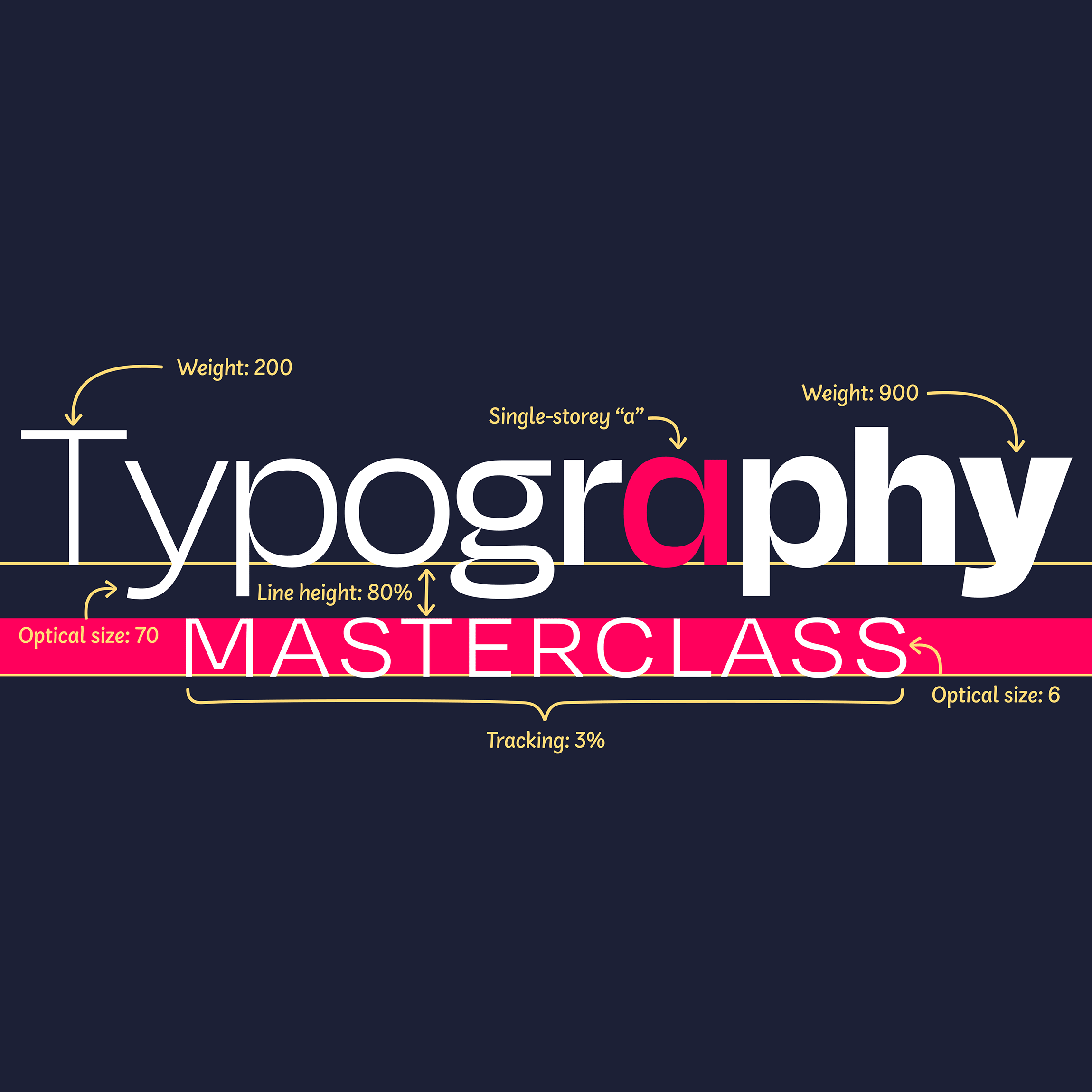
If you would like to subtly adjust my tone of voice, try spacing my letters out a little using tracking. Wider = Friendlier. 
Just 10 units can make all the difference. Try it and see for yourself.

SideNote Font Serious Type Skills | Jamie Clarke Type
SideNote Font Alternative Characters 1 | Jamie Clarke Type
SideNote Font Alternative Characters 2 | Jamie Clarke Type

Alternative Characters

I’ve got so many characters that not all of them can be found on your keyboard. Not to worry as many can be typed in using a very common OpenType technology called Contextual Alternatives. When activated, this feature will swap characters and groups of characters that you type for alternative special characters. For example: you type :-) and your software swaps those characters for a smiley face emoji.

Here is a PDF Cheatsheet showing the shortcuts to my characters.

Here are some handy videos showing my features in Figma:

The Contextual Alternatives feature is often automatically switched on in many design programs but needs to be turned on manually in other applications, such as Microsoft Word. You can find out how to do this by searching: [name of your software program] turn on contextual alternates”. In Microsoft Word, for example:

  • Selected the text you would like to change
  • In the top menu, click Format > Font…
  • Click the Advanced tab.
  • Tick the box next to ‘Use Contextual Alternatives’

If the feature is not available in your software of choice then see my section “How to find my special characters” below.

SideNote Font
SideNote Font OpenType Shortcuts | Jamie Clarke Type
SideNote Font OpenType Shortcuts 2 | Jamie Clarke Type

How to find my special characters

Access to my special characters will depend on what software you are using. Some programs enable easy access with a couple of clicks, whereas others may take a few extra steps.

Option 1
Many programs such as Adobe Illustrator®, InDesign®, Photoshop®, QuarkXPress and CorelDRAW, all provide Glyph Palettes where you can see all of my glyphs. Within the Glyph Palette, you can select the glyph you’d like to use, copy it, and paste it into your text.

Option 2
An alternative way to access my special characters is via your computer’s system software. 

On a Mac: 

  • Open the Font Book application
  • Select SideNote from the list of fonts
  • Select the glyph you’d like to use from the list and hit Cmd+C to copy it
  • Head back to the document you are editing.
  • Click into a text editing box and hit Cmd+V to paste

On a PC: 

  • Open the Character Map application
  • Select SideNote from the list of fonts
  • Select the glyph you’d like to use and hit Cmd+C to copy it
  • Head back to the document you are editing.
  • Click into a text editing box and hit Cmd+V to paste

Laura Worthington also provides some excellent tutorials and helpful videos here.

Special thanks to Borys Kosmynka and all who helped me to become the refined and adaptable typeface that you see before you, today ;)

Get my Fonts

Use my fonts free with an Adobe subscription or purchase from a reputable foundry partner.

Contact

I'd love to hear about your next project, and how I can help.

Newsletter

For occasional project and blog updates, please subscribe.

© 2015-2024 Jamie Clarke Type LTD and contributors | The Hive, Bristol, BS39 4JJ, United Kingdom