Type Worship blog in review
Categories:
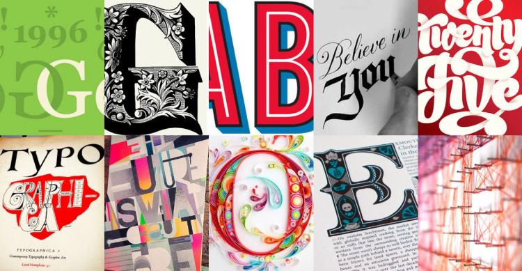

After 12 years and 228,317 followers, Type Worship on Tumblr is coming to an end. But the journey continues – I’ll be sharing my thoughts and insights here instead. But before I move on, I wanted to take a moment to look back at how Type Worship began, how it grew, and the unexpected ways it shaped my career.
I started the Type Worship blog back in 2011 while still working at my digital agency. At the time I had no idea it would grow so fast, or that it would propel me into a completely new career.
The blog began as a personal research aid, a place to collect examples of the type and lettering that inspired me, along with my own notes and commentary. Tumblr was on the rise and its short-form blog platform felt like the perfect place to host it all.
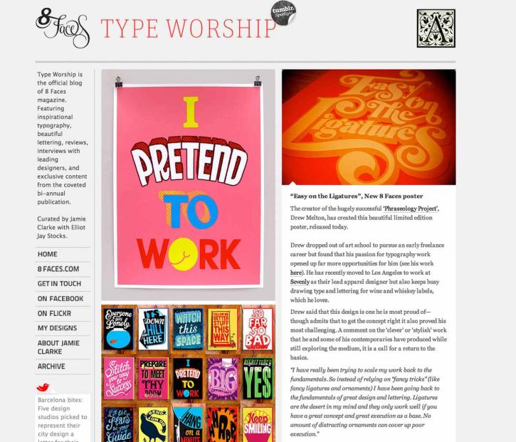
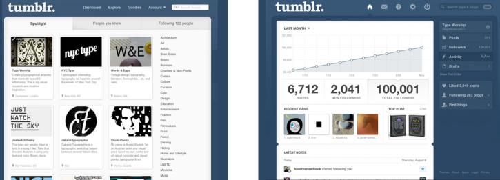
Type Worship grew rapidly. It gained support from Tumblr, which added it to a ‘Spotlight’ list of blogs to follow. I kept blogging in my spare time and grew familiar with the key figures working in the type and lettering industry and the underlying design trends. Eventually, I began to approach type designers and lettering artists, hoping to learn more about their work.
I even wrote blog posts, about the blogging, for other blogs, like Creative Bloq.
At this time, Seb Lester was becoming well-known for his gorgeous lettering work (this was before he became a calligraphy superstar). I contacted him out of the blue in 2012 to ask for an interview and he agreed. Even though my blog was growing fast, I was worried this opportunity might be too big for the blog. I needed back-up!
8 Faces Magazine
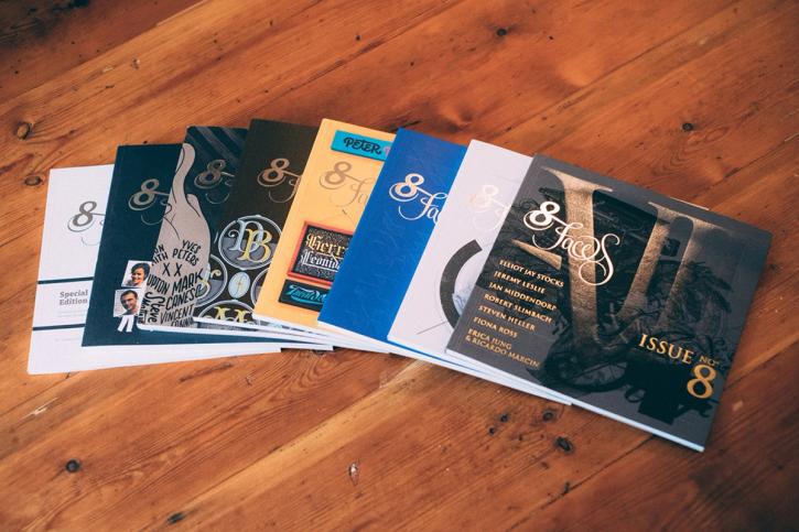
I’d met Elliot Jay Stocks at an event during my agency days. He’d set up the popular typography magazine called 8 Faces, which was on a whole other level compared to my humble blog. I called him to ask if he’d be interested in publishing my interview with Seb in 8 Faces.
Not only did Elliot agree, he also wondered if my blog and 8 Faces might join forces. This set off a chain of events that led to Type Worship becoming the official blog of the 8 Faces magazine. I also wrote articles and interviewed type designers for the magazine and subsequent book.
Our partnership culminated in me flying to New York to interview Michael Beirut of Pentagram, while Erik Spiekermann wrote, ‘Need to go back to 8Faces more: blog.8faces.com great blog about type & typography.’
After the release of the final issue of 8 Faces and the publication of an omnibus book, Type Worship continued to grow. For several years, it was sponsored by the global type foundry Monotype. At its height, Type Worship became one of the web's largest type and lettering blogs. By late 2018, it enjoyed a following of almost 225,000 type enthusiasts.
However, by that point Tumblr had been in decline for a while. New follower numbers grew but interactions were slowing. My blog posts became less frequent and my audience drifted to other platforms.
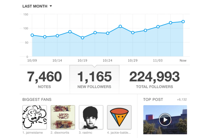
Looking back, I had no idea where Type Worship would take me. With no blogging experience, I jumped in purely out of passion and curiosity. The blog became a gateway – giving me the confidence to connect with established type designers, explore lettering myself, and ultimately pursue type design at Reading University. What started as a personal research tool ended up shaping my career in ways I never could have predicted – and the journey is still unfolding.
New blog
I recently decided to stop posting on Tumblr and focus on blogging from my own platform. For now, Type Worship will remain where it is, though I may migrate some of the most popular posts – there are over 1,000, so I can’t bring everything!
With this new blog, I’ll continue exploring the world of type and lettering in a more medium-length format. Here’s to the next chapter – let’s see where it leads.
Next Post

Newsletter
Join my newsletter to get the latest on new fonts, updates and behind-the-scenes insights.