Chocolate Ampersands
Categories:
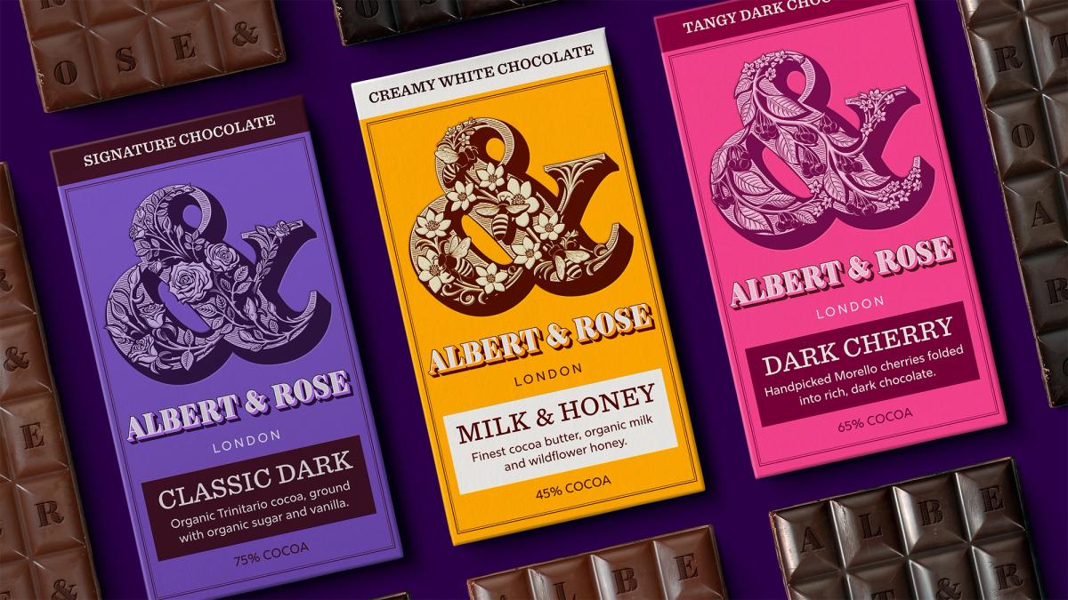
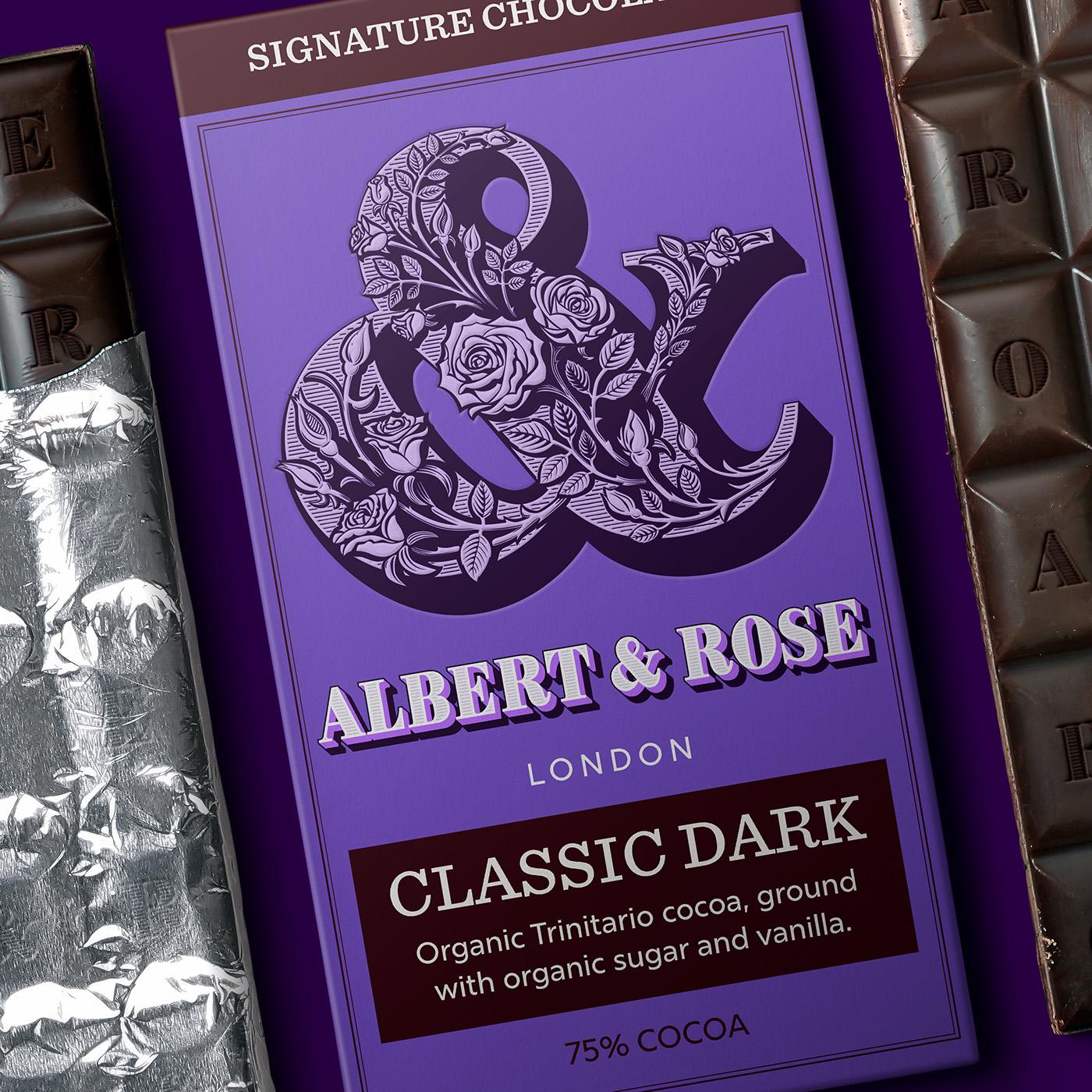
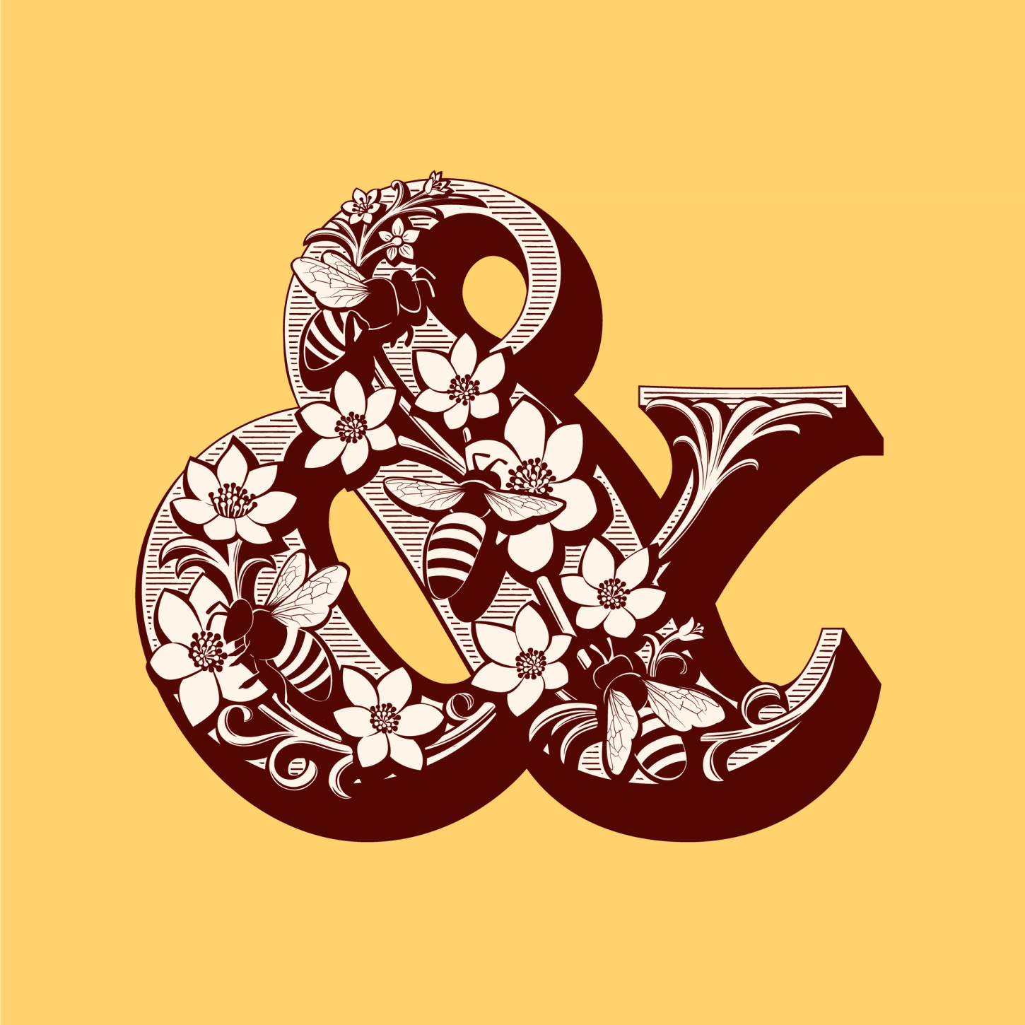
A typographic tribute to chocolate – reimagining historic illustrated letters for contemporary packaging.
Overview
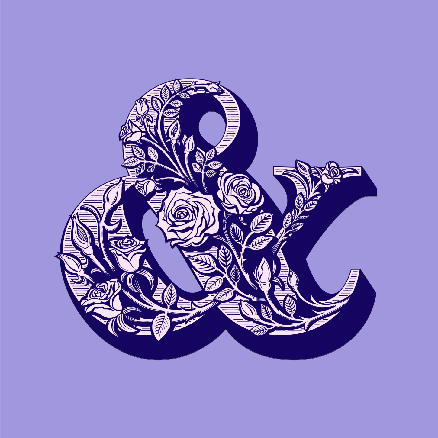
This monogram and packaging concept was inspired by the Pouchée wood type alphabets and early Victorian packaging.
The design blends ornate woodblock-style illustration and digital layered typography, creating a look that feels both modern and deeply rooted in historic craftsmanship.

Method
I closely studied a variety of fat-face alphabets, most notably Pouchée’s work, to understand how letterforms and illustration interacted so seamlessly.
Through extensive experimentation, I explored how the ampersand’s structure could accommodate intricate detailing without compromising clarity.
I redrew it with more modern proportions, refining the way illustration and shadows flowed around the form to enhance depth and legibility.
Outcome
While designing the lettering for the fictional brand name Albert & Rose, I realised the concept had the potential to become a versatile layered typeface. The result was Brim Narrow, a typeface that has since become one of my most popular designs. The project was also featured in Print Magazine’s ‘10 Remarkable Shadow Type & Lettering Designs’.
Beautiful work. I trust him with my trickiest projects