Case Study/
Orvis Brand Illustrations
Categories:
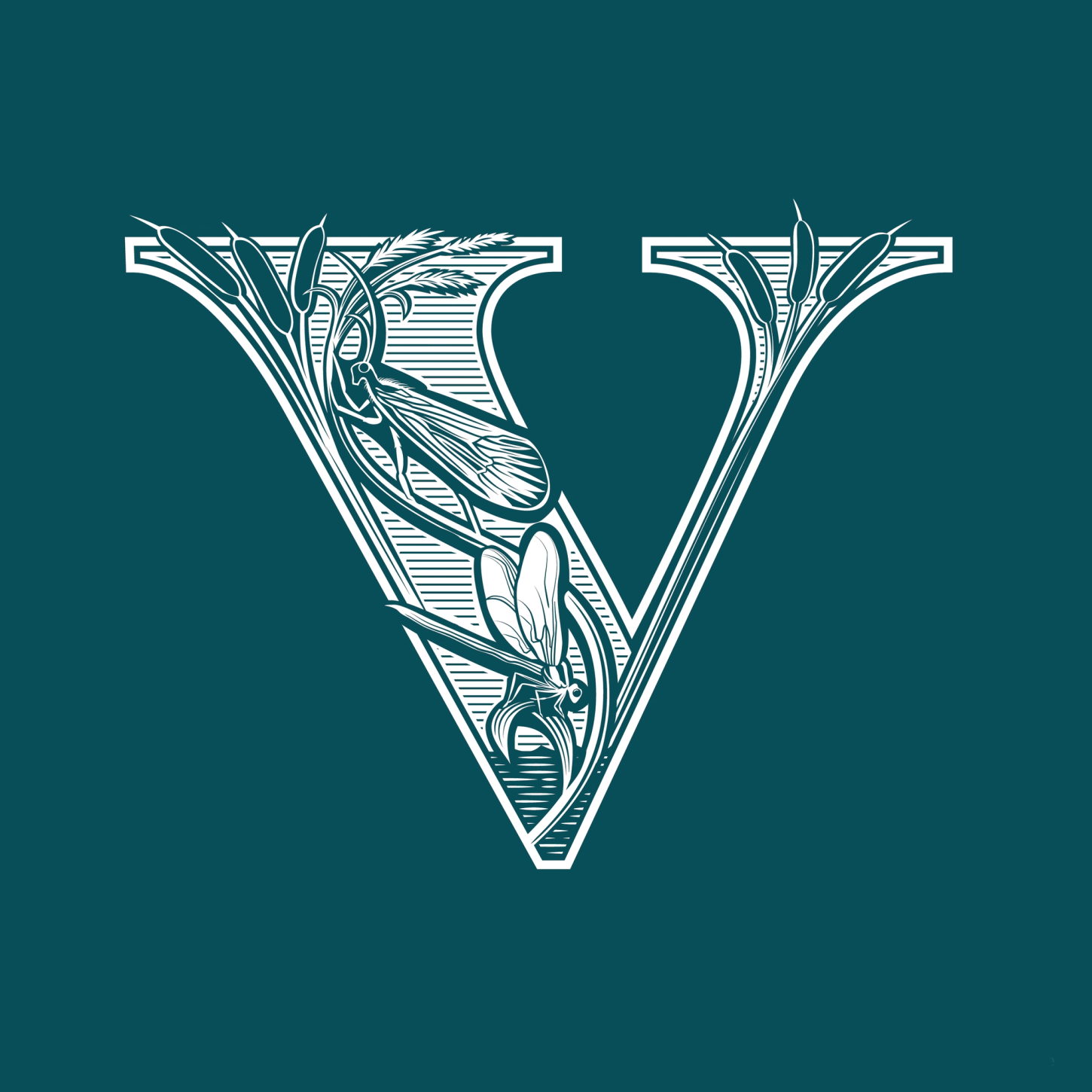
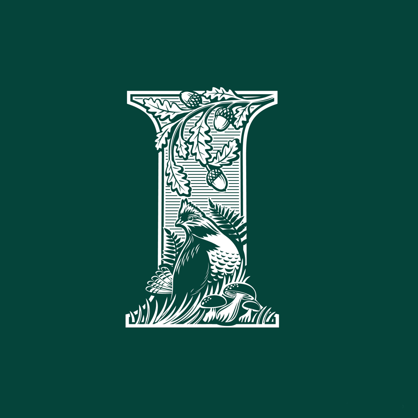
Typography meets nature – illustrated letters inspired by nature for Orvis.
Overview
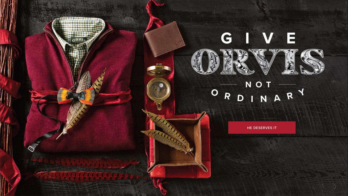
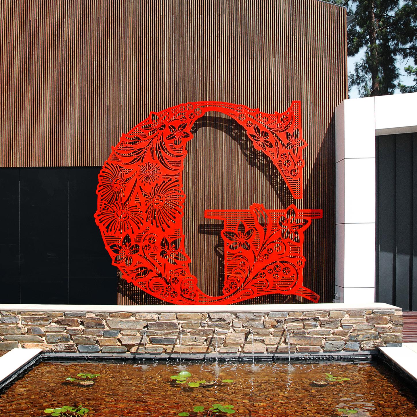
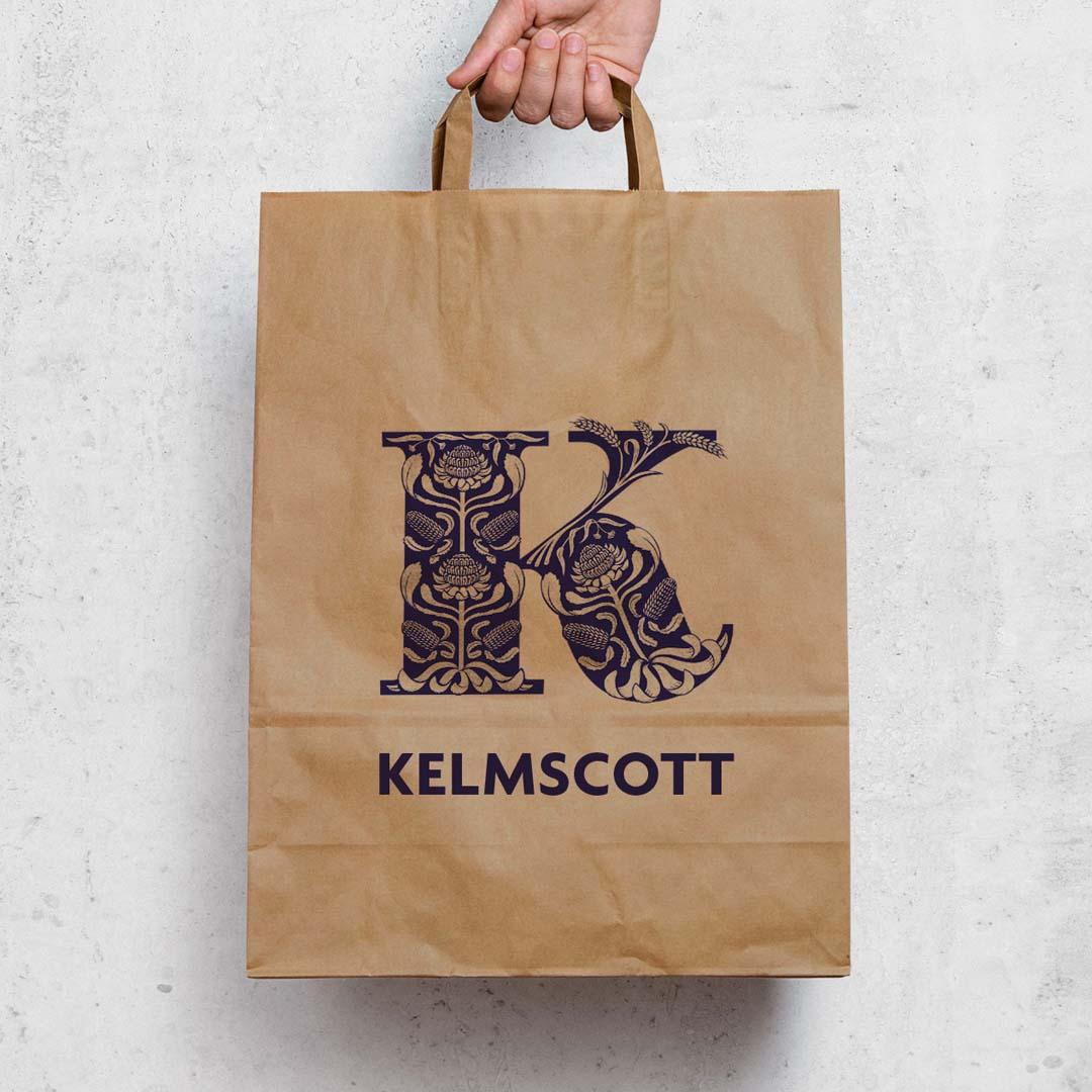
Orvis commissioned me to create a set of illustrated letters for their brand, each depicting flora and fauna from distinct natural habitats. The design reflects Orvis’s passion for adventure and the outdoors.

Method
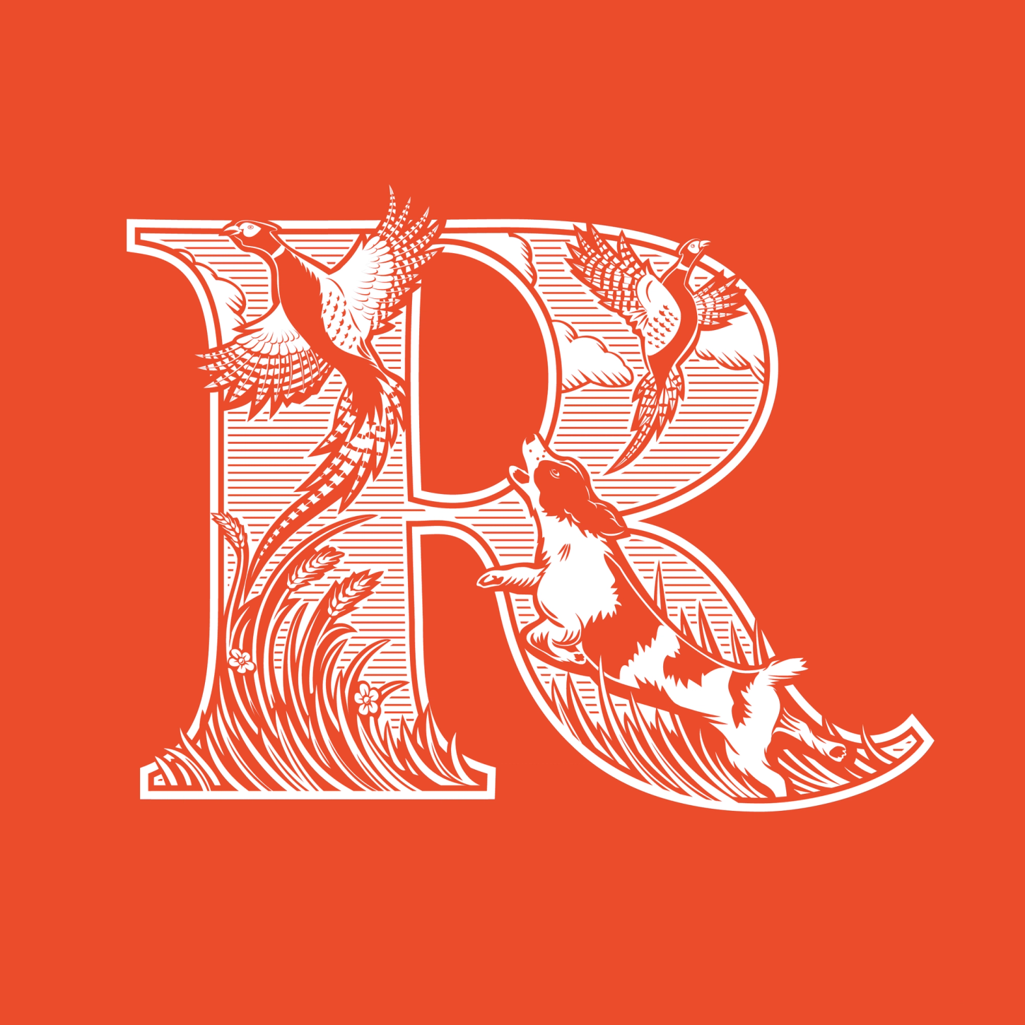
Each letter was intricately drawn in a woodblock-inspired style, capturing the essence of environments such as rivers, uplands, riverbanks, forest floors, and saltwater regions. The artwork balances vintage craftsmanship with a fresh, contemporary appeal.
Outcomes
The final illustrations bring Orvis’s identity to life, creating a timeless connection between the brand and the natural world.
Jamie is your illustrator. Here’s why: He’s a rock star talent. The man can create anything. He tracks on creative direction and doesn’t miss a beat. He listens. He understands. He pushes on ideas to bring out their full potential. And then best of all...he delivers...on time and on point. Beautiful work. I trust him with my trickiest projects. He’s a superb communicator. Jamie is your illustrator.
