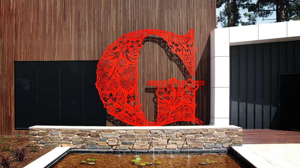
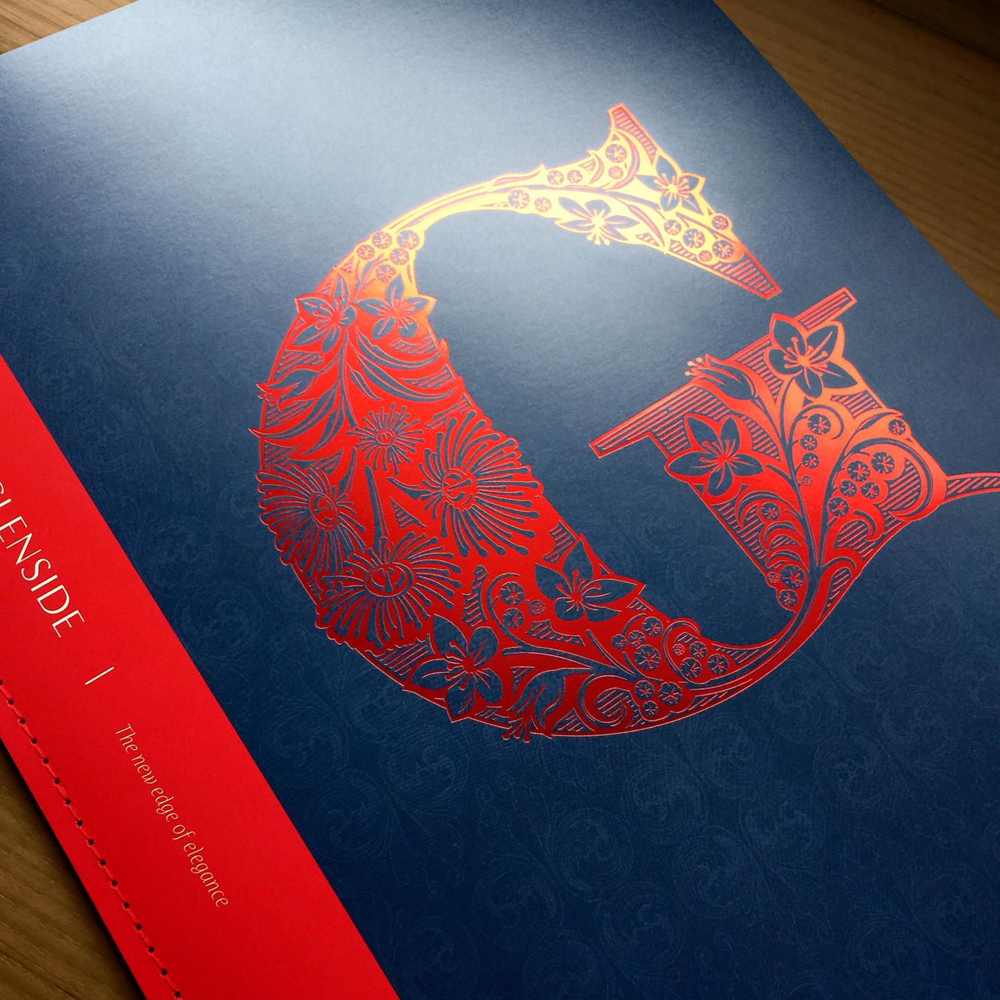
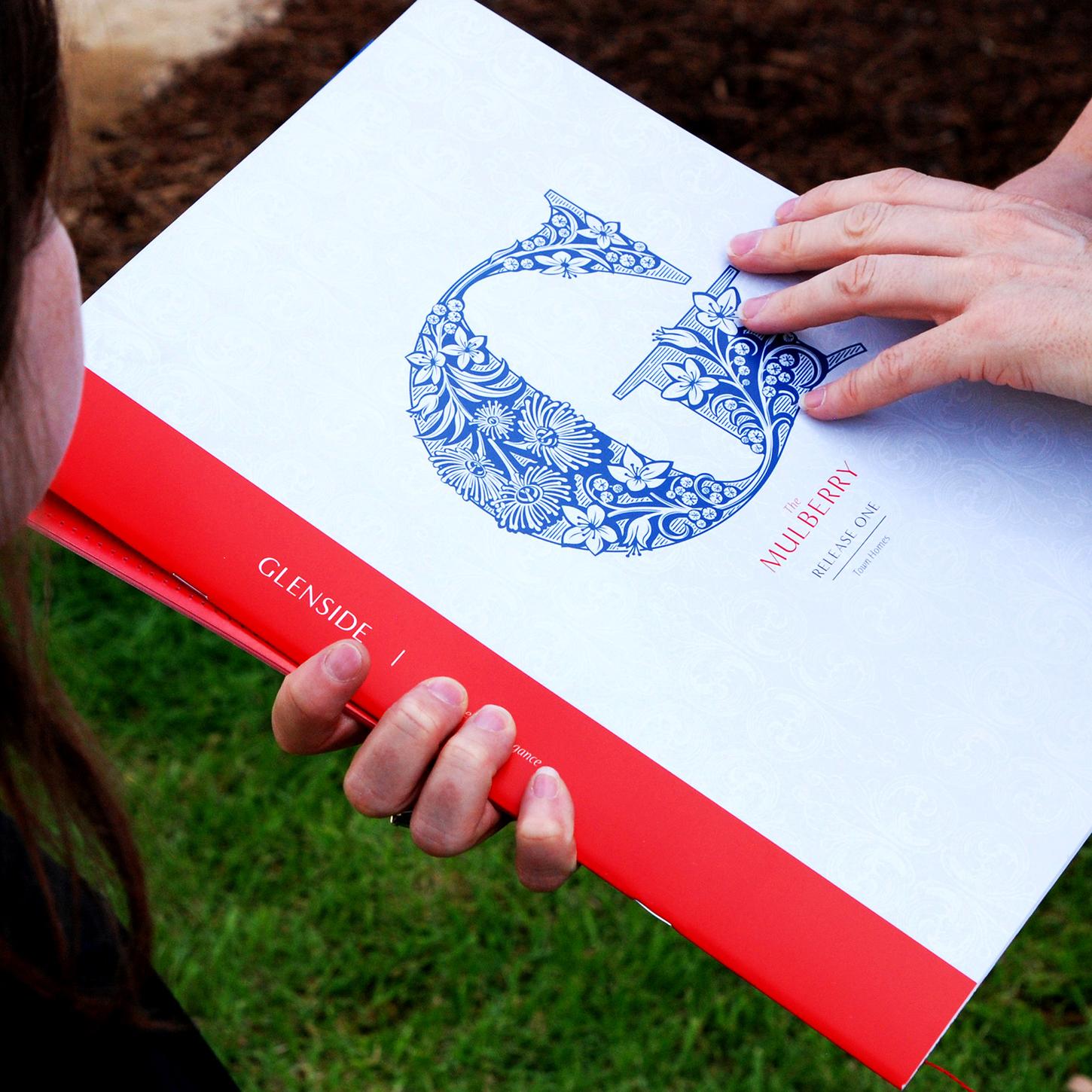
Glenside Monogram Logo
Categories:
An intricate 'G' intertwining South Australia's native flora with Victorian style to embody Glenside's heritage and design.
Overview
Collaborating with Martins Brand House, I created a G motif for Glenside’s redevelopment in Adelaide. This emblem blends the site’s Victorian architectural heritage with its rich botanical landscape, embodying the essence of ‘heritage architecture, contemporary design, and botanical splendour’.

Method
I drew the sturdy G and adorned it with plants native to the site: Blue Gum (Eucalyptus leucoxylon), Golden Wattle (Acacia pycnantha), and Calytrix flowers. The plant stems follow the central spine of the G, sweeping the eye around the curved letter.

Outcomes
The design strikes a perfect balance between old and new, reflecting the site’s unique character. The G became a hallmark of Glenside’s branding, featured across materials and signage to celebrate the area’s heritage and natural beauty.
Everyone in Adelaide knows it and they all love it!