Overview
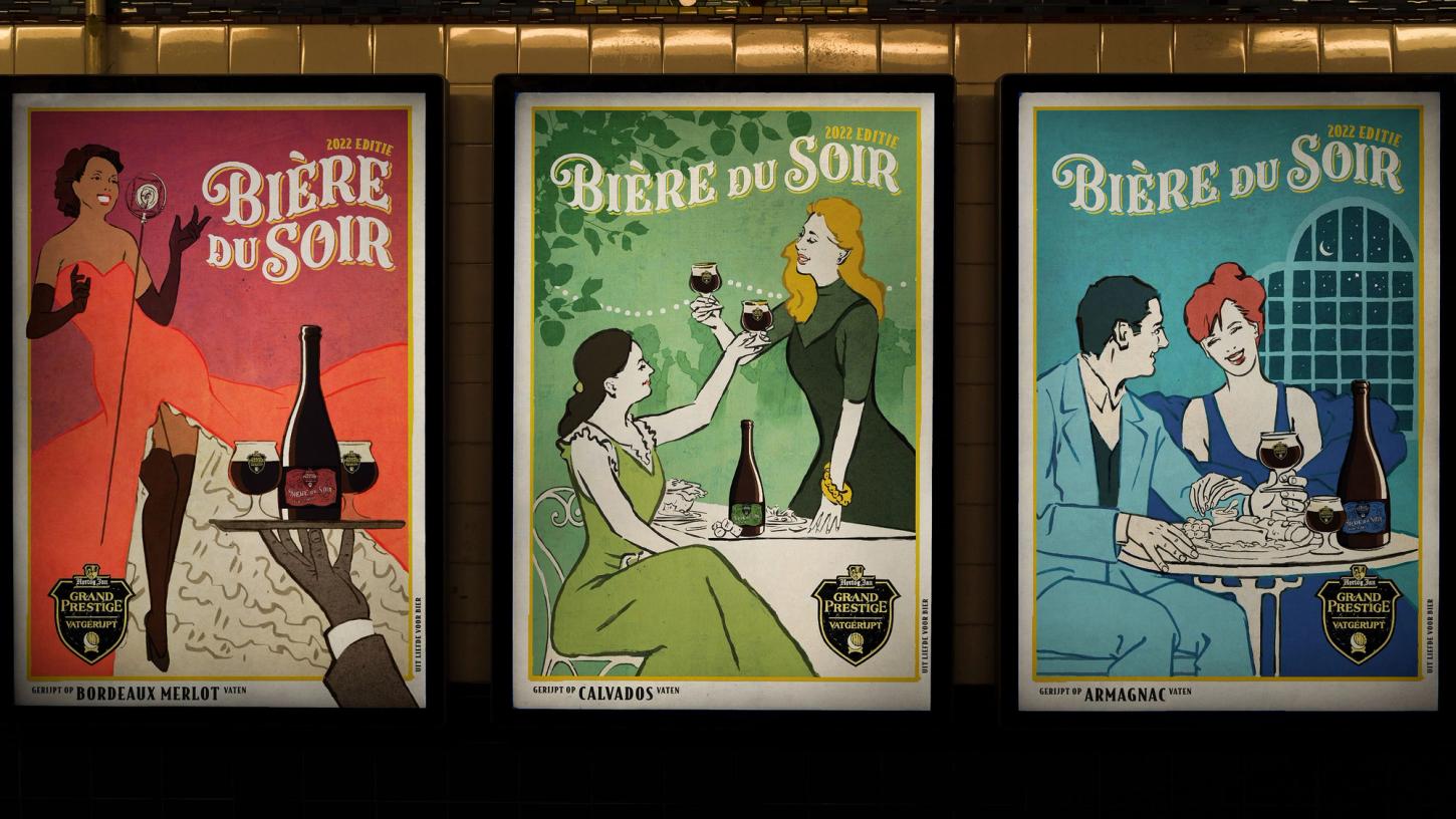
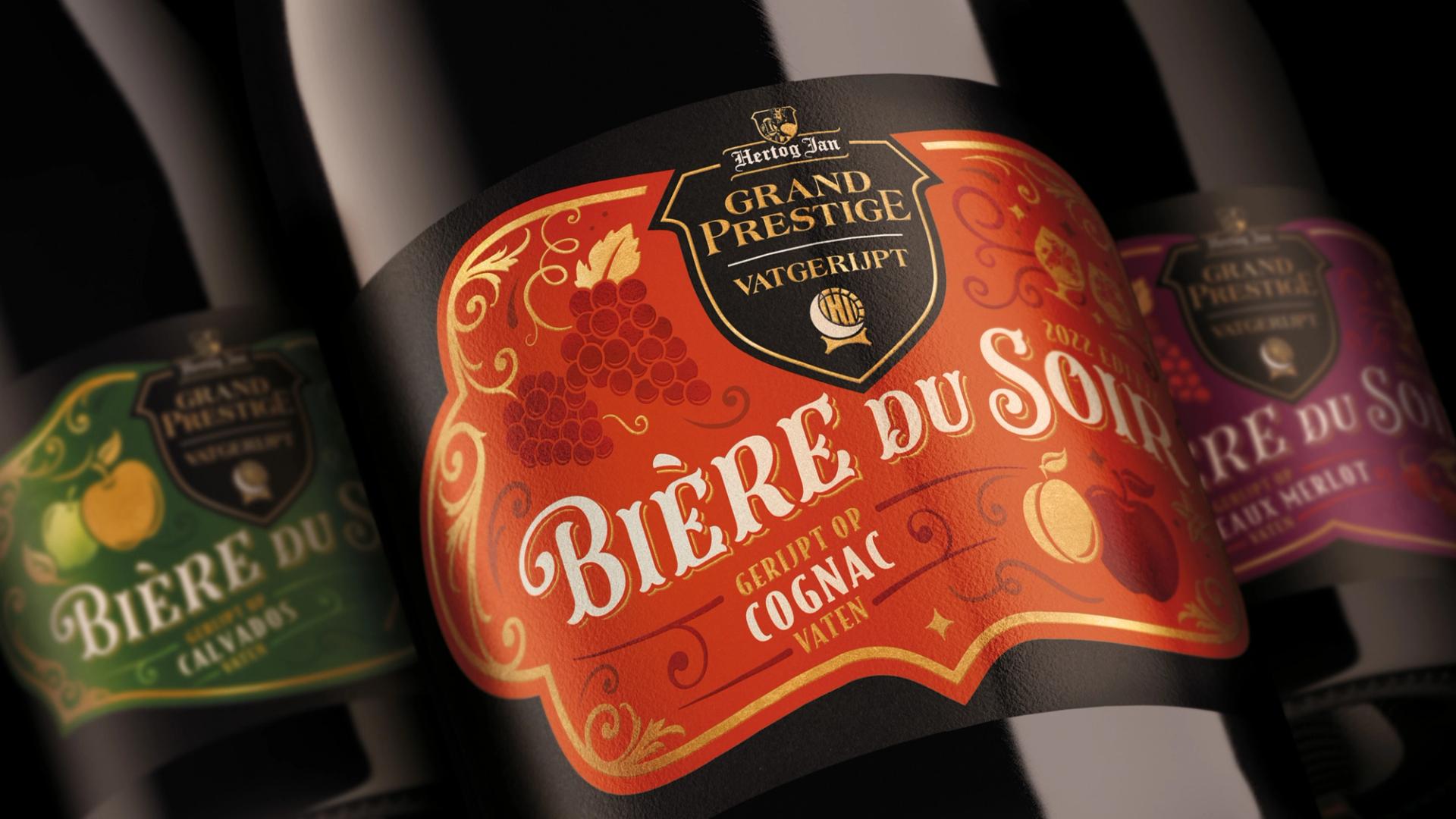
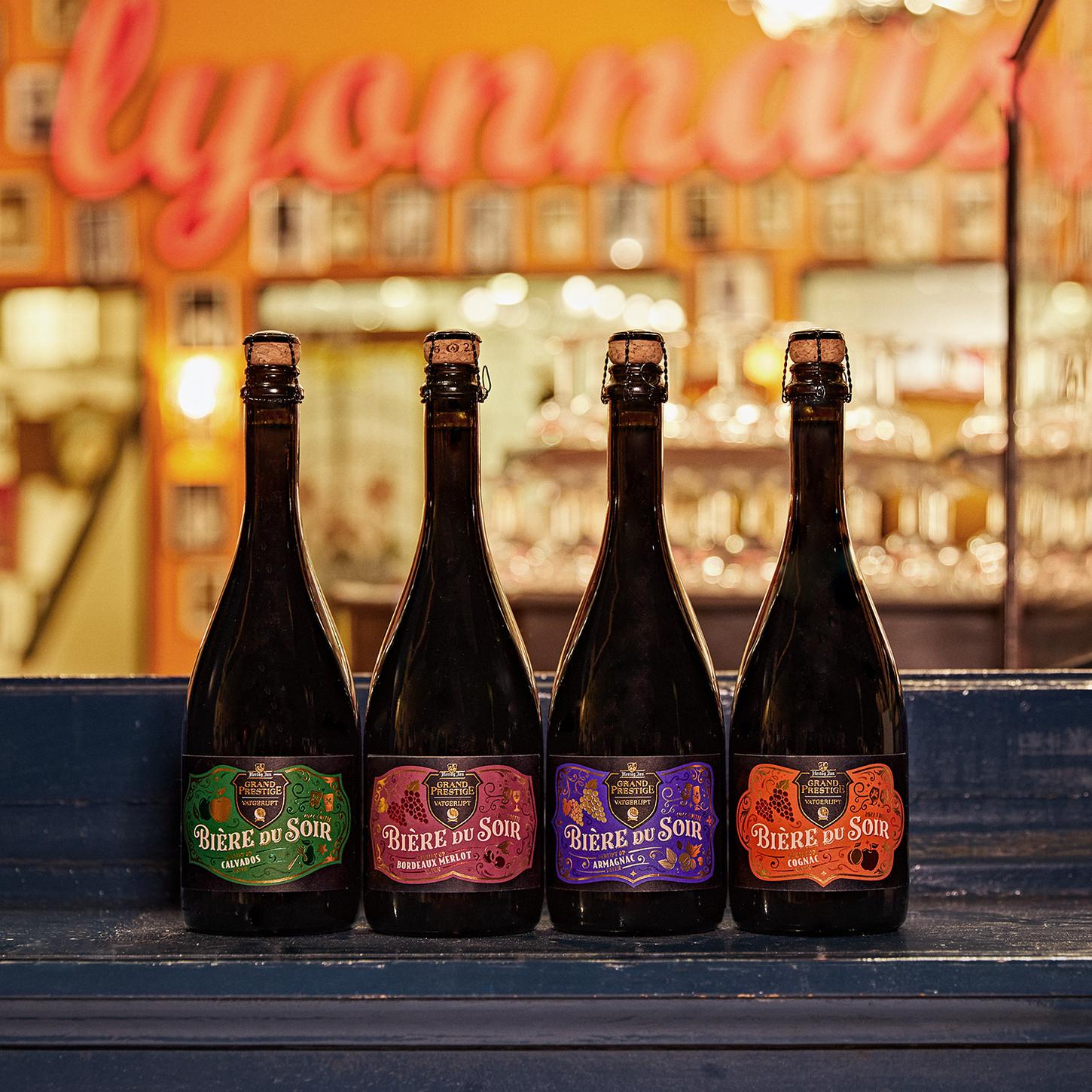
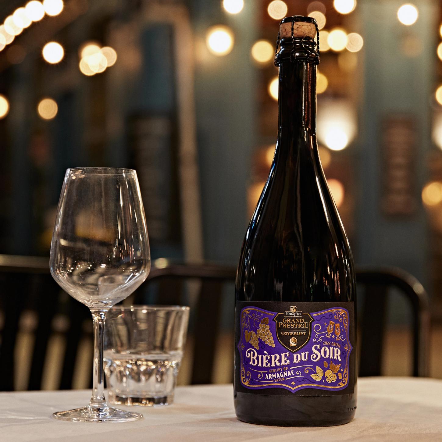
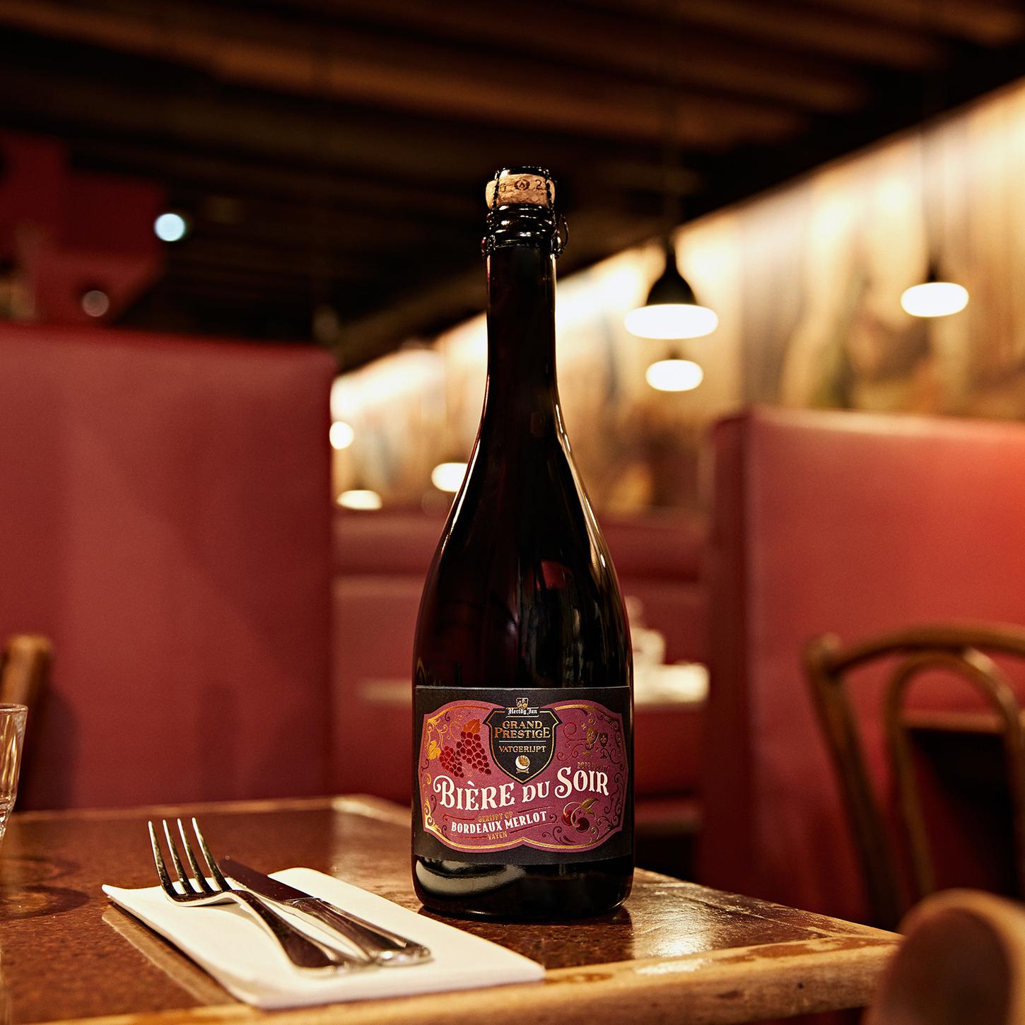
Collaborating with Osborne Pike, I created bespoke lettering for Hertog Jan’s Bière du Soir, a limited-edition barrel-aged craft beer.
Inspired by the beer’s maturation in French oak barrels – previously home to Calvados, Cognac, Bordeaux Merlot, and Armagnac – the design evokes the sophistication of an evening digestif.
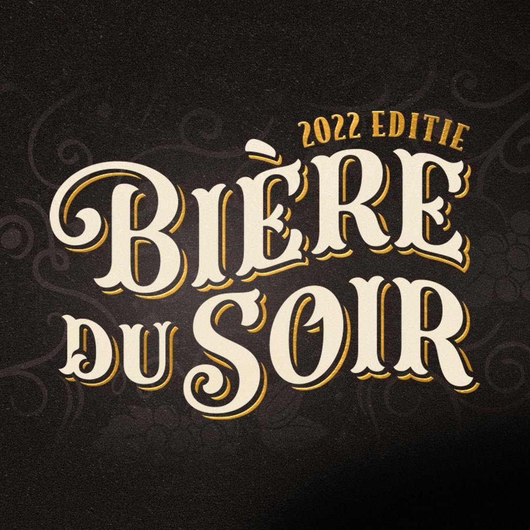
Flowing letterforms and hand-drawn drop shadows capture the elegance and warmth of a perfect nightcap.
Method
I refined the lettering to harmonise with the curved baseline, enhancing the sense of movement. Each stroke was carefully adjusted to mirror the smooth, aged quality of the beer itself.
Each letter and drop shadow was optically adjusted to add depth, character and clarity, reinforcing the artisanal craftsmanship behind both the lettering and the brew.
Outcomes
I produced both horizontal and stacked versions of the logotype, encapsulating the beer’s French influence. The final label felt as rich and inviting as the drink itself.
The result? A beautifully packaged beer that quickly sold out – before I even had the chance to taste it.
He’s a rock star talent.