Case Study/
Rivals Custom Font
Categories:
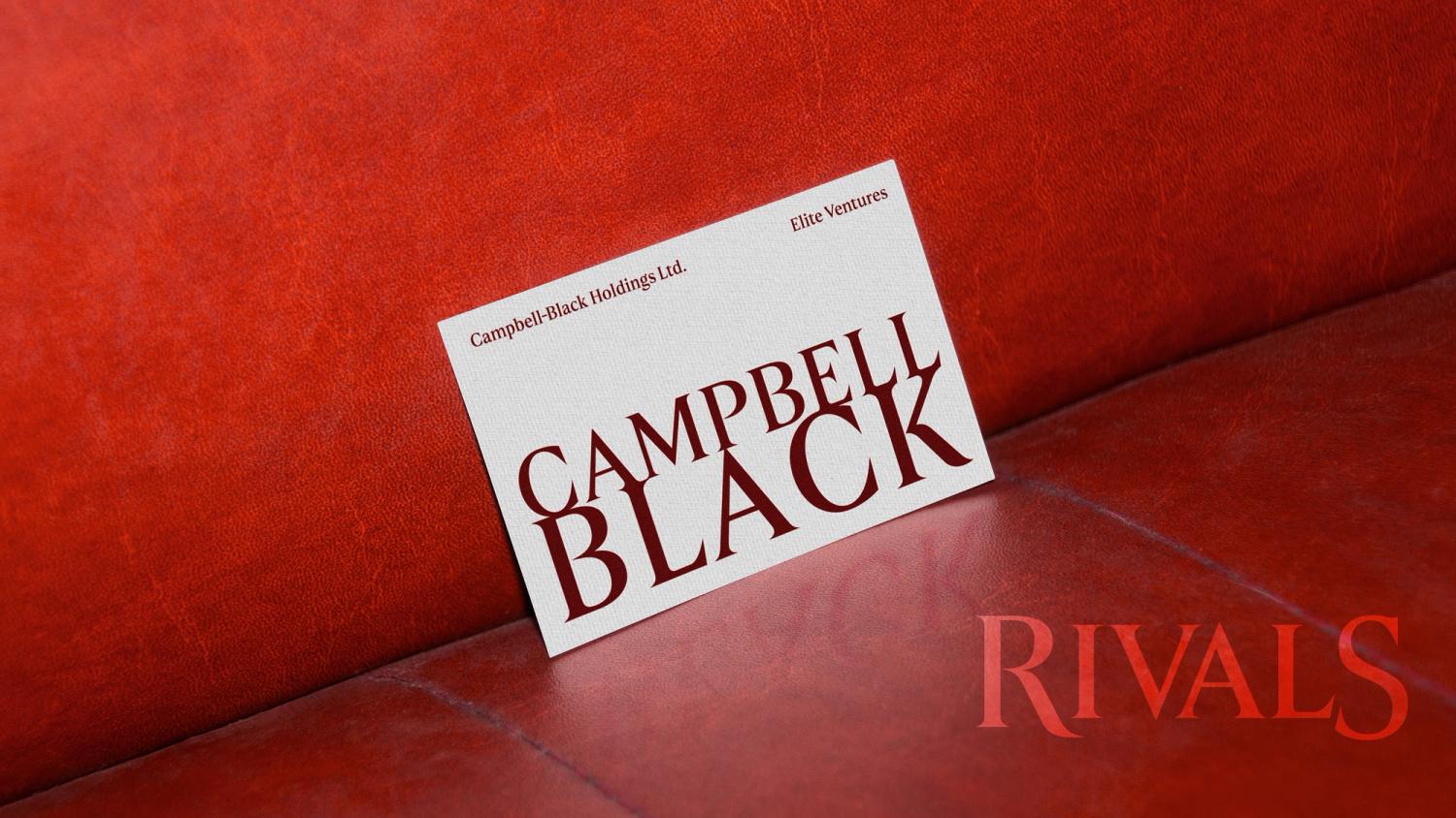
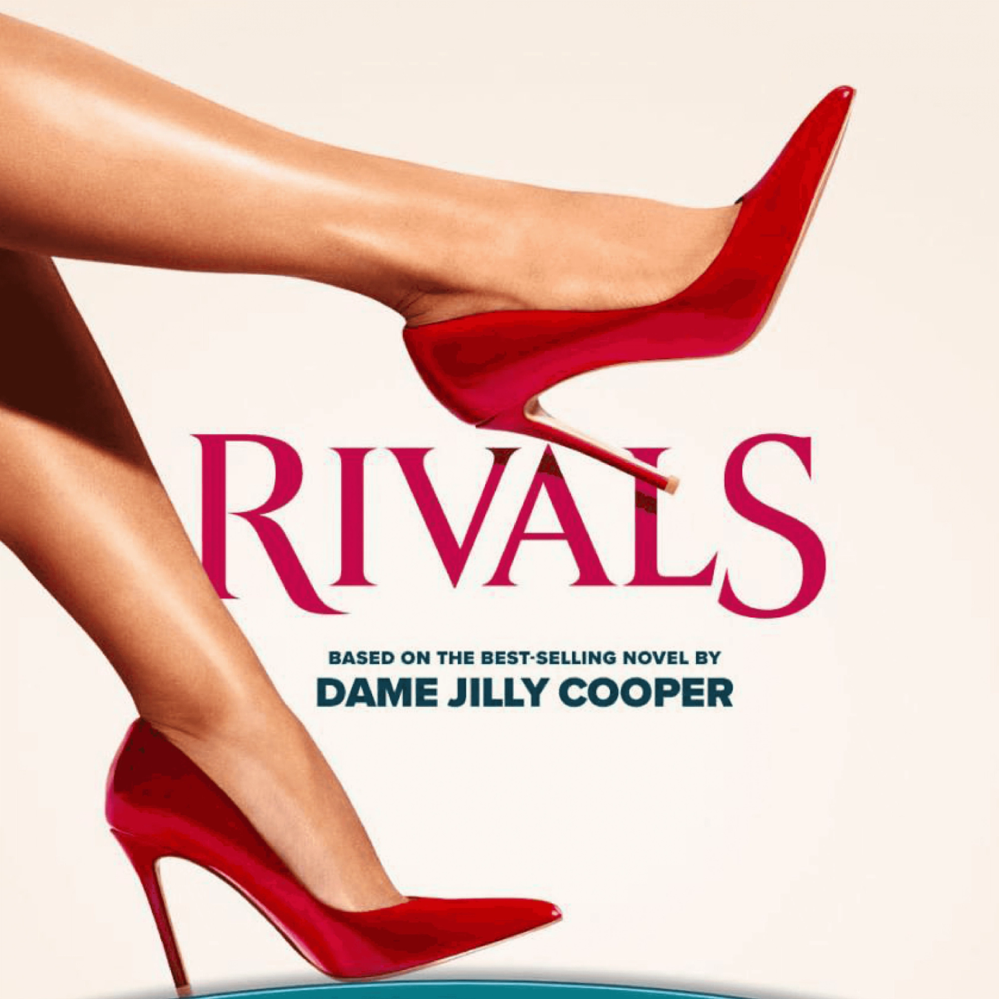
A sensual typeface for the hit Disney+ TV show.
Overview
Building on the success of the Rivals title treatment I designed for Disney+, I was commissioned by The Creative Partnership to design a custom font that carried forward its seductive yet commanding style.

Method
The typeface was crafted to tease out the themes of allure and ambition with sensual curves and sharp serifs.
I expanded the provocative, stencil-like feature in the R to other capitals, adding a subtle erotic charge to the letterforms.


Outcomes
The final custom typeface exudes strength and sophistication, lending a sexy, domineering edge to text. It includes 145 characters, one weight, and stylistic alternatives.
Jamie created a beautiful font for us, that fits our needs perfectly. He is a pleasure to work with.