Overview
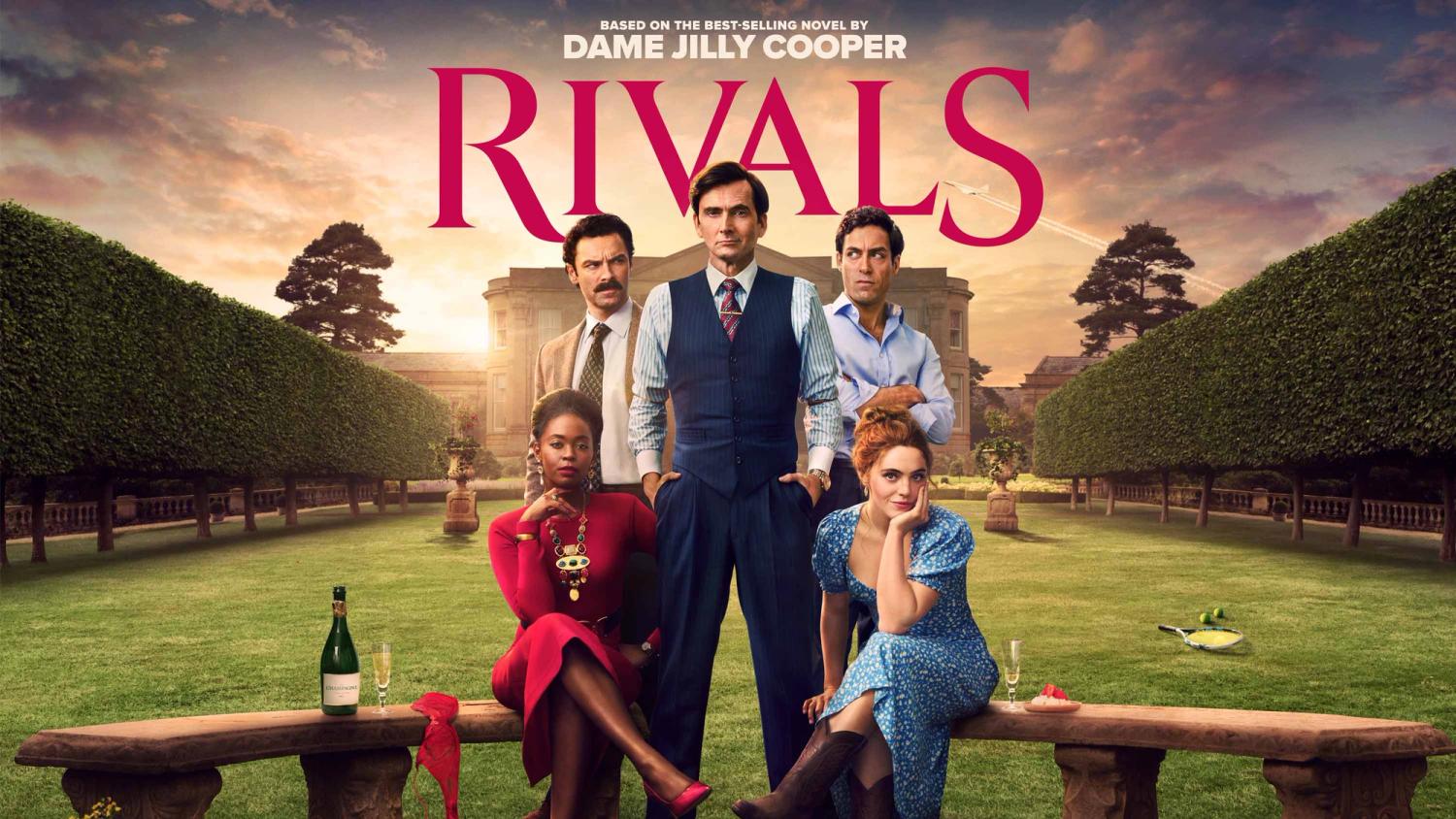
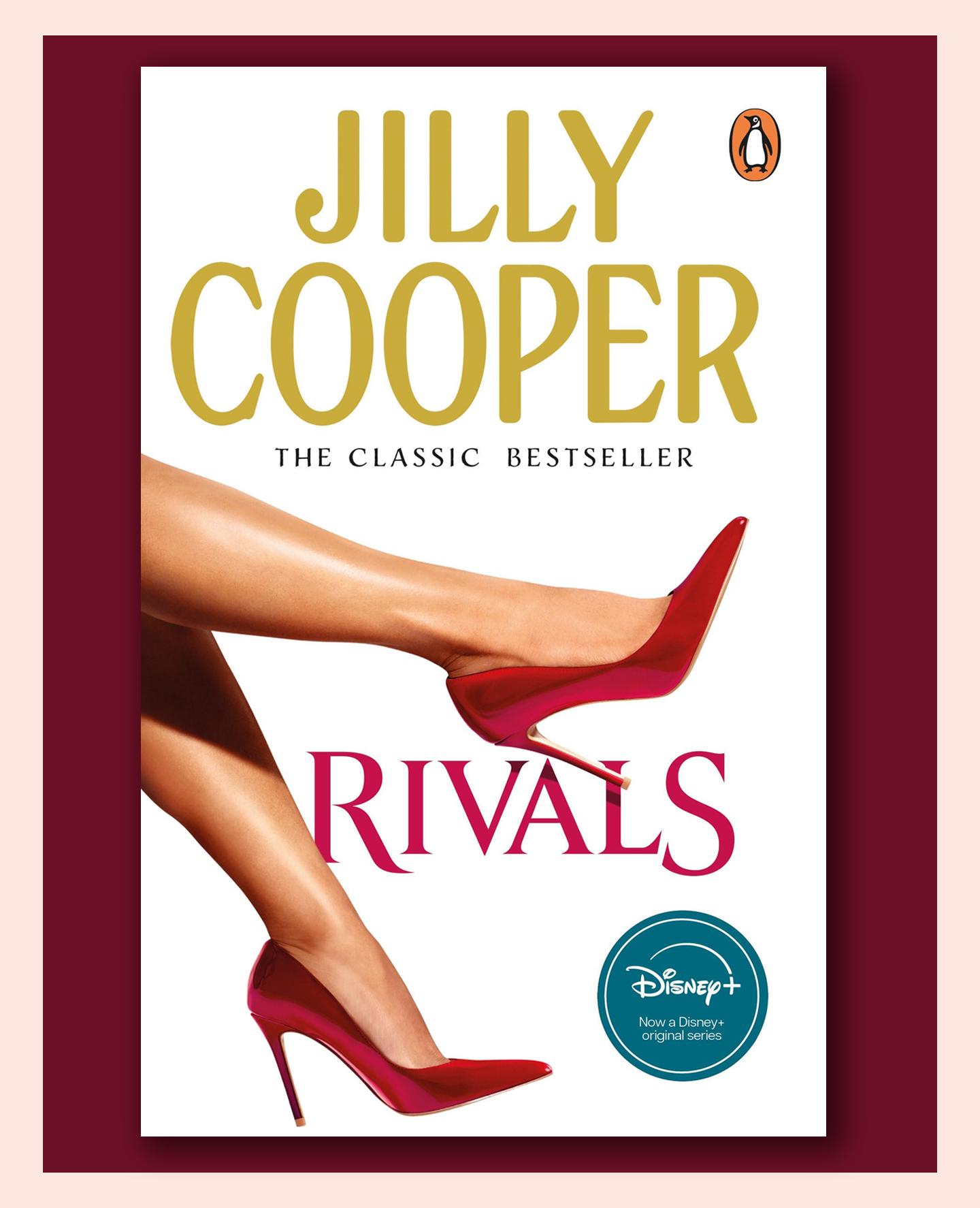
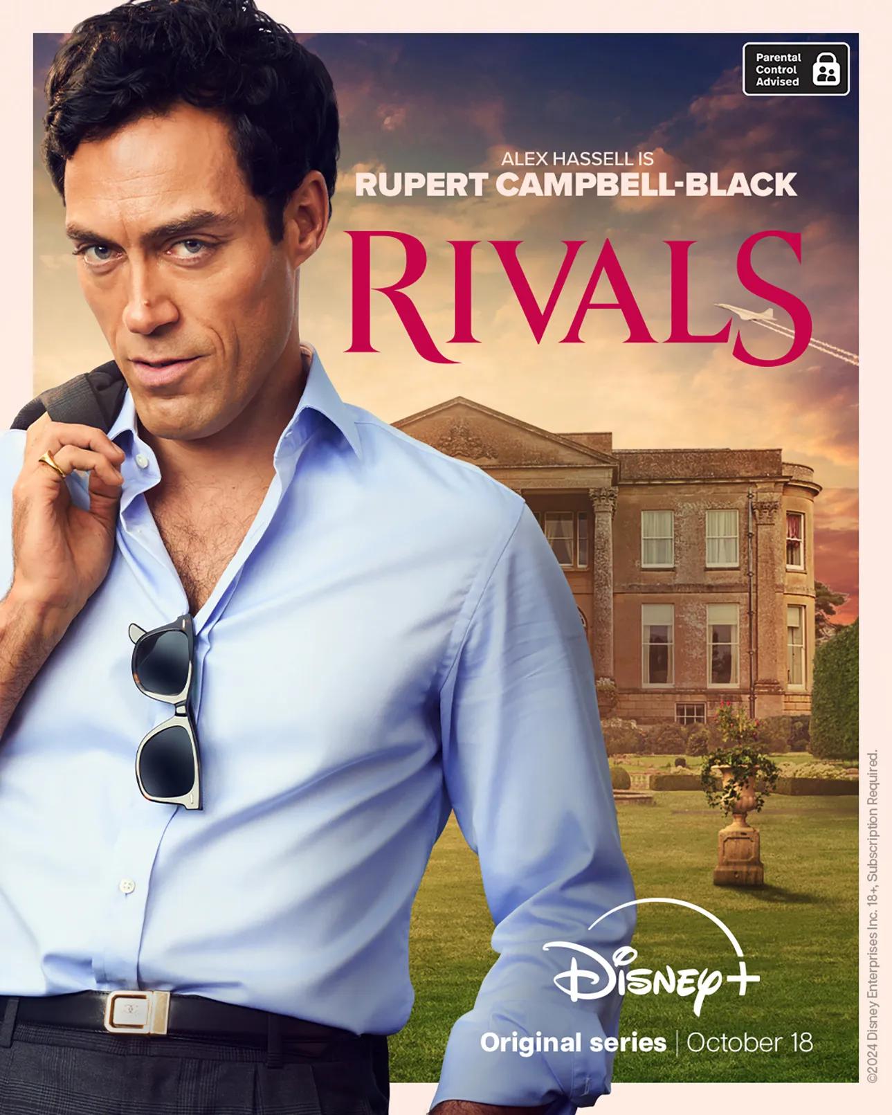
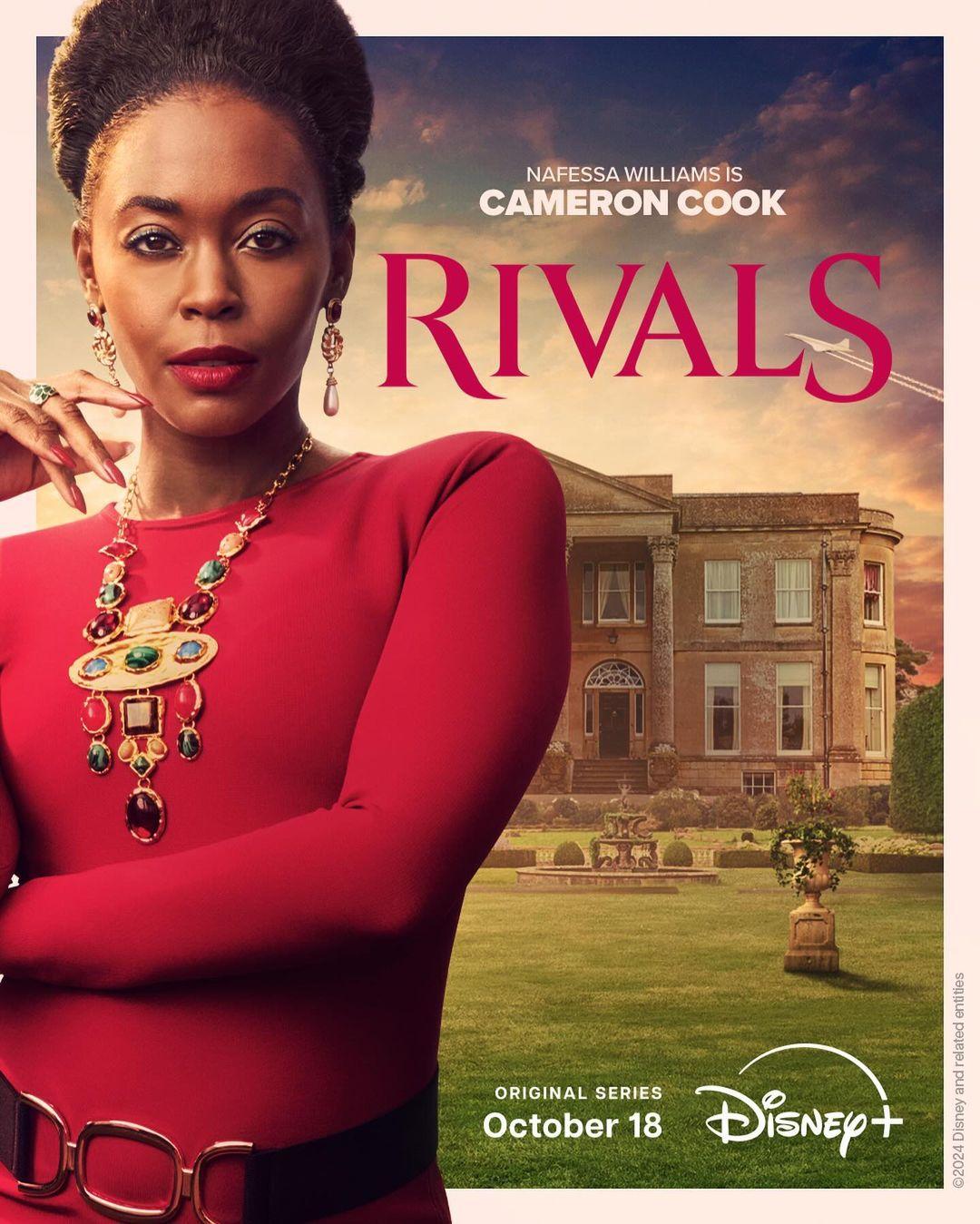
For the Disney+ adaptation of Jilly Cooper’s classic novel Rivals, I was commissioned by The Creative Partnership to design a title treatment that captures the story’s seductive glamour and commanding energy, setting the tone for the show’s high-stakes drama.
Method
I crafted each letterform with sharp serifs, sensual curves, and a sturdy, upright frame. To heighten the tension, the middle V and A were kerned fractionally tighter, subtly emphasising the story’s theme. This detail was later animated in the opening titles for added impact.
Outcomes
The finished title treatment captures Rivals’ distinctive tone, drawing viewers into Cooper’s glamorous, competitive world.
This impactful design serves as a powerful visual anchor, establishing the show’s identity across all media – including the book’s reissue.
He’s a rock star talent.