Tea-Inspired Pattern Design & Lettering
Categories:
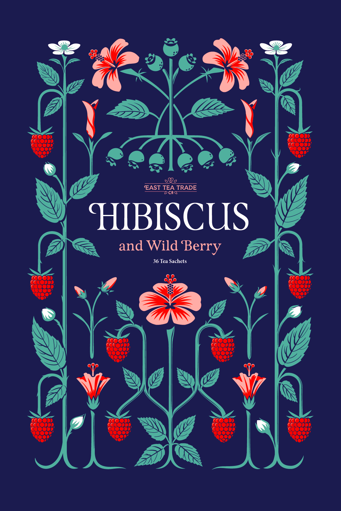
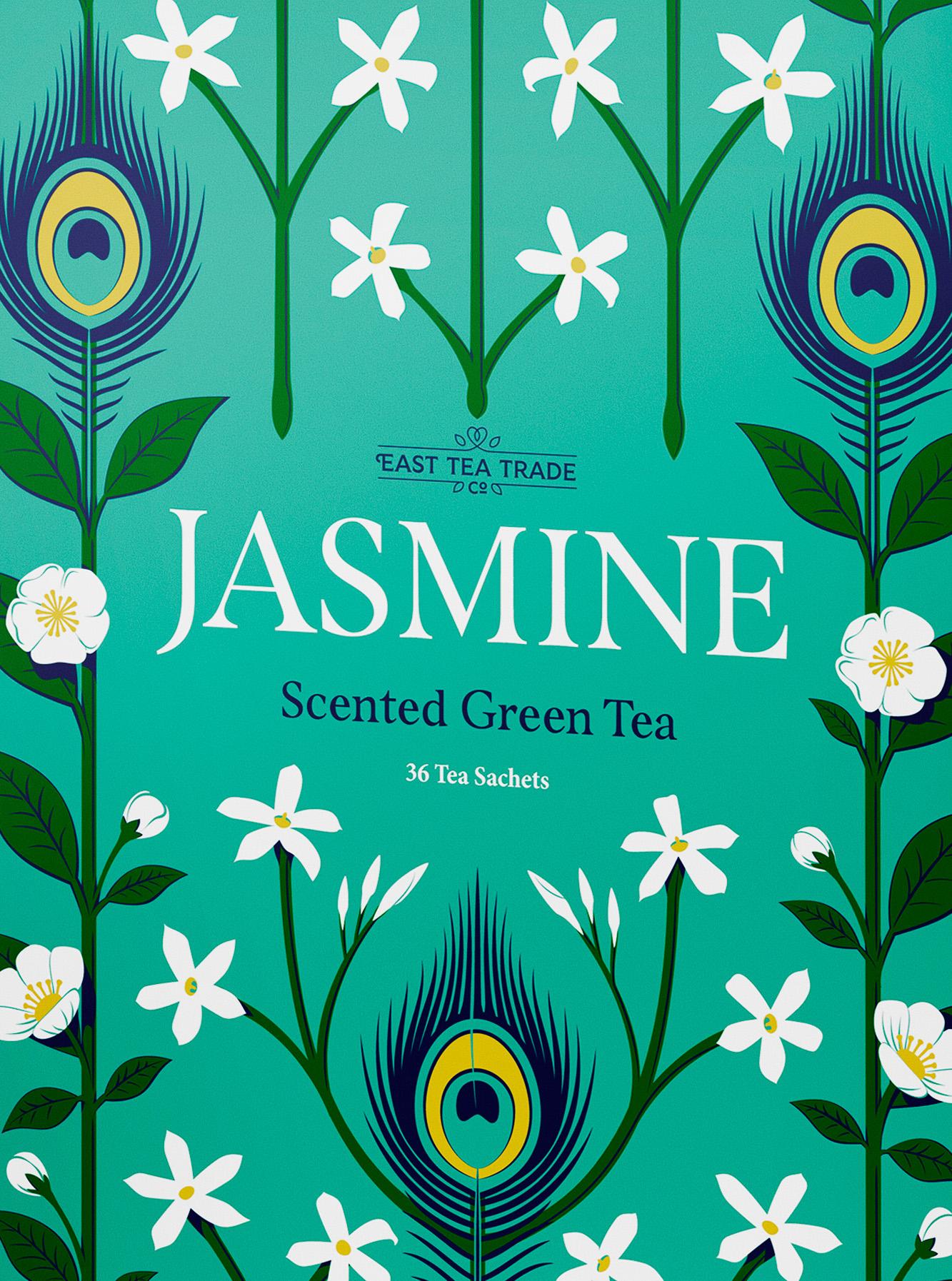
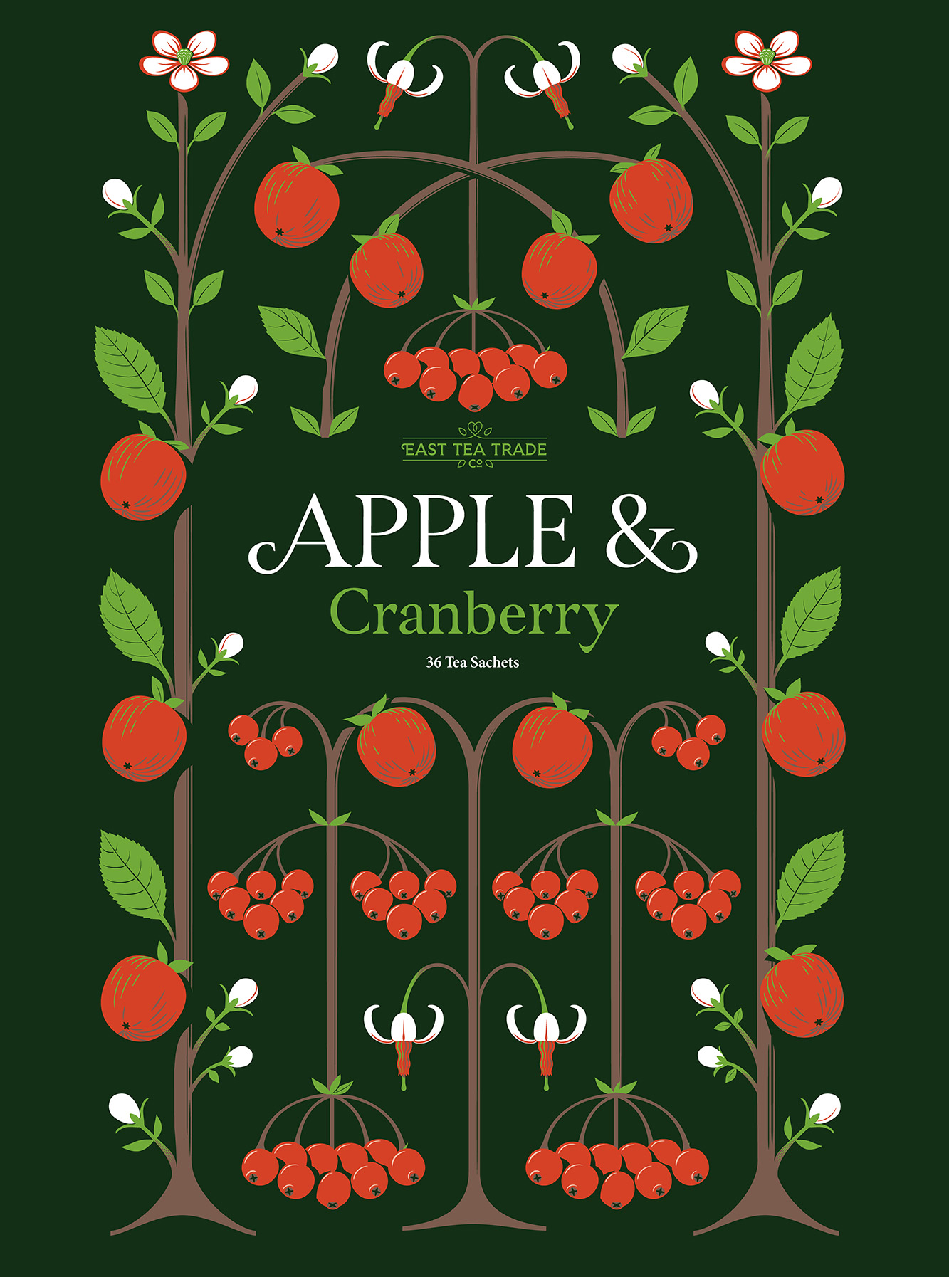
A self-initiated packaging project, balancing organic shapes with structured geometry and celebrating the many flavours of tea.
Overview
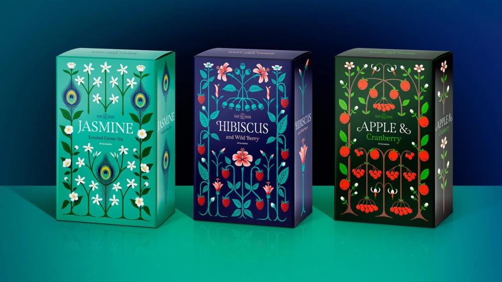
As someone fuelled by tea rather than coffee, I was struck by reports that tea drinking is in decline in England. In response, I set out to design packaging that celebrates the art of tea, letting intricate illustrations take centre stage while lettering complements the design.
Method
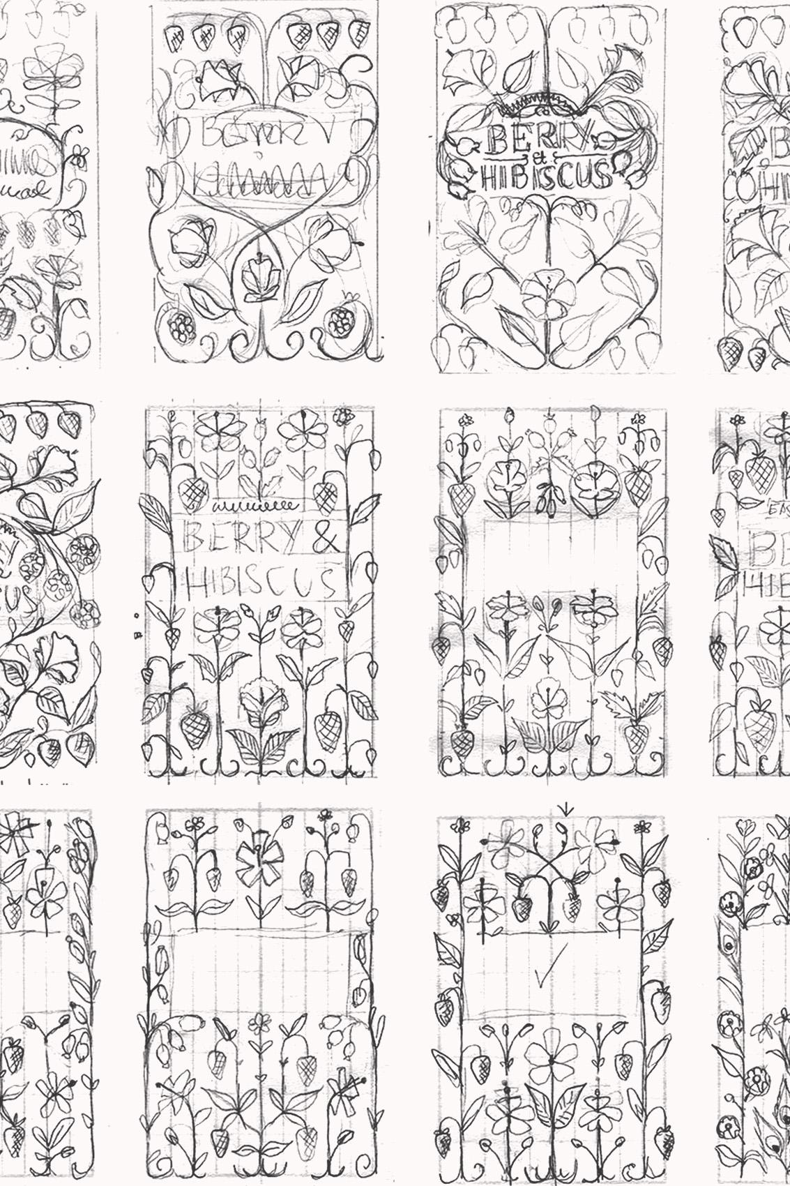
When combining imagery with lettering, I prefer structure over excess. William Morris said ‘structure is a wall against vagueness’, and I took this to heart, beginning with a precise grid layout to guide the illustrations. The same principles I apply to type design – rhythm, uniformity and clarity – shaped the patterns.
Outcome
The final patterns bring a structured elegance to the packaging, striking a balance between order and ornament. The project was featured on the TypographHer blog in the article ‘Craftsmanship that would make William Morris proud’.
The lettering I drew for the titles later inspired my typeface Span, which carries the same high-contrast, engraved style and glyphic serifs.
Beautiful work. I trust him with my trickiest projects