Wallace and Gromit Font
Categories:
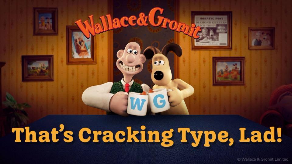
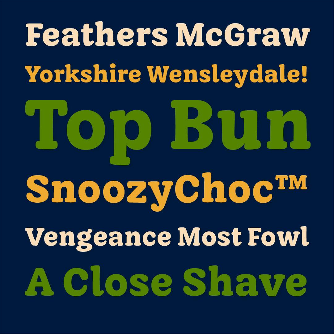
A new typeface for Aardman’s iconic duo – meet Buttered Crumpet.
Overview
I was thrilled to be selected to design a custom typeface for Wallace & Gromit – Aardman’s most beloved and recognisable characters.
The brief called for a font with a distinct tone of voice that could work seamlessly across film, print and digital, while bringing warmth and continuity to their next chapter.
Method
We began by exploring warm, characterful styles, taking inspiration from Oswald Cooper’s original drawings for Cooper Black. We then took a creative turn, developing a softer, low-contrast design with a distinctly hand-crafted feel.
Each letterform was carefully shaped to feel expressive yet balanced, with serifs that resemble loaves of bread – a nod to Aardman’s tactile, playful world.


Outcomes
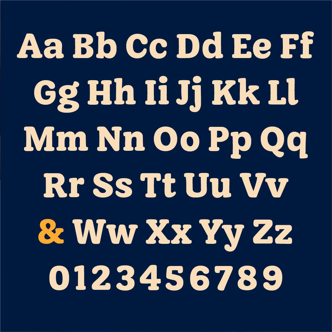
The finished typeface – Buttered Crumpet – gives Aardman a timeless, familiar tone of voice with bundles of charm. It includes over 200 characters, covering all Western European languages, and was designed in a single, carefully crafted weight with room for future expansion.
As a Bristol-based designer, it was a joy to create a lasting connection with my home city and one of its most renowned creative studios.
I’ve loved rolling out this typeface and we’re starting to see it in action now. There have been lots of compliments.