Font StoriesRead more about Reel: Font Story
Reel: Font Story
Condensed ALL CAPS headlines are powerful, but they come with a default setting: loud. Reel is a new typeface designed to command attention without shouting.
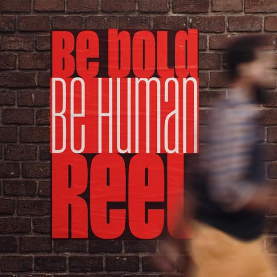
Condensed ALL CAPS headlines are powerful, but they come with a default setting: loud. Reel is a new typeface designed to command attention without shouting.
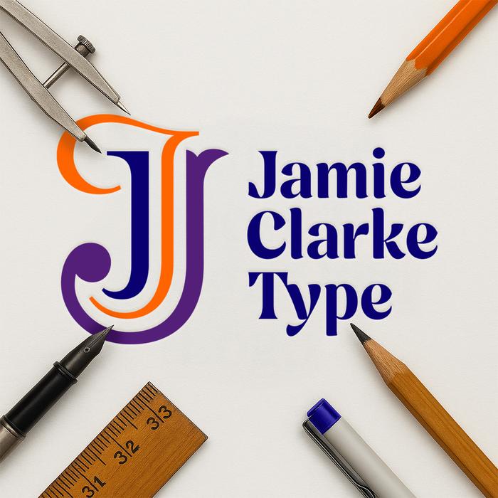
As a designer, you’re often too close to your own work to see all the possibilities. Collaboration gave me the distance I needed – and helped shape a new identity that feels sharper, clearer, and more true to what I do.
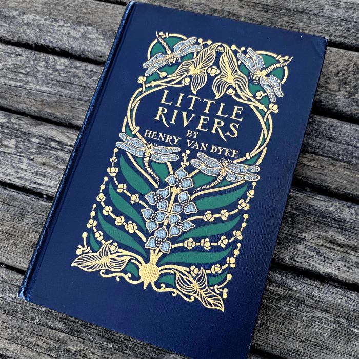
In the early 1900s, Margaret Armstrong’s luxurious, Art Nouveau book covers helped define an era.
Good design takes time – not just to refine, but to fully realize the vision behind it. Nave took 10 years to create, but the journey was just as valuable as the final typeface.
AI promises a major upheaval in typography, with designers finding themselves navigating both opportunities and challenges. How will it impact quality, design roles, and our use of type in the future?
Join my newsletter to get the latest on new fonts, updates and behind-the-scenes insights.
