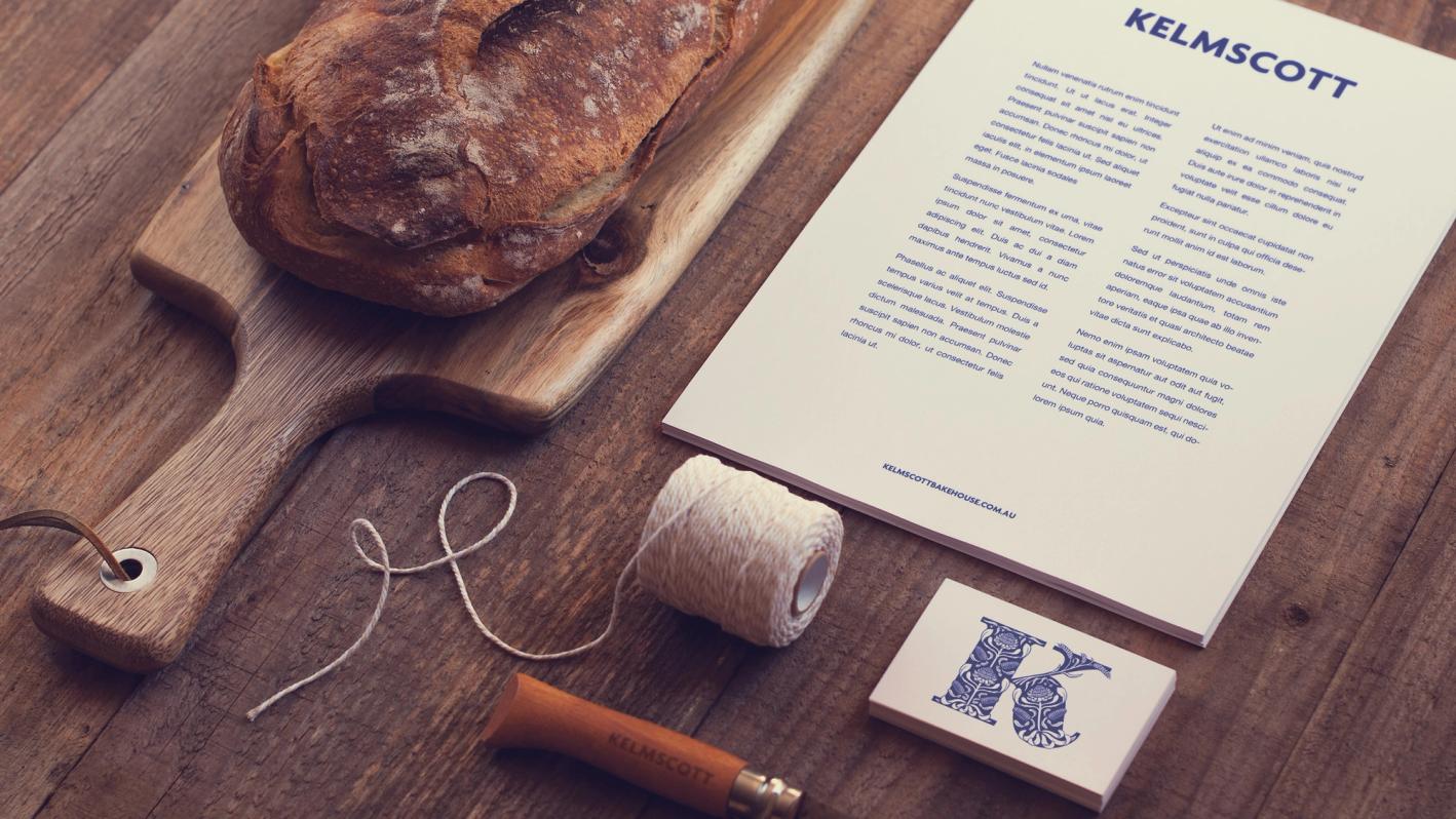
Kelmscott Bakehouse
Categories:
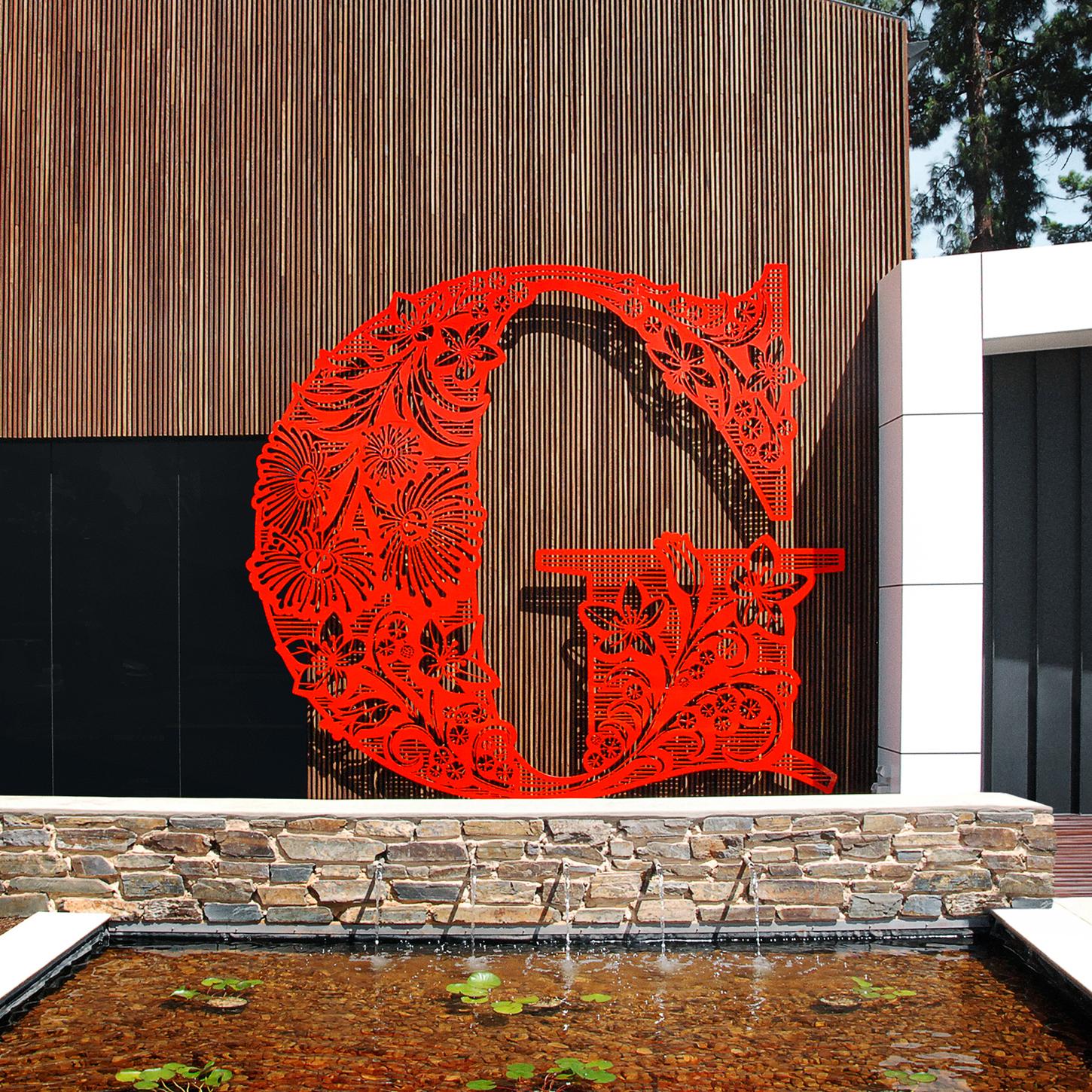
A bold, ornamental monogram blending William Morris-inspired patterns with native Australian flora.
Overview
I was commissioned by Bit League to create a decorative monogram for Kelmscott Bakehouse, an artisan bakery that honours traditional methods and sustainability.
Named after William Morris’s Kelmscott Press, the bakery sought a design that reflected Arts & Crafts heritage, incorporating native Australian plants and wheat to symbolise its craft and location.

Method
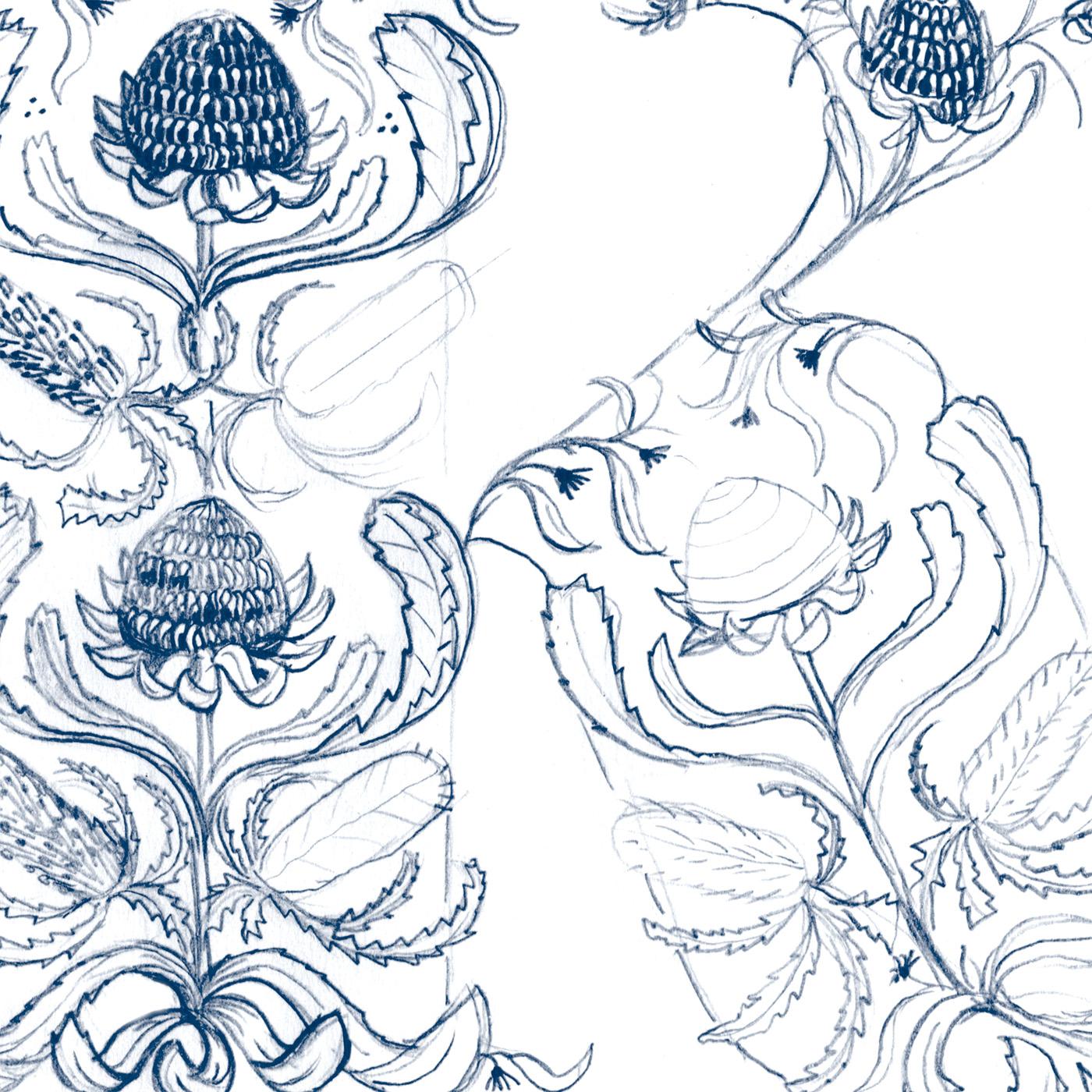
Inspired by Morris’s intricate patterns, I wove together Waratahs, Gum and Banksia into a design that harmonised with the letterform.
The Waratah’s bold, structured stems formed the monogram’s central spine, ensuring clarity and balance. The wheat, drawn slightly finer, allows the dark background to reinforce the letter’s form.


Outcomes
The final Kelmscott Bakehouse monogram is both historically inspired and uniquely local, seamlessly integrating Arts & Crafts aesthetics with Australian identity.
In all of his work, Jamie shows an obsessive attention to detail