
The dream project: what would you design?
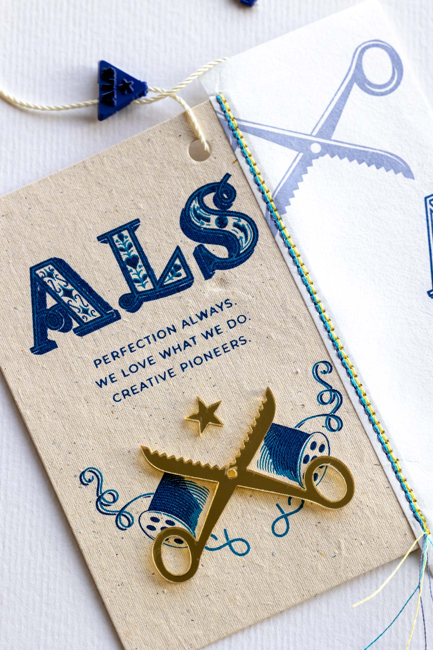
Checkpoint Apparel Labeling Solutions (ALS), a leader in branding and labeling for the fashion industry, reached out to me for a collaboration. It was quite serendipitous, considering my hobby of collecting well-designed clothing labels for years.
ALS proposed a creatively open brief, encouraging a wide range of ideas. They then showcased the designs in a variety of sample materials, effectively demonstrating their impressive production capabilities and manufacturing magic.
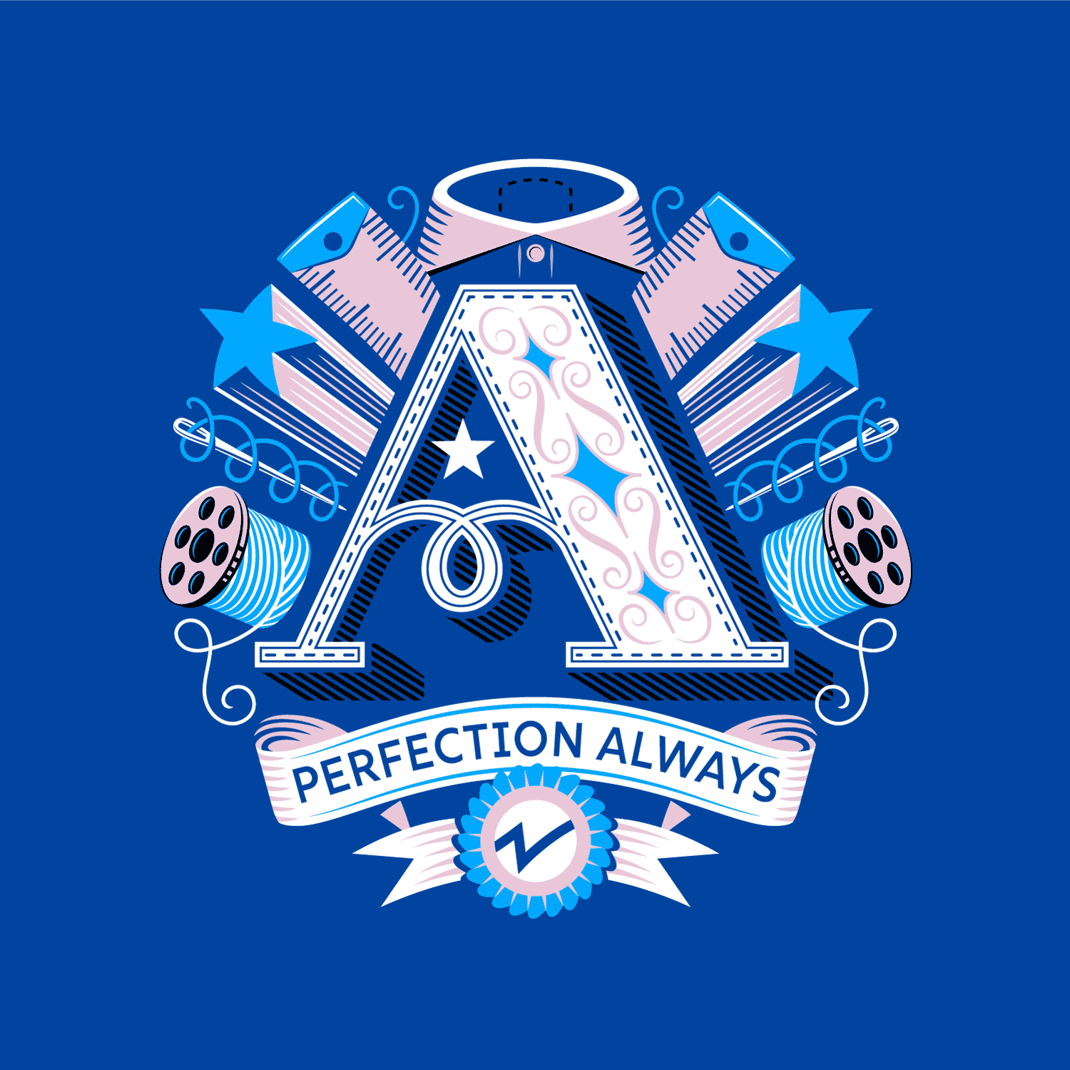
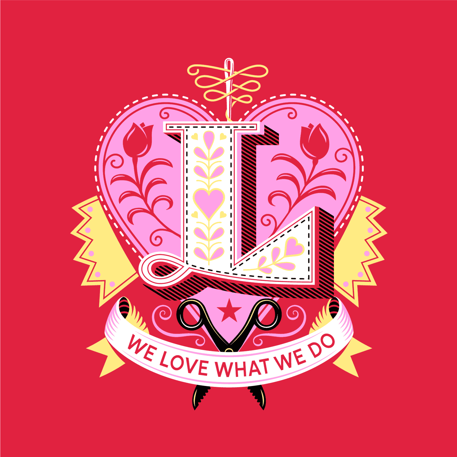
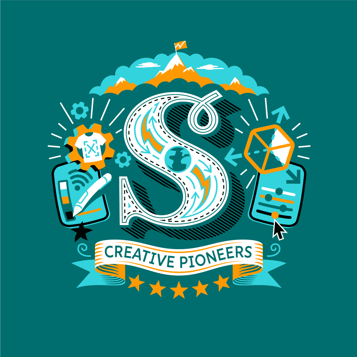
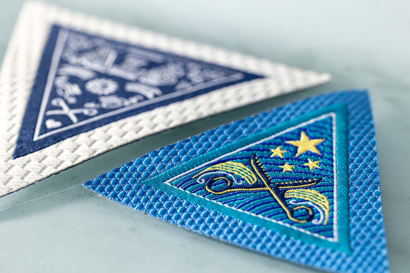
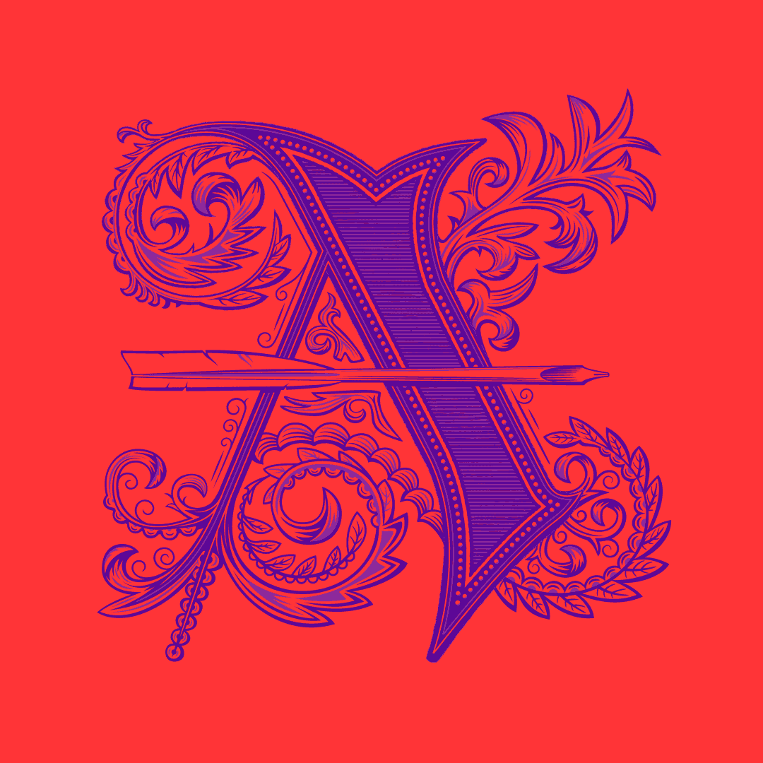
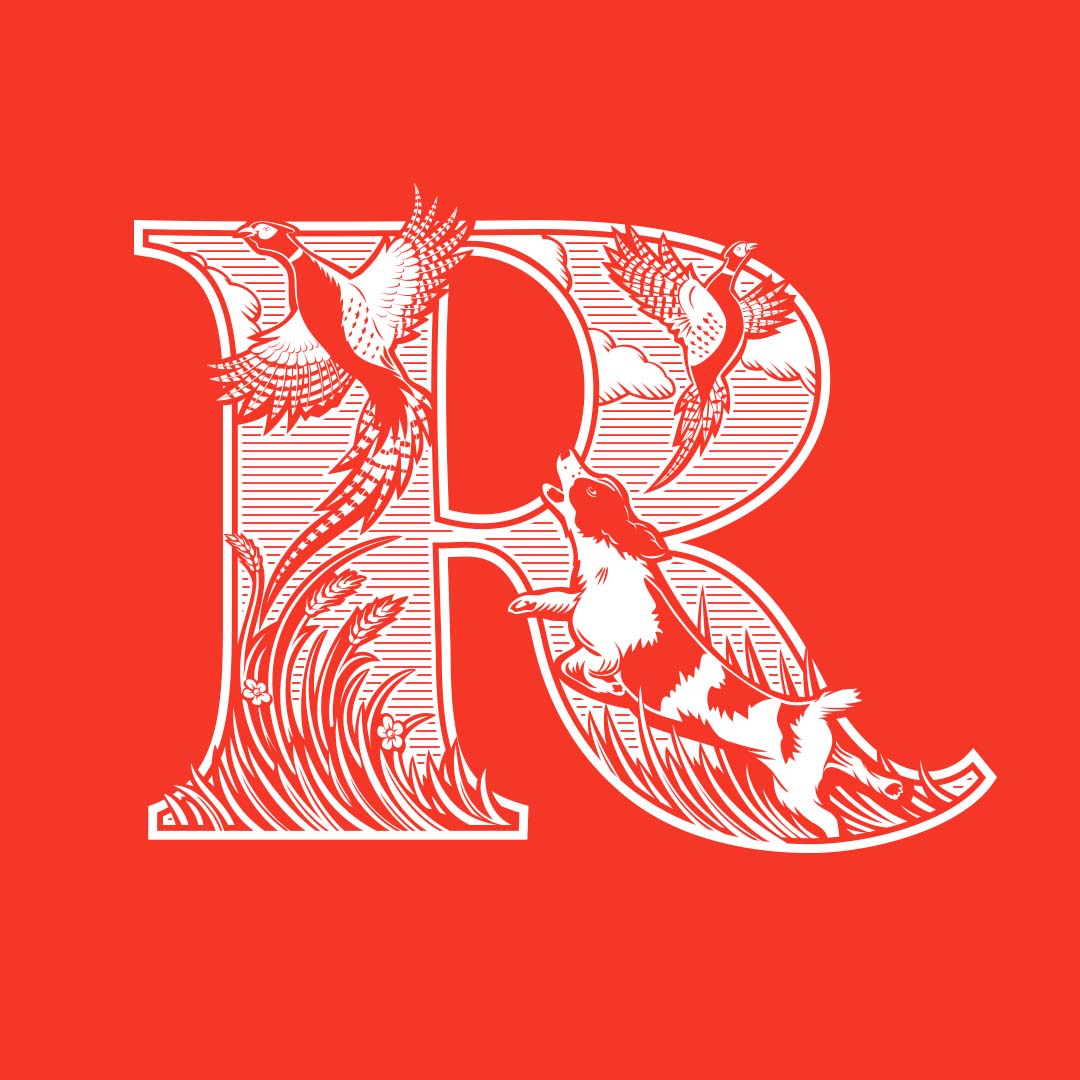
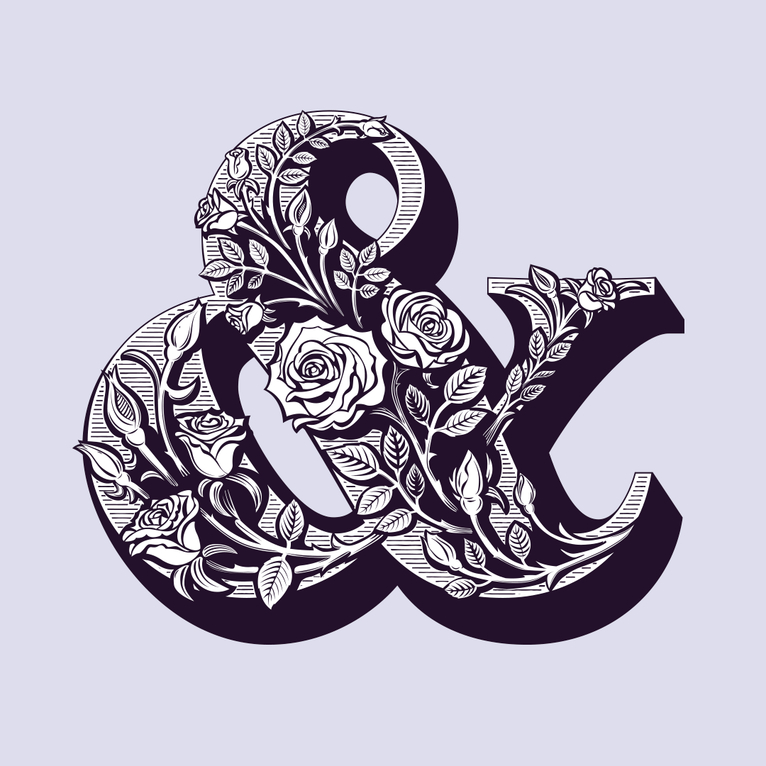
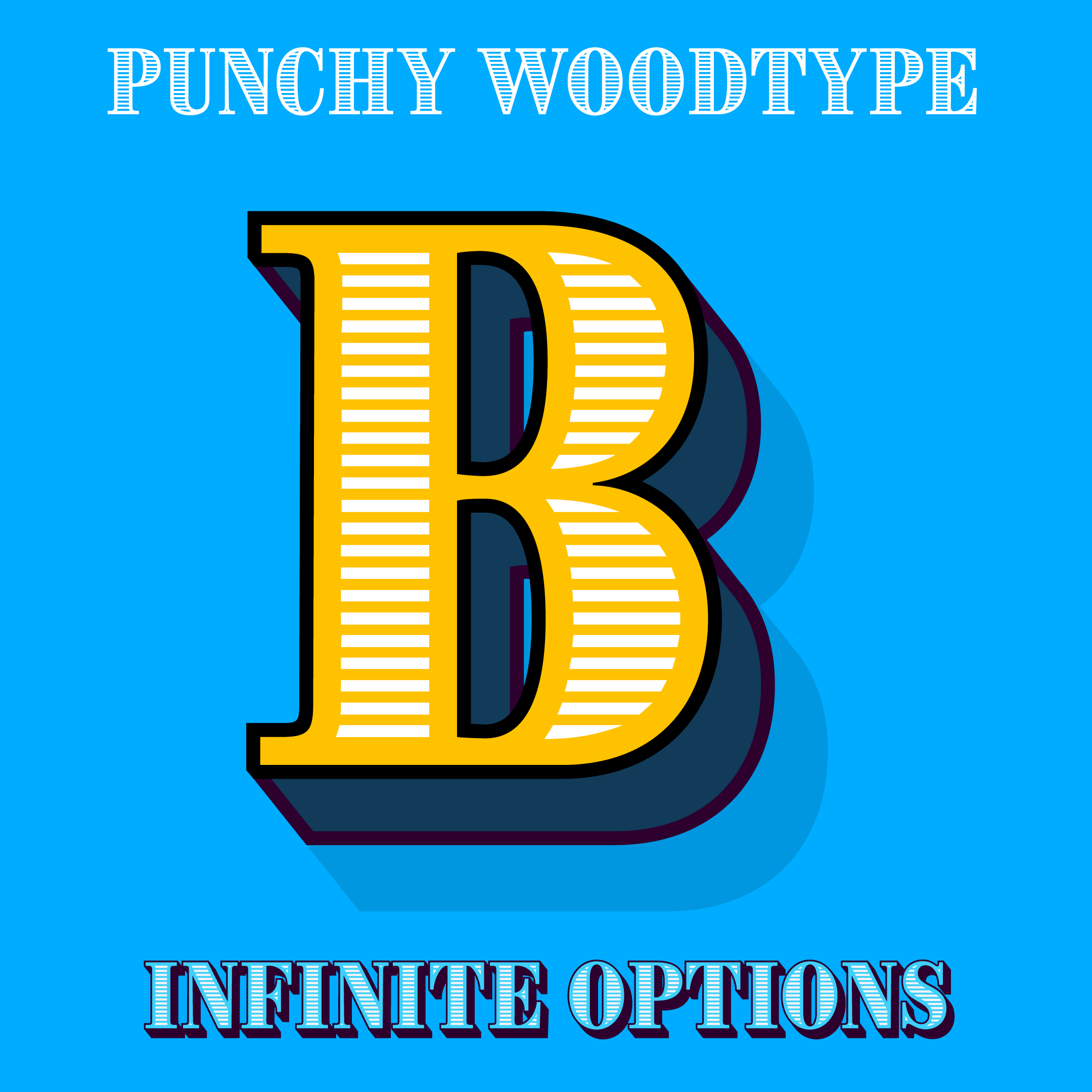
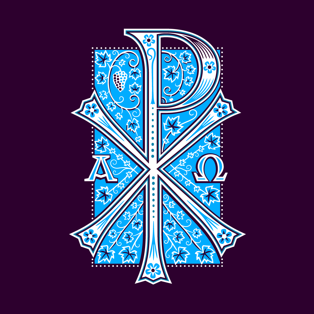
As the UK geared up for its new king's coronation, full of grandeur and a post-COVID trend towards ‘Formal Luxury’, I saw an opportunity. This style, known for its crests, decorative monograms and high-contrast serif typefaces, is synonymous with elite fashion houses. It was the perfect moment to tap into this zeitgeist. In contrast, there's a growing trend towards fluid, informal designs, especially among brands targeting Gen Z. These styles, reminiscent of the 1890s and 1960s, feature wavy letters and Art Nouveau-inspired typography in vivid colours. Intrigued, I set out to merge these two distinct themes into a set of typographic crests.
‘What we wanted to achieve with this campaign was to give our internal design teams an entirely new set of boundaries and creative elements that they can play with to create a range of labels, perfect to show off our expertise.’ Simon Dickinson, Senior Marketing Manager at Checkpoint ALS.
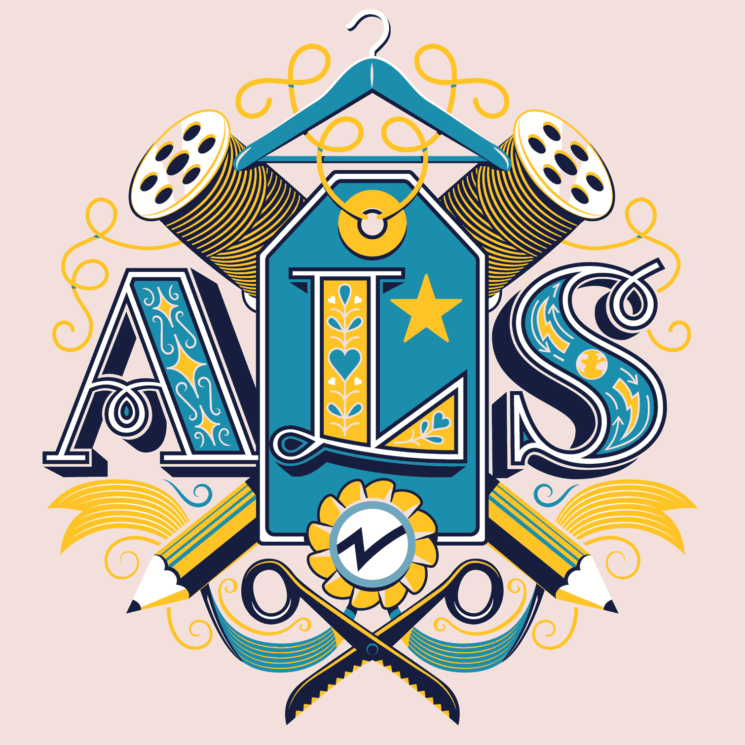
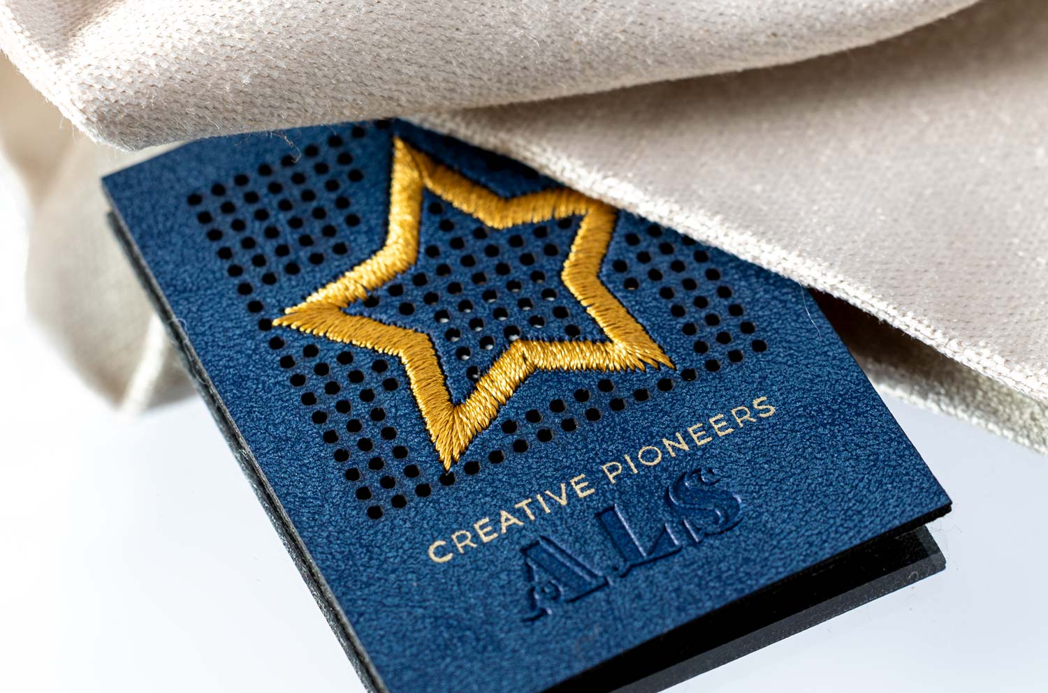
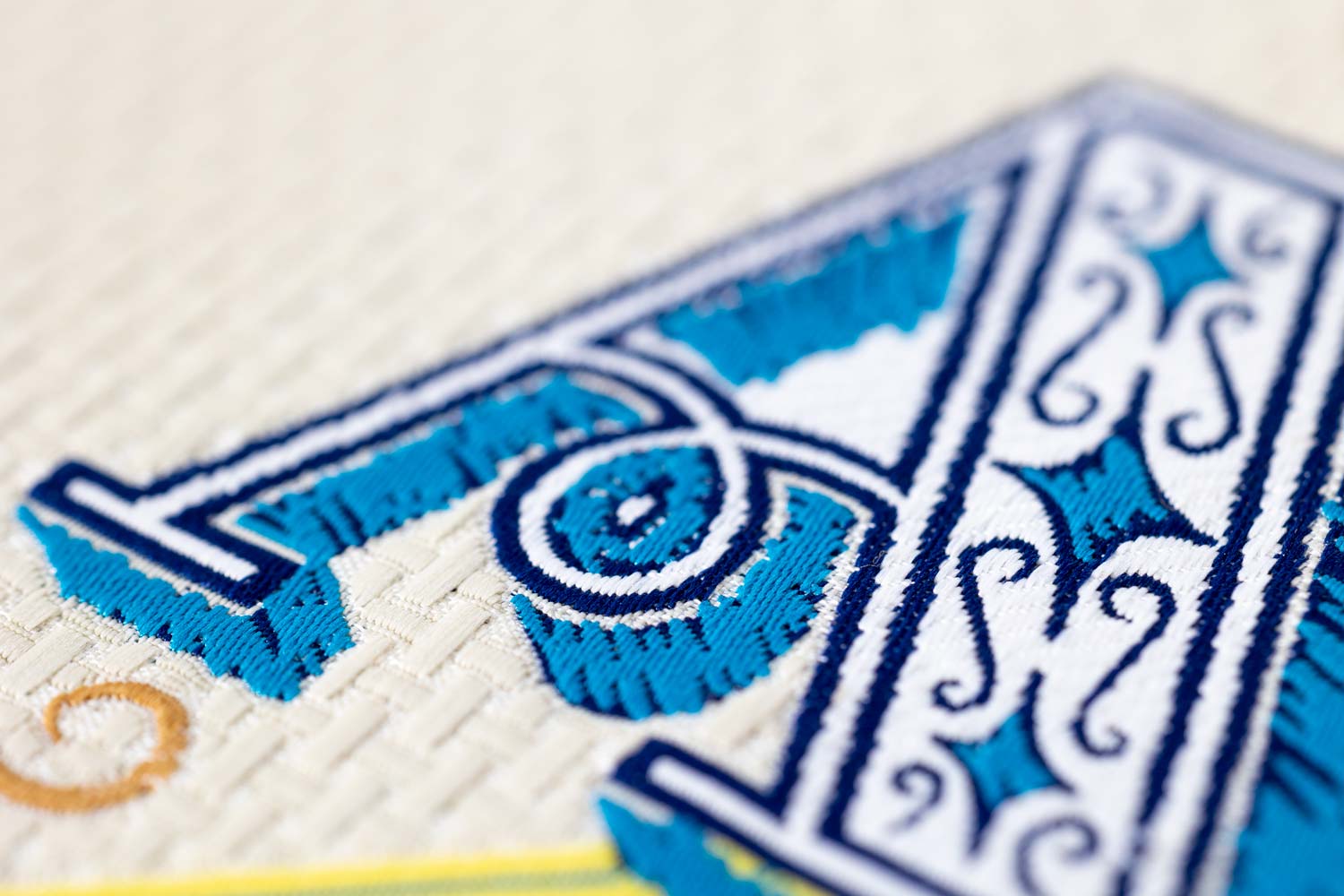
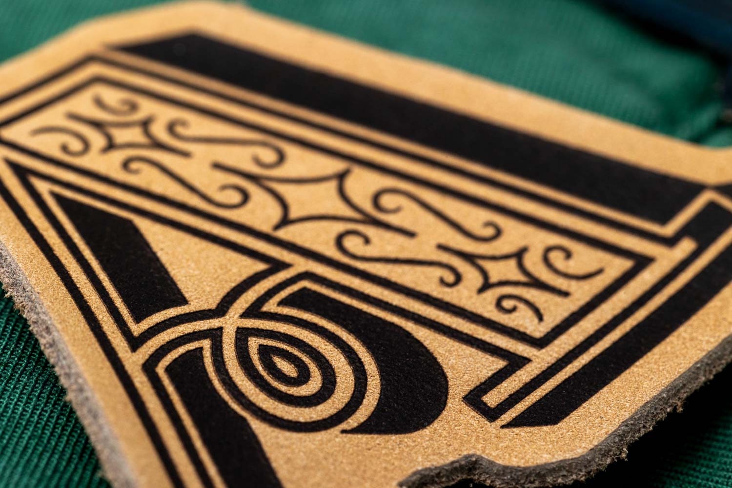
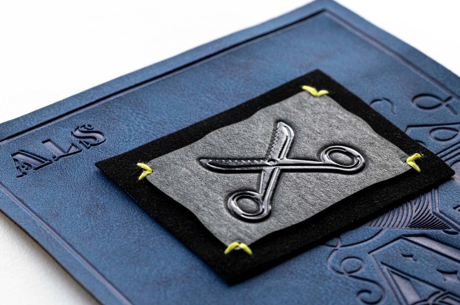
ALS showed me their label production process. We chose a scaled-back colour palette and avoided super-thin lines for the best result.
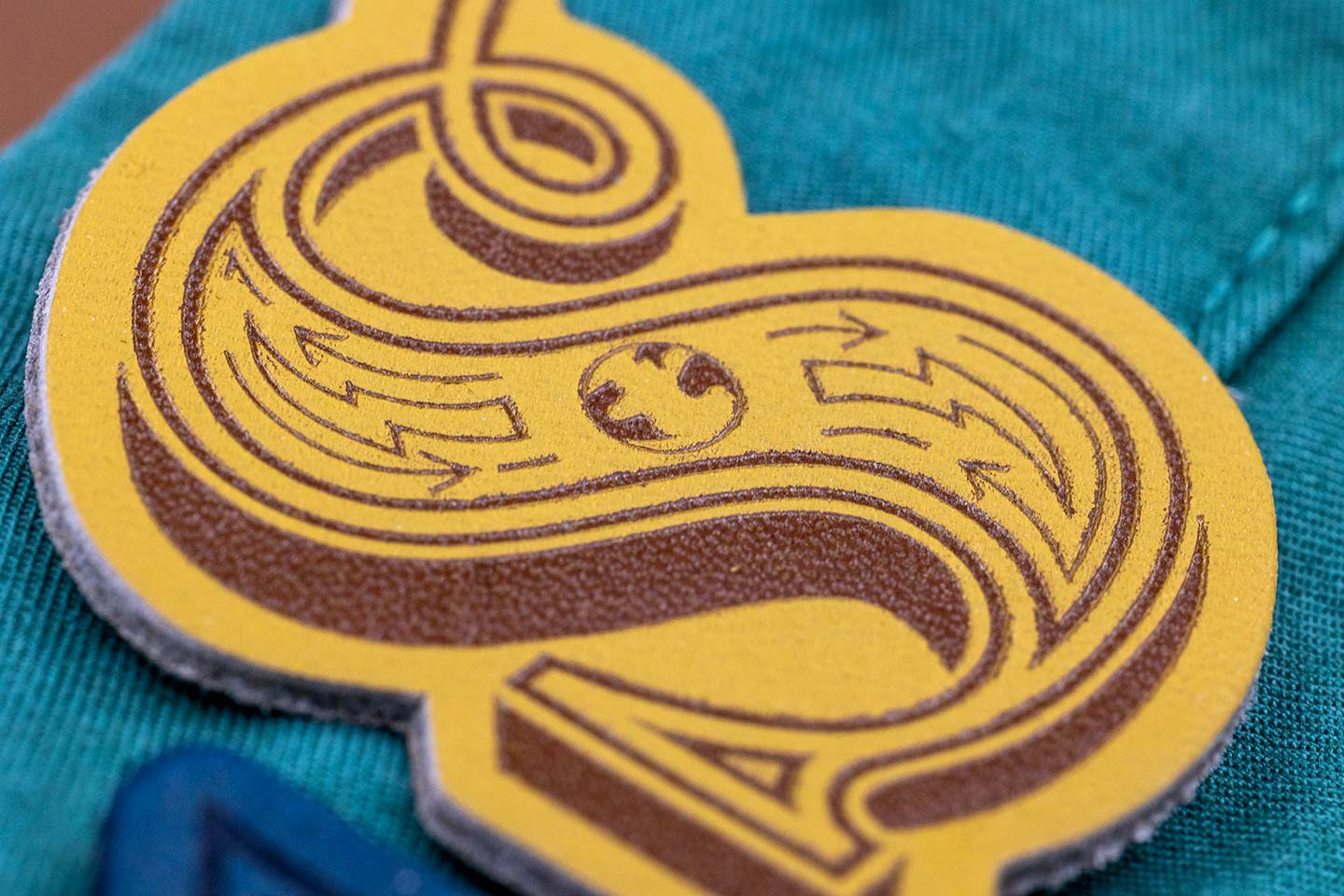
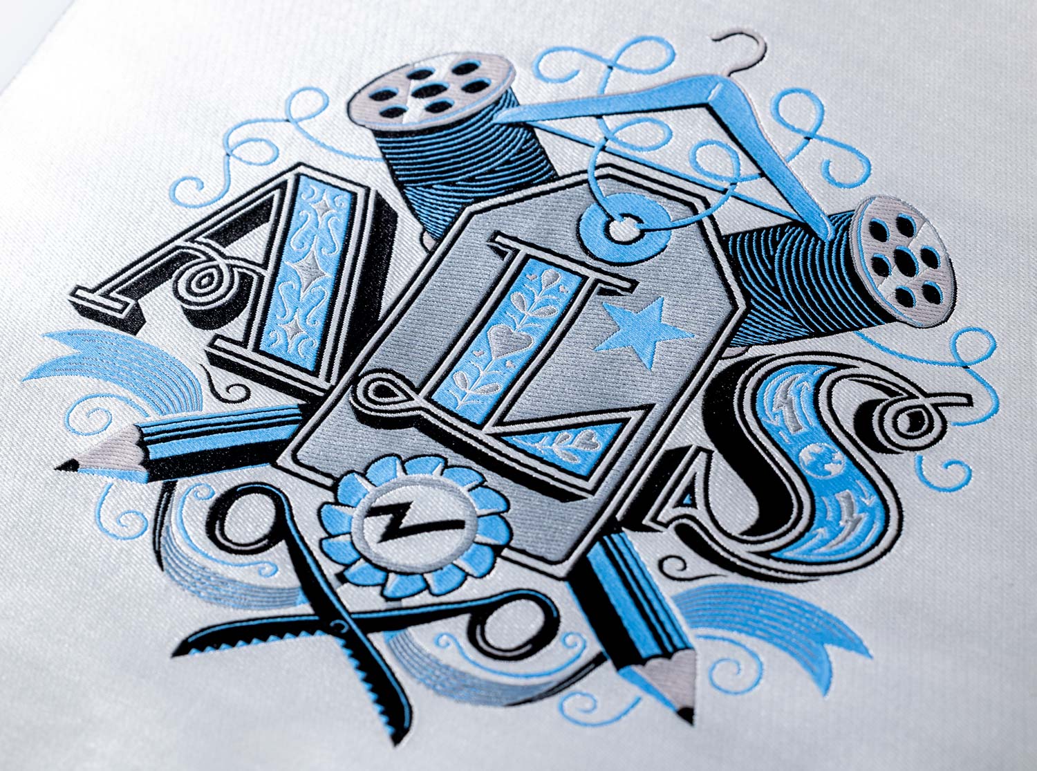
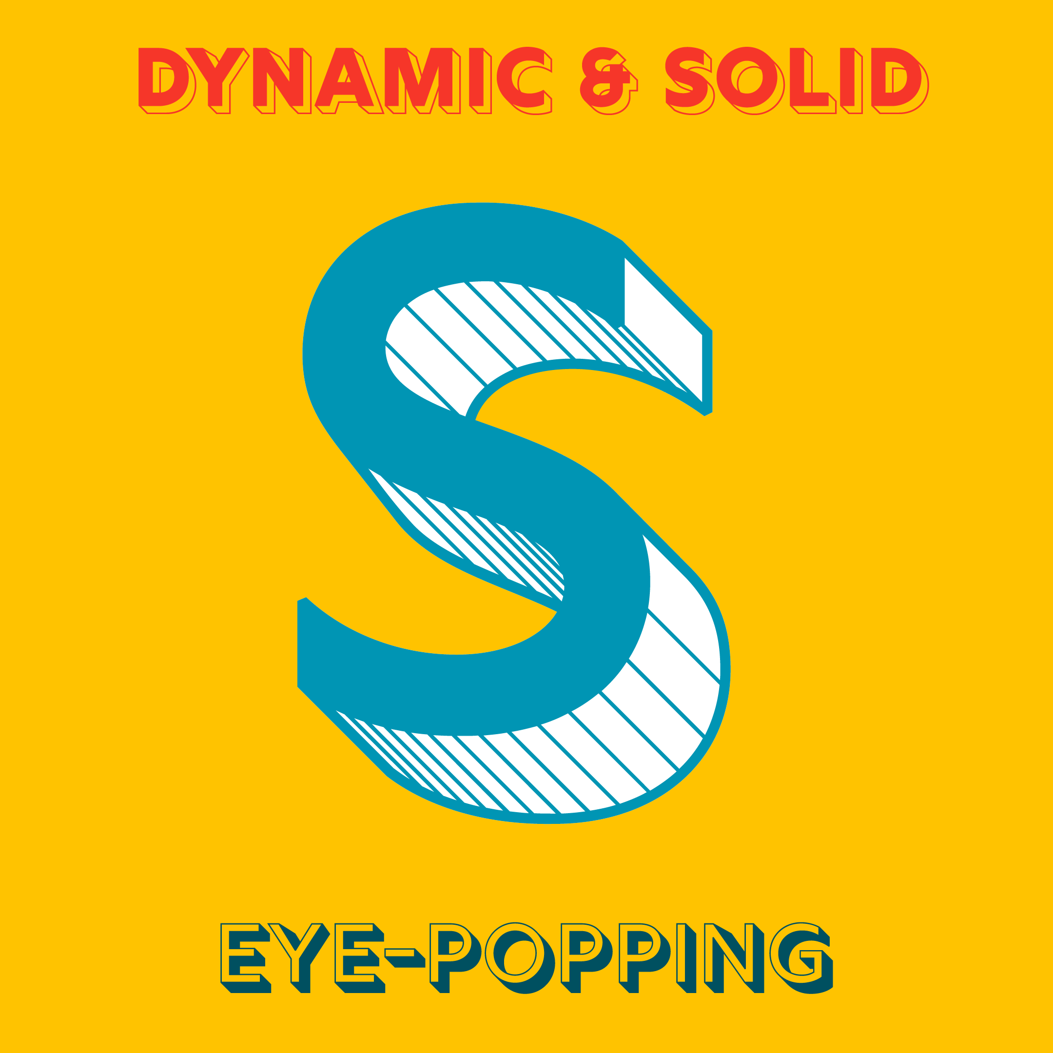
I created four crests, corresponding to each letter in 'ALS' plus a main crest. Each one highlights the company's brand values and manufacturing strengths. They interconnect, building up to the larger crest. Every crest features a unique colour scheme and intricate details, challenging the ALS creative and production teams. The crests are like little stories – vibrant, jewel-like, conveying a sense of movement and sparkle.
The final designs were sent to ALS teams in Brazil, Spain and Asia, with the sole instruction to make the end products look premium. I’m sure you’ll agree – they did a fantastic job!
‘What we received from Jamie was fantastic and completely surpassed all of our expectations, not only to get the crest, but the individual letters that spoke to our brand values as well was amazing.’ Simon Dickinson, Senior Marketing Manager at Checkpoint ALS.
More Lettering & Fonts
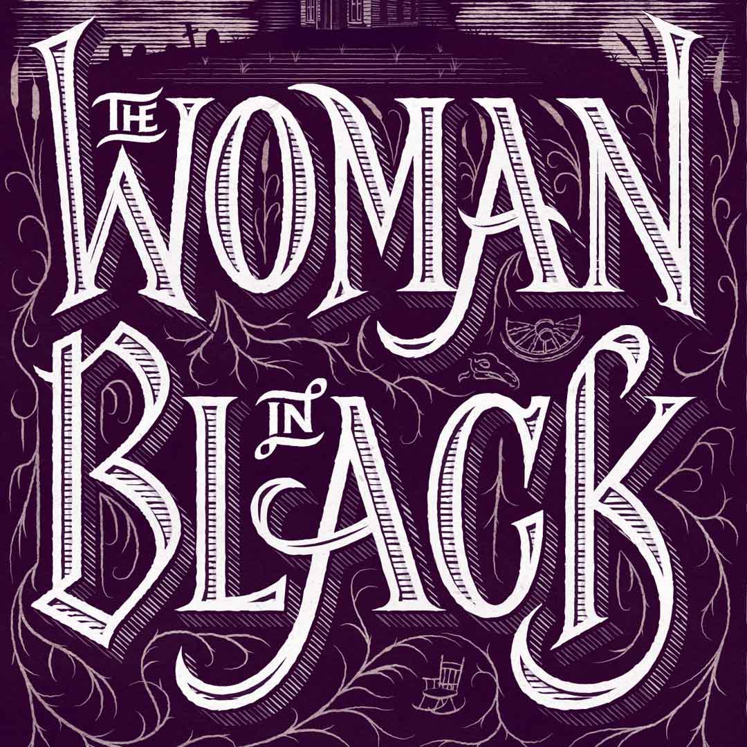
The Woman in BlackBook Cover
The Scandal of the CenturyBook Cover
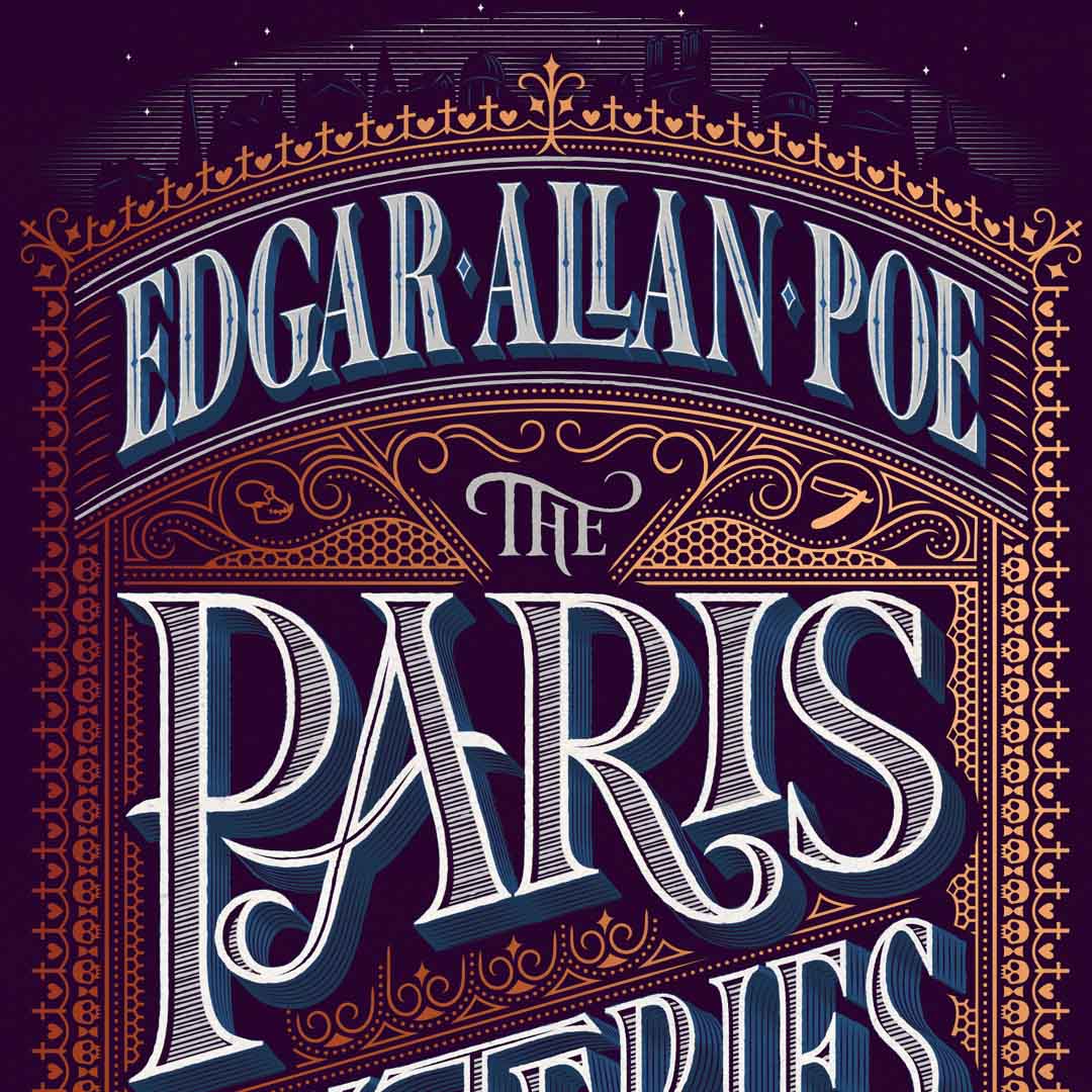
The Paris MysteriesBook Cover
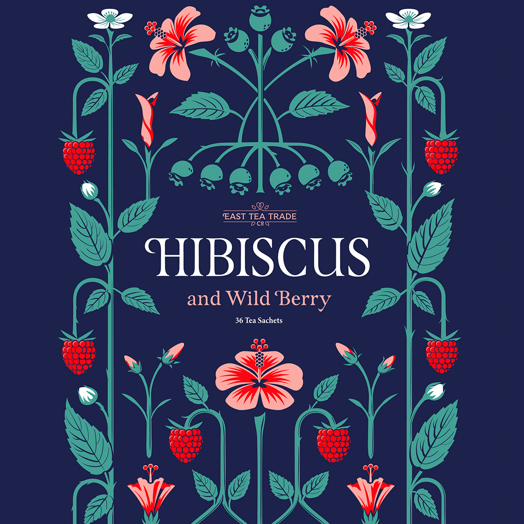
Tea PatternsPackaging
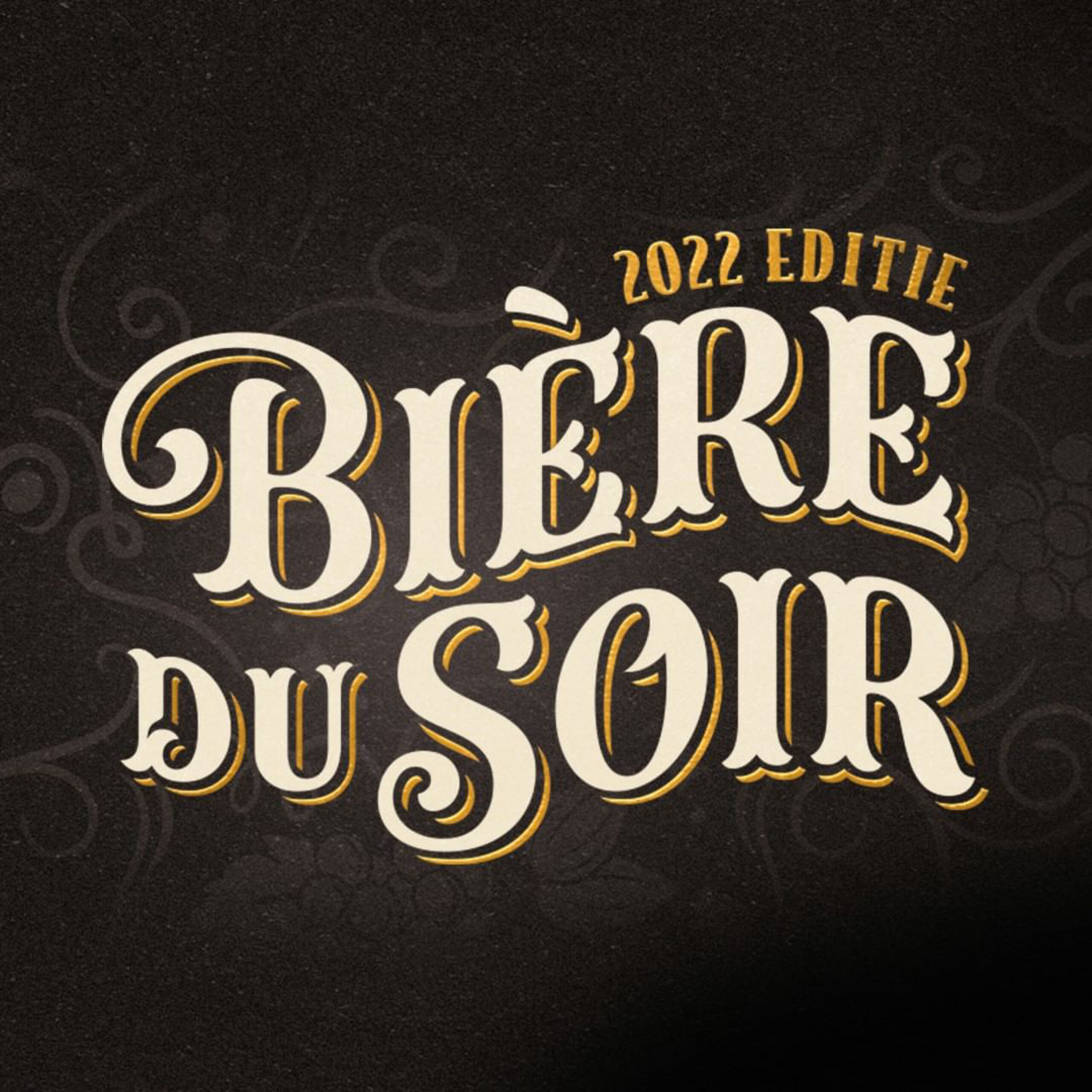
Bière du SoirBranding
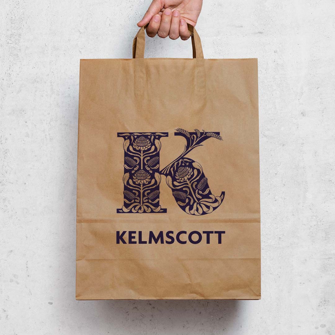
Kelmscott BakehouseBranding
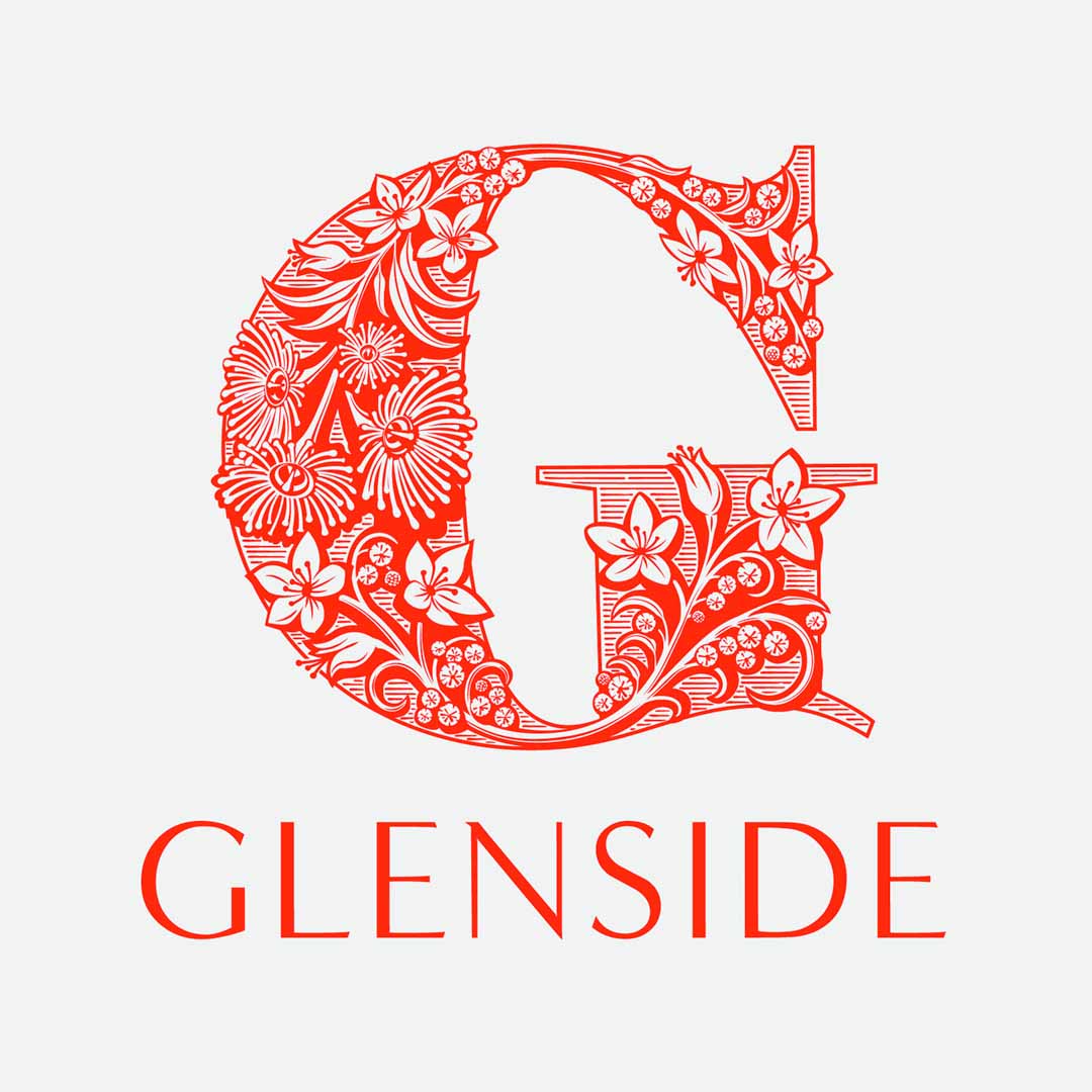
GlensideBranding
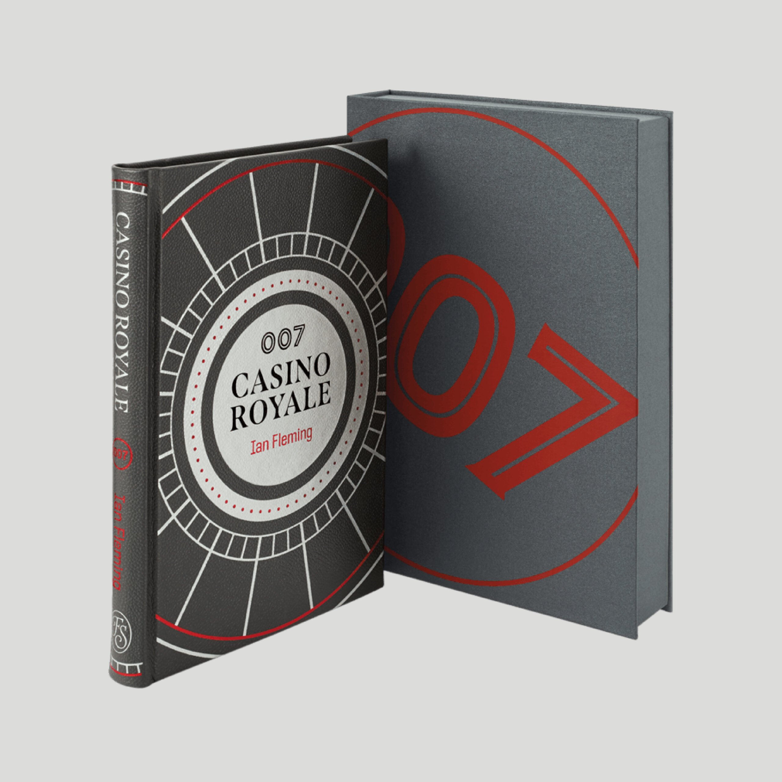
Casino Royale Limited EditionBook Cover
Orvis Brand LetteringBranding
Chocolate AmpersandsPackaging
Rig SansFont

Nave TypefaceFont
Rig ShadedFont
Brim NarrowFont
SideNoteFont
SpanFont
Rig SolidFont
A History of ChristianityBook Cover
SaintsBook Cover
The Folio Diary 2022Book Cover
Ghost LettersBook Cover
Get my Fonts
Contact me to buy my fonts directly or use them free with an Adobe subscription, or licence them from a reputable foundry partner.
 I Love Typography
 My Fonts
 Adobe Fonts
Newsletter
For occasional project and blog updates, please subscribe.
© 2015-2024 Jamie Clarke Type LTD and contributors | The Hive, Bristol, BS39 4JJ, United Kingdom